After we discussed the advantages and challenges of microservices in monorepos in Part 1, now we will look at how Nx supports this structure for AWS CDK-based applications.
What is Nx?
Nx is a JavaScript-based build system for monorepos. It enables the efficient execution of all tasks such as build and test across multiple projects in a monorepo, regardless of whether NPM, Yarn, or PNPM is used as the package manager. Nx also offers a fully integrated mode that does not require separate package.json files for each project. This enables deeper integration and is particularly interesting for UI applications with AngularJS or React.
Let’s start with a simple example. If we want to run the build script for service A, we can do this as follows:
npx nx build service-a
Now in our example repository (see Figure 1, Part 1), there are also services B and C. If we want to execute the build script for all projects in the repo, we proceed as follows:
npx nx run-many -t build
It is interesting to see that this works faster than if we were to do it individually. This is because Nx runs them in parallel, if our services are designed to be independent of each other at build time (which they also should be if they are well designed).
The advantage of Nx is particularly evident in its interaction with the version management of the Git repository. It is possible to execute only the target scripts of the projects and their dependencies for which changes were detected in the comparison between head and base. Let’s assume there are only changes in service B in a branch for a pull request to the base branch “dev”. In the following example, the build script would only be executed for service B. The scripts for the other project are not executed.
npx nx affected -t build
Now let’s return to the example repository from Part 1. The package.json of each service contains the corresponding CDK deploy script. For service A, it looks like this in simplified form:
In addition, we have a dependency on a user-defined library that is used by all three services. Suppose that we make a change to this library and then execute the following command:
npx nx affected -t deploy
In this case, the deployment scripts are executed for all three services. This happens because the library has changed and therefore all three services are indirectly affected. Nx therefore considers the dependency graph between the individual projects within the monorepo. Nx offers a useful visualization of all modules contained in a repository and their dependencies to help keep track of everything. The command
npx nx graph
is used to start a webapp locally, which can be utilized to examine the module structures and their dependencies in a browser.
All of this together is very powerful when you consider that corresponding target scripts can be defined in the package.json for practically every task in the projects, such as build, unit tests, code style checks, integration tests, audit, deployment, and much more. Consistent naming of these scripts across projects means that separate automated workflows (e.g. with GitHub Actions) can be provided for each of these tasks. These are universally valid to the extent that they do not even need to be adapted when additional projects, such as services or libraries, are added. This gives us an effective way of dealing with some potential problems of a monolithic CI/CD process.
Nx and AWS CDK: Do they go together?
AWS CDK provides us with a framework for infrastructure as code that enables the entire serverless infrastructure to be defined in TypeScript. When structuring, it is recommended to combine both the infrastructure code and the business code in one application. This means that each service will become a separate CDK application with its own stacks.
Nx enables the simple organization of AWS CDK applications in separate packages. This interaction allows for clear and well-organized development of cloud applications, with AWS CDK efficiently handling the infrastructure aspects and Nx providing the flexibility to manage the different parts of the application in a monorepo.
For our example repository, a greatly reduced version would look like as follows:
In this structure, there are two different workspaces at the top level. One for all applications (service a, service b, service c, and ui) below the apps folder. Each application follows the recommended structure for an individual CDK application. The second workspace libs contains the shared library custom-lib with its own structure and package.json. The nx.json file serves to configure Nx and contains only the default settings for the entire monorepo.
This structure can be expanded as required with additional services, libraries, and the entire workspaces, by simply adding new packages
CI/CD made easy
In the previous structure, we defined the monorepo for an architecture of multiple cloud-native microservices that exist as separate CDK applications. Nx enables efficient management of these applications.
However, in reality, it is often not enough to execute a deployment script efficiently for selected services only. A common approach is to create the individual CDK stacks of the applications via an AWS CodePipeline and deploy them to the desired target accounts of the various stages. This approach is compatible with the monorepo approach, but will mean that a separate pipeline has to be managed for each service application. This procedure is similar to a multi-repo approach, and the workload increases with the number of services.
An alternative option is to build a single pipeline that creates, tests, and deploys all stacks of all services. However, there is a risk of a monolithic, time-consuming CI/CD process, as described in Part 1. And in addition, the advantages of Nx are lost because AWS CodePipeline does not yet offer any integration for this.
Figure 2: Monorepo CI/CD
So at this point, we would like to consider another option, which is shown in Figure 2. With this approach, we attempt to combine the options outlined above. During the development in particular, we benefit greatly from the monorepo approach in combination with Nx and can automate many of the development steps. As we use GitHub as repository, many tasks for our monorepo can be implemented as GitHub Actions, including the deployment of individual service CDK stacks into an AWS dev account. All of this is based on the Nx affected feature and therefore enables a very automated and efficient development environment.
To deploy the entire application to the other required stages (QA, STG, PROD), we also set up another pipeline project in the monorepo that connects all the necessary stacks and configures the target accounts to which they are to be deployed, depending on the stage. Here, atomic and native provision within the AWS cosmos via an AWS CodePipeline is more important to us than efficiency.
Conclusion
Our analysis has shown that the development process of several microservices in monorepos with Nx can also be very efficient for CDK applications. In particular, individual teams benefit from the clear advantages of simplified dependency management, easier collaboration, and the ability to easily perform extensive refactorings, which makes monorepos an attractive option. The success of cross-team projects depends greatly on how well the teams can work together. Effective coordination on common guidelines and patterns is crucial.
Despite the obvious advantages of monorepos, the design of CI/CD processes remains a challenge. The clever use of suitable tools, however, can create clear, streamlined processes. The monorepo approach in combination with the right tools can offer a promising option for efficient development and provision of cloud-native microservices. It is important to maximize the advantages and address potential challenges in a targeted manner.
There has been a paradigm shift in the software architecture of web applications in recent years. There is a move away from monolithic structures towards heterogeneous architectures that are characterized by the implementation of various microservices. This approach is also recommended for larger, complex, serverless, and cloud-native web applications for Amazon Web Services (AWS). Usually, the infrastructure code for different technologies, the business code, and the necessary CI/CD processes are combined in one application for each service using the AWS Cloud Development Kit (CDK). These applications are typically housed in their own repository.
The division into different microservices using domain-driven design proves to be useful even for individual teams, within partial projects, or for smaller projects. Sometimes the team takes responsibility for multiple services, for organizational reasons.
Parallel to this structuring, however, there are recurring challenges in the area of infrastructure code and technical solutions for cross-cutting aspects that require uniform and centralized provision. But this creates a considerably larger workload for individual teams in terms of providing different library versions, managing dependencies, and maintaining CI/CD processes in different repositories.
One approach to overcoming these challenges is to consider using a monorepo. In the context of microservices architectures based on the CDK, the question arises: Why not combine all services and dependencies in a common repository without creating a monolithic structure?
Figure 1: From monoliths to microservices in multi-repos and back to monorepos?
Figure 1 shows an example of such a scenario. An application originally developed and grown in a repository as a monolith was initially converted into a microservices architecture with multiple repositories. This architecture consists of various CDK applications and libraries. Finally, as part of the software evolution, the individual components and services were merged into a monorepo. This is just an example from an existing project and not a general recommendation, although such migration occur frequently in real life. At the start of the project, you should be aware of the appropriate strategy and, after careful consideration, can start directly with the monorepo approach. Alternatively, there might be clear reasons not to use a monorepo and instead opt for a multi-repo approach. Let’s take a closer look at why we want to choose monorepos and what the consequences are. In the second part, we will examine in more detail about how a monorepo strategy can work effectively with AWS CDK and the Nx build system.
Advantages of monorepos
The key strength of monorepos lies in its function as a single source of truth. This results in many further advantages:
Simplified dependency management: The repository houses the entire code base and each component is integrated with its main version, which makes dependency management significantly easier. This also makes the use of artifact repositories (e.g. CodeArtifact, Nexus) superfluous.
Simplified access: Teams can collaborate easily as they have an overview of the entire repository.
Large-scale code refactoring: Atomic commits in the entire code make cross-module refactorings and implementations considerably easier.
Continuous deployment pipeline: No or little new configuration is required in order to add new services.
Dealing with possible disadvantages of monorepos
Of course, there are consequences when using monorepos. Some disadvantages can be offset from the start if certain conditions are met. Ideally, this includes an agreement on the technologies used and the selection of similar CI/CD processes across all services. Consideration must also be given to the fact that access control cannot usually be set at a fine granular level and that everyone has access to the entire code base. This can be especially important when several teams work in a monorepo. Otherwise, many of the advantages of monorepos can quickly be lost, and a multi-repo approach might be more appropriate.
There are three other limitations or risks that must be taken into account:
Limited versioning
All services are always available in their current versions. A service cannot simply reference an older version of another service. When designing microservices, particular attention must be paid to the interface contracts of the services within the monorepo. These should ideally be semantically versioned and documented. Established standards such as OpenAPI, GraphQL, and JSON Schema support this. Ensure backward compatibility when using shared libraries, otherwise changes will require adjustments in all modules that use the library.
High coupling is possible
The advantages of a monorepo, namely fast and efficient collaboration through a central code base, can quickly turn into the opposite. This happens when services directly reference blocks of other services, or if code reusability is misunderstood, and leads to the business logic of the services being outsourced to shared libraries. This quickly creates an architecture with high coupling between the individual blocks. There is strong temptation to incur technical debts, especially when under time pressure when developing new features. If these accumulate, there is a risk that no further refactorings will be carried out for fear of breaking changes, which in turn significantly impairs the maintainability of the entire system.
Therefore, it is important to define clear rules and ensure that compliance to these rules is monitored and measured, ideally using static code analyses. The aim is for the services to have no dependencies on each other during the build time and instead communicate with each other at runtime via clearly defined interfaces. The interface contracts can be efficiently stored centrally as libraries in the monorepo.
Monolithic, lengthy CI/CD processes
If the entire code is located in a single repository, the CI/CD processes for automated testing, static code analysis, build, and deployment must run through the entire code with every change, in the worst case. With increasing project sizes, these long waiting times lead to frustration, which can have a negative impact on team performance.
In a microservices architecture, however, this should not be the case, because this contradicts the goal of considering each service individually. In the case of code changes in a service, only the necessary CI/CD processes for this service and its dependent libraries should be executed. The development should be as quick and isolated as if you were only working on the code base of a service in a repository. There are suitable tools, such as Nx, to implement this in a monorepo.
Storybook is a component-driven tool for creating visual style guides and demonstrating UI components from React, Angular and Vue, as well as web components.
In particular, snapshot testing provides an opportunity to detect and correct unexpected changes to style at an early stage.
Snapshot testing in Storybook
Snapshot tests are a very useful tool if you want to ensure that there are no unexpected changes to your user interface.
A typical snapshot test case renders a UI component and creates a snapshot before comparing this to a reference snapshot file that has been saved alongside the test. If the two snapshots do not match, the test has failed: There has either been an unexpected change or the reference snapshot needs updating to match the new version of the UI component.
Storybook offers several ways to test an application, starting with Chromatic. However, this tool chain assumes that the source code has been versioned in GitHub and is subject to a monthly fee for professional use.
Another option is Storyshots, a streamlined addon that uses the Jest testing framework. It launches in the command line, where it lists instances where components have deviated from their previous state. The programmer must then check whether such changes were intentional or erroneous.
Installation for Angular
This guide assumes that Storybook has already been installed for the Angular application. A setup guide can be found at the following link. Angular comes with the Karma testing framework by default. To migrate the application to Jest, the following steps are required:
Installation of Jest dependencies
To install Jest, simply run the command “npm install jest jest-preset-angular –save-dev” in the command line.
Create Jest setup file
In the root directory of your Angular project, create the new typescript file setupJest.ts with the contents: import ‘jest-preset-angular’.
Adjust package.json
A script for the Jest testing framework must be added to the package.json of your Angular project:
Außerdem muss die Script-Ausführung für Test angepasst werden. Anstatt “test“: “ngtest“, muss “test“: “jest” In addition, the test script execution must be adapted. Instead of “test”: “ngtest”, “test”: “jest” must be used.
Next, the Karma.config.js and test.ts files in the <root>/src directory should be deleted and the section for testing must be removed from the angular.json.
Migrating from Jasmine (optional)
To migrate to Jest, certain adjustments must be made:
• spyOn with returnValue() must be changed to jest.spyOn(…).mockReturnValue(…)
• spyOn with callFacke() must be changed to jest.spyOn(…).mockImplementation(…)
• Asymmetric matchers: jasmine.any, jasmine.objectContaining, etc. become expect.any, expect.objectContaining
Installing Storyshots dependencies
Storyshots is now being installed. To install Storyshots, the following two command lines should be run::
npm i -D @storybook/addon-storyshots
npm i -D @storybook/addon-storyshots-puppeteer puppeteer
After installation, the following dependencies should be available in the package.json (as at 12/11/2021; important for the installation workaround under Angular):
After installing Storyshots, the addon still needs to be configured. To do this, the Storyshots.test.js file must be created in the <root>/src directory with the contents:
import initStoryshots from '@storybook/addon-storyshots';
import { imageSnapshot } from '@storybook/addon-storyshots-puppeteer';
import path from 'path';

// Function to customize the snapshot location
const getMatchOptions = ({ context: { fileName } }) => {
 // Generates a custom path based on the file name and the custom directory.
 const snapshotPath = path.join(path.dirname(fileName), 'snapshot-images');
 return { customSnapshotsDir: snapshotPath };
};

initStoryshots({
 // your own configuration
 test: imageSnapshot({
 // invoke the function above here
 getMatchOptions,
 }),
});
Expanding tsconfig.json for Storyshots
Moreover, the tsconfig.json must also be adapted. To do so, the compilerOptions section in tsconfig.json must be expanded as follows:
"compilerOptions": {
 "esModuleInterop": true,
Expanding package.json for Storyshots
Lastly, the section contained in the package.json must be reconfigured for Jest:
These adjustments are specific to the selected version because the folder structure must be remapped in Jest. This may change again in later versions of Storyshots.
Testing components
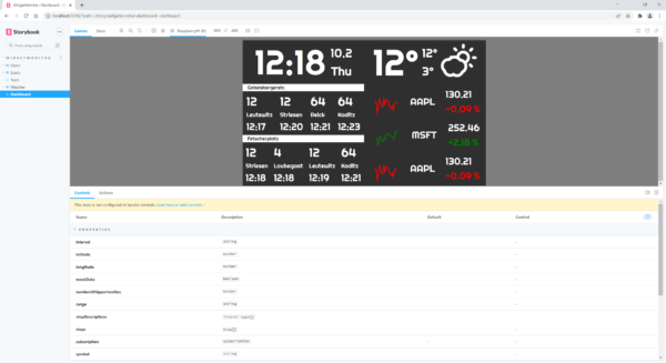
There is a sample application for the test, which is composed of four individual components. The first component displays the time, including the date and day of the week. The second component shows a chart of the current weather in degrees, as well as the highest and lowest daily temperatures. Another component displays tram departures, using Dresden Striesen as an example. There is one final component, which shows three share prices along with graphs and indicators.
Figure 1: Storybook for an application composed of four components
For example, the source code for the clock component appears as follows:
This includes three states, the first two of which are static points in time. The third state, “Running”, shows the current time, i.e. not static.
Prerequisite for snapshot tests in Storybook
It is important for us to have a static state under Storybook in order to test the application. The “Running” state is not static in the clock component example. This can be omitted by adding the parameter storyshots: { disable: true } (see source code above).
Start testing
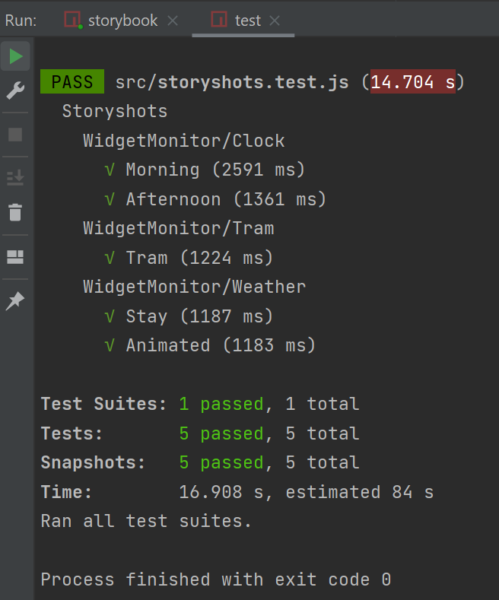
Using the npm test command line, the test is launched in the command line of the Angular project directory. The initial snapshot test will now produce a snapshot image of each component state.
Figure 2: Start test in Storybook
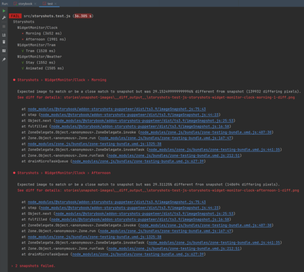
To demonstrate an example of an error, the font used on the clock in the clock component has now been changed so that it is smaller and red in the SCSS, and the test has been restarted.
Figure 3: Show errors in Storybook
The result of the snapshot test shows that the two active states of the clock component have failed and a diff image is referenced. This appears as follows:
Figure 4: Result of the snapshot tests
The original state is visible on the left, and the state following the change can be seen on the right. In the middle, you can see how both states overlap. It is now possible to either apply this state or to re-run the test after the application has been adapted.
The npm test — -u command line is used to force-apply the state. This deletes the differential images and creates a new snapshot of the state of the component. The npm test command line should now run again with no errors.
Summary
For Storybook, maintaining a state invariably means that more effort is required in the project. Anyone who is not afraid of tackling this can use Jest and the Storyshots addon to check a specific state in a closed environment. This is particularly helpful for detecting styling bugs at an early stage, as these can be difficult to detect in unit and end-to-end tests and usually only become apparent during manual testing.
In the first part of this series we looked at how to build your own web components. Now, let’s take a look at the integration in React applications.
According to their idea, web components can be used independently of JavaScript frameworks. While this works with Angular, for example, with just a few steps without problems, the situation with React is unfortunately a bit different. Why this is so and how to solve the problem is explained in more detail below.
In principle, web components can also be fully used in React. However, in certain cases additional effort is required and deviate from the usual React conventions. Usage is no longer necessarily what React developers would expect.
Essentially, there are two problem areas: On the one hand, it is the problem “Attribute vs. Properties”, which we will address in this article. On the other hand, there is the problem of “custom events” – this is discussed in the next part of this series.
Description of the problem „Attribute vs. Properties“
As we saw in the first part of the series, there are two ways to pass data to a Web component – as an HTML attribute or as a JavaScript property.
In this code example, the value is defined as an attribute in HTML:
<my-component value="something"></my-component>
Here, on the other hand, the property of the same name is set using JavaSript:
In JavaScript, however, it is also possible to explicitly set the attribute:
myComponent.setAttribute("value", "something")
JavaScript is more flexible in this respect, because in HTML only attributes are possible – properties cannot be set in HTML.
It is important to understand: Whether and how attributes and properties are processed or taken into account by the component is entirely up to the implementation of the component. While there is a best practice, to offer both attributes and properties and keep them in sync, technically, no one is bound to do so. It would therefore be possible to accept either only attributes or properties, or to give them completely different names (which would certainly cause the resentment of the users of the component).
On the other hand, however, there are also solid reasons for deliberately deviating from this best practice in some cases.
An important factor is that attributes and properties have different power: Attributes only allow values that can be represented as a string, i. e. strings and numbers. In addition, Boolean values can be represented by the presence or absence of an attribute. More complex data such as JavaScript objects or functions cannot be passed as an attribute, or would have to be serialized.
JavaScript properties naturally do not have this limitation. However, properties have the disadvantage that they are always imperative and not declarative when used. Instead of simply declaring, as with HTML, which state you want to have, you have to use commands to set properties in sequence. From a developer’s point of view, this is rather unattractive, because frameworks such as React and (with slight derogations) Angular have made you accustomed to the benefits of declarative work.
Another difference between attributes and properties concerns performance: Both attributes and properties are used not only to input data into the component from outside, but also to access component information. A nice example of this is the standard HTML tag <video>, which offers the current playback position of the video being played using the JavaScript property “currentTime”. When querying these properties, you get the position in seconds as a decimal number. A matching HTML attribute does not exist. Otherwise, such an attribute would have to be constantly updated with the current playback time, which would be a relatively expensive operation in the DOM. The query via a JavaScript property, on the other hand, can be solved quite efficiently, since a Lazy-Getter method can be implemented for this purpose, which is only triggered when the position is actually queried.
In web components, we have two different mechanisms for a very similar purpose, but they are quite different in some respects.
Attribute
Properties
declarative
imperative
String, Number, Boolean
String, Number, Boolean, Date, Object, Function
React Props
With React, things look a little more straightforward: React only knows so-called “props”. Since React places a strong focus on declarative programming, the use of HTML attributes is similar:
<MyComponent value="something" />
However, React props are not limited to certain data types, but allow transfer of arbitrary data and functions. For this purpose, a syntax with curved brackets is used instead of quotation marks:
As a React developer I have to say that I personally like the React variant with props much better than the distinction between attributes and properties with their respective characteristics in web components – but this is a matter of taste.
Web Components in React
Now the API of web components is just as it is. So the question is: What happens when I use a web component in React? Are “props” passed to the web component as attributes or properties?
Initially, React decides whether the tag is case-sensitive or not, and whether it is a React component (starting with uppercase letters) or an HTML tag, which includes web components. With the exception of some special cases for some standard HTML tags, React Props always uses “setAttributes” for HTML tags and web components. This means that using attributes in web components in React does not cause any problems. It is different when JavaScript properties have to be explicitly used, e. g. because complex data or functions are to be added to the Web Component. React is currently unable to do this in a declarative way. In about 90% of cases, this is not a problem because, as already mentioned above, it is considered best practice to keep attributes and properties synchronous, and to support both variants if possible. Only in the remaining 10% of cases where properties are necessary (because either the authors of the Web Component did not follow the best practice, or some other reason prevents the use of attributes) do we have to come up with something.
However, this does not mean that such web components cannot be used in React at all! We simply cannot go down the usual, purely declaratory path, but must resort to the mandatory API, which is also supported by React. We will look at how this works in the following.
React abstracts from concrete instances of DOM nodes. Even independently of web components, you have to access DOM nodes directly in some cases, for example if you want to call a method like “.focus()”. For this purpose, React uses so-called “refs” and we can use this mechanism to set JavaScript properties on our web components. In the code, for example, it looks like this:
With “const elementRef = useRef(null)” we create a kind of container into which React will put the reference to the DOM node after it has been made. “useEffect” can be used to execute a function once certain variables have been changed. To do this, we give the “elementRef” variable (wrapped into an array) as a second parameter to the “useEffect“-Hook-function. As soon as React has rendered the component for the first time, the specified function is executed, so our property is set accordingly. As you can see, the code is a lot more complicated than just setting an attribute directly on the tag. The example shows, however, that it is possible to use web components in React. In the fourth part of this series of articles, we will look at another variant, which scales better especially for larger applications where certain web components are to be used again and again. In the next article in the series, however, we will then take a closer look at the second problem of web components with React: The processing of custom events.
Conclusion
As an interim conclusion, the situation of web components with React is complicated. On the one hand, React is ideally suited for the development of comprehensive web applications and is therefore widely used. On the other hand, it is extremely annoying that React has such problems with a modern web technology like web components.
There are at least two reasons for this: On the one hand, React was created at a time when web components or “custom elements” were still a mere idea and far from being implemented in practice. At the same time, the React team places great emphasis on backward compatibility and understandably shies away from incompatible changes in the way React components are written. The discussion about which options are available to make React compatible with web components can be followed if you are interested in the issue tracker of the project.
The second factor I want to highlight is: The concepts of web components and React are quite different when it comes to how components are used. React is designed entirely for declarative programming, while web components and standard HTML tags provide a mixed form that is partly declarative, but in some places imperative. And since React developers like this declarative character of React, it is not the solution to simply blindly adopt the imperative API of web components. Instead, ways need to be found to enable these two “worlds” to work together. Unfortunately, the process of finding a solution has been going on for quite some time now, and in the meantime the discussion within the React-developer community seems to have fallen asleep a bit.
It is therefore only to be hoped that this process will pick up speed again, so that web components can be used in React projects easily and without any hassle.
So-called “web components” are one way of building reusable UI components for web applications. Unlike common single-page app frameworks such as React or Angular, the component model is based on web standards. Since SPA frameworks can, in fact, do far more than just build components, web components do not compete directly with the established frameworks. They can, however, be a useful addition. Whenever components are meant to be reused for applications with different technology stacks, web components can be very useful indeed.
Still, using web components in single-page applications presents some difficulties when you go into detail: While the integration into Angular applications is relatively simple, a few things have to be observed, in particular when using React applications.
Whether the “fault” lies on React or the web component standard depends on one’s point of view and is not easily answered. Furthermore, there are some aspects where web components are disadvantageous even with respect to their core competency of building components because they are unnecessarily complicated or inflexible, e.g. compared to React.
Figure 1: Web components and SPA frameworks
This series of blog posts deals with these and other aspects regarding the interaction of web components and SPA frameworks, in particular React. The first part of the series focuses only on web components, what the term means, and how to build web components.
What are web components, and how do you build your own components?
The term “web components” refers to several separate HTML specifications that deal with various aspects of the development of one’s own components. Consequently, there is no such thing as “one” standard for web components; rather, it is a combination of several specifications.
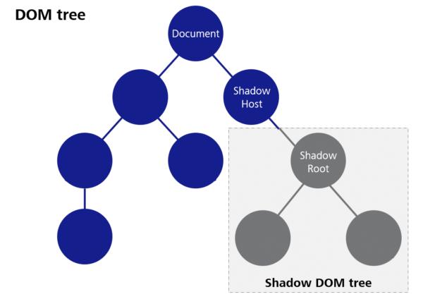
The two most important ones are “Custom Elements” and “Shadow DOM”. The Custom Elements specification describes the JavaScript base class “HTMLElement”, among others, from which individual components have to be derived. This class provides numerous lifecycle methods that allow you to respond to various events in the component’s life cycle. You can, for example, program a response to the component being integrated into a document or attributes of the component being set. The developers of a component can then update the presentation of the component. Custom Elements furthermore comprise the possibility to register individual component classes under a specific HTML tag so that the component is then available throughout the entire document.
“Shadow DOM” means a method that allows for a separate DOM tree, which is largely isolated from the rest of the document, to be created for a component. This means, for example, that CSS properties set globally in the document do not take effect in the Shadow DOM, and on the other hand, CSS definitions within a component do not affect other elements in the document. The goal is to better encapsulate the components and avoid unwanted side effects when integrating foreign web components.
The following code block shows a simple Hello World component that comprises a property for the name of the person to be greeted.
Firstly, a separate Shadow DOM tree is created for the component in the constructor of the component. “Mode: open” ensures that it is possible to access the DOM tree of the component from the outside with JavaScript despite the Shadow DOM barrier.
Then, the “shadowRoot”, i.e. the root node of the Shadow DOM, is created according to our requirements—in this case, with “innerHTML”.
With “observedAttributes”, we describe which attributes the component is supposed to have and/or which attributes we want to be notified of (we can also specify standard attributes such as “class” at this point).
The notification is done by means of the “attributeChangedCallback” method, with the name of the changed attribute and both the old and the new value as parameters. Since we only specified one attribute in “observedAttributes” in this case, checking the name of the attribute is not really necessary. In the case of several attributes, however, it is important to always check which attribute has been changed in each case.
In our case, we first check whether the new value is actually different from the previous one (we will see how this can happen later on). Then, we set the “person” property that we created as class variable to the value of the submitted attribute.
To update the presentation of the component, the “update” method was created in this example. This method is not part of the Custom Elements standard, but only serves to gather the update logic in one place in this case. We retrieve the previously created span element with the ID “person” from the Shadow DOM and set its text to the value of the “person” property.
Figure 2: Shadow DOM
The code example shows how, in a final step, our component class is registered with the tag name “app-hello-world”. It is important that the name comprises at least one minus sign. This rule was defined in order to avoid possible name collisions with future standard HTML tags. Choosing a meaningful prefix for one’s own components has also proven to be useful to prevent collisions with other component libraries as far as possible (the prefix “app” used in the example is, in fact, not a very good example in this respect). However, there is no sure way to prevent conflicts.
We are now able to submit simple data to the component by means of attributes. “Attributes” have a few more particularities and pitfalls, but we are going to deal with those in the next part of this series of blog posts. For this general introduction, we will leave it at that.
Slots
The so-called “slots” are another important feature of web components that will be dealt with again in a later part of this series. Slots allow for HTML snippets to be submitted to a component. The component then decides how to present the submitted elements. For example, if we want to build a message box that presents both a text and an icon inside a frame, it is advisable to submit the message text to the component by means of a slot instead of an attribute. This way, we are not limited to plain text, but we can use any HTML content we want.
Here is an example of how this can look in the application:
<app-notification-box>
	<p>Some Text with additional <strong>tags</strong></p>
</app-notification-box>
We only have to write the HTML tags we want as child elements. Within the component, there has to be a <slot> element in the Shadow root for this purpose. When the component is rendered, the submitted content is then displayed instead of the slot element.
A component can also contain several slots. In order for the browser to be able to decide which HTML elements to assign to which slot, so-called “named slots” have to be used in this case, i.e. the slots are given a specific name attribute. A component must not contain more than one slot without a name attribute. This one is called the “default slot”. Here is an example of how this can look in the component:
You can see how the “slot” attribute is used here. The values have to match the “name” attributes of the slots within the component. Consequently, this is part of a component’s public API and has to be documented accordingly.
Events
So far, we have only considered how data can be submitted to the components, but we have not yet looked at the opposite direction. In order to be truly interactive, developers must also be able to respond to certain events and accept data from the component.
This is the purpose of HTML events. We are only going to take a brief look at this aspect in this post and address it in more detail later.
Web components can generate both standard events and custom events.
Standard events are useful if the type of event also appears with standard HTML elements and does not need to be invented, e.g. a KeyboardEvent. Custom events are useful if additional data are to be sent with the event as payload. For example, if we build our own interactive table component where the users can select individual lines, it may be advisable to trigger an event upon selection that contains the data from the selected line as payload.
The mechanism for triggering an event is the same for all kinds of events. It can be seen in the following code block:
To generate an event, you either generate an instance of “event” or one of the other event classes (one of which is “CustomEvent”). Every event constructor expects the first parameter to be the type of event. This type is later used to register listeners for these events as well.
The second parameter is optional and constitutes a JavaScript object that configures the event. For CustomEvent, for example, the “detail” field is provided to submit any desired payload data.
Conclusion
This post gives a brief introduction to the topic of “web components”, and with the methods shown, you can already build your own components. There are, of course, numerous other aspects that need to be considered in the development of web components. After all, this topic fills a number of reference books. In this series of blog posts, we want to focus on some of the pitfalls that can occur with individual issues, and examine how to avoid them. This series will also include a critical analysis of the web component API. The next blog posts are going to focus on the interaction with SPA frameworks in particular.
Setting a full-size background image with CSS3 is no problem, right? There are numerous solutions available on the internet. They work quite well at first glance, but once you take a closer look, more often than not you will be disappointed. Should a 2 MB image be delivered to mobile devices with 3G? Probably not. Are mobile browsers supported as well? You often won’t find that information, and the standard solution fails your own test. The first question: What characterizes a good full-size background image?
It is always focused.
It does not take up too much network traffic.
It is centered.
It is not distorted.
It adjusts to the size of the device or browser window without any whitespace.
And it looks the same in all common browsers, from Android browsers to Chrome, Safari, Firefox, and Internet Explorer.
Is there a simple, clean solution to meet all of these requirements?
If you are researching how to choose the right motive, or you want to use an svg file as a background, you are unfortunately looking in the wrong place. But if you are looking for a substantiated answer to the issue described above, you should read this post. And if all you need is a quick solution to conjuring up a background image for your website, just scroll right down to the end.
The perfect image
As the variety of screen sizes increases and responsive designs have been developed, images on the web have become a science in themselves. Therefore, the “perfect background image” is in fact a combination of image sizes that are optimized for various requirements. But what are the requirements that have to be fulfilled? And how can they be fulfilled?
What has to be observed?
As a rule, the user experience, i.e. the way the web platform is perceived by the user, should be the first priority. Google thinks so, too, basing many of its ranking factors for search results on this principle.
The four most important points with respect to background images are listed below.
1. Short load times are essential for the user experience
A survey shows that 65% of online shoppers cancel their purchase after a waiting period of three seconds, and many of them never return to the shop. This result can also be translated to web presences in general. Therefore, images should not take much time to download, i.e. they should be small.
2. Google ranks websites with long load times lower
This means that the slower your website is, the lower it is among the search results.
3. The whole thing has to look good, too
The brain recognizes images more quickly than other content, and images speak to the users’ emotions. Furthermore, it is difficult for an emotion to be balanced by content. A pixelated or distorted image has a negative effect on your website’s credibility, and it can cause the user to leave the website quickly even if its performance is okay.
4. The bounce rate is a ranking factor
Even though search engines currently do not check whether an image is visually appealing, an image of poor quality can affect the ranking of your platform in the search results because of the bounce rate.
In summary:
Your background image should be as small as possible, but as large as necessary.
Which file format should I use?
In the web environment, two file formats are important for photographs: png and jpg. Generally speaking, the png format provides a greater subjective richness of detail because only the number of colors is reduced upon compression. Furthermore, it supports the alpha channel, meaning that it enables transparent areas. The advantage of jpg is in the compression and the resulting lower file size.
As background images rarely require great detail or transparency, but the file size is important, the jpg format is preferable in this case.
Which image sizes do I need?
A definitive answer to this question is given in the “Media queries” section below. But first, there are some aspects that play a role in choosing suitable image sizes and help to better understand how images on the web work.
In order to deliver the background image that matches the respective screen size, we use media queries to classify the sizes into ranges. Then, each of them is allocated an image that has been optimized for the respective range. For example, a range covers screen widths of 320 to 640 pixels. Any background image for this range should have a width of at least 640 pixels. The dots per inch (dpi) are not important in this context.
The ratio of logical and physical pixels (device pixel ratio) should also be taken into account in the selection of the suitable image sizes. The device pixel ratio describes how many physical pixels (device pixels) a logical pixel (CSS pixel) consists of. If the value is two, each logical pixel of your background image consists of four physical pixels (two vertical and horizontal each). In this case, an image with a width of 640 pixels looks pixelated on a 640 pixel screen. Therefore, your background image should be delivered double the size in this case.
Currently, device pixel ratios on the market range from one to five. In theory, this means that images need to be provided in up to quintuple size. With connections in the 3G range in particular, this would cause long load times. However, with a pixel ratio of one, the human eye can no longer distinguish individual pixels at a distance of a little over the screen diagonal. With a pixel ratio of two, this is true already at half this distance. This means that with a pixel ratio of two, you would have to press your nose to your smartphone to be able to see individual pixels. Consequently, providing images double the size is sufficient for normal use.
The question remains what the maximum image size should be. These days, 4K screens (usually 3840×2160 pixels) are all the rage, and more and more manufacturers are jumping on the bandwagon. Other sizes such as 5K (MacBook Pro 2016) and 8K (Dell UltraSharp 32 Ultra HD 8K) are, of course, also available on the market. You alone decide which maximum size you choose. Obviously, the original image should have a corresponding size.
How do I optimize my image?
Once the sizes of your image have been determined, there are several tools or web apps that can be used for the actual optimization. Photoshop, for example, provides a feature for exporting images for the web. As every image reacts differently to the optimization according to its properties, you should fiddle around some with the quality and other options and compare the result with the original image, always keeping an eye on the file size and the corresponding download time. The latter should be less than one second in common networks (e.g. 3G). To determine appropriate download times for files, you can use online tools such as the download calculator.
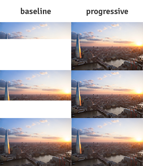
To reduce the perceived waiting time, the jpg format offers the progressive mode, which has been supported by IE since version 9 and by all true browsers since the beginning of time. Contrary to the common baseline version, the image is not loaded line by line from top to bottom, but the quality gradually improves.
Media queries
Unfortunately, there is currently no way to determine the current network speed by CSS, JavaScript and the like, and to deliver images accordingly. Consequently, you have to look at the screen size and aspect ratios, and try to design the image to be as visually appealing as possible for them and as small as possible at the same time. As mentioned above, CSS media queries are used to realize the background image in various sizes. Are there other methods? Yes, there are.
Then why use media queries?
You could, for example, use different img elements and show or hide them with JavaScript, or use the srcset attribute. However, this method violates the principle of separating design and content. An image integrated with img is part of the content, but a background image is definitely part of the design. Furthermore, Internet Explorer does not support the srcset attribute
Ok… And how does it work?
With media queries, you can link styles to certain attributes. The styles take effect only when the attribute has the required value. For background images, the attributes min-width, max-width and orientation are of particular interest. They refer to the size and aspect ratio of the browser window, and therefore they work both in the full-screen and in the windowed mode. The values used in this context are called breakpoints. With background images, breakpoints ensure that only the image corresponding to the current browser window is downloaded. In the example below, the background is red on devices with a width of less than 640 pixels, and blue on larger devices.
The orientation attribute can take on two values: landscape and portrait. They indicate whether the device is currently wider than it is high, or higher than wide, i.e. whether a smartphone, for example, is being held upright or horizontally. As our background image scales itself according to the longest edge of the browser window and is usually wider than high, larger images have to be delivered for devices with portrait mode. If, for example, a tablet (16:9) is 640 pixels wide and 1130 pixels high in portrait mode, the image (4:3) is delivered with a width of 640 pixels and a height of 480 pixels. Consequently, the image is scaled to more than twice its height, becoming distorted. Therefore, the image should be delivered at a correspondingly larger size in this case.
Which breakpoints do I use for my background image?
As always with CSS, it is important to use the mobile-first principle. This means that you specify styles for small screen sizes without a media query, and then add or override styles for larger screens by means of media queries. For background images, you should also pay attention to whether you deliver the image as landscape or portrait in the general style.
In the years after media queries were first developed, breakpoints used to still be assigned for certain standard screen sizes. But because of the wide variety of devices, the breakpoints of the media queries are now chosen based on the content. There are two approaches for our full-size background image at this point. Either you reuse the breakpoints you chose before, or you choose new ones for the background image. When choosing your own breakpoints, you can base the decision on various things, e.g. on the DevTools of your favorite browser, the HD standards, or make them up yourself.
I like to start my designs with a minimum size of 320 pixels. This corresponds to older iPhones and the slimmest smartphone I know. I use this value as a basis and double it again and again so that I do not have to generate as many images. This way, I can reuse images several times.
My breakpoints:
640 pixels
1280 pixels
2560 pixels
5120 pixels
Using this version, if you have a width of less than 1280 pixels in landscape mode, you can use the image optimized for a width of 1280 pixels. If the screen has a device pixel ratio of two and/or it is held upright, you deliver the image with a width of 2560 pixels. The image will still be scaled to match the aspect ratio for the portrait mode, but only to a small degree. In my experience, slight scaling is not a problem. Since unfortunately it is not possible to determine the aspect ratio of the device by means of a media query, this is difficult to optimize. If you want to optimize the image further at this point, you can determine the aspect ratio using JavaScript and assign corresponding classes with the background URL.
And the device pixel ratio?
There is “a” media query attribute for the above-mentioned device pixel ratio (cross-browser retina/high-resolution media queries). Unfortunately, browser support is poor at present. Safari requires the “-webkit-” prefix, and Google Chrome always delivers the image for the higher pixel ratio despite the media query. Hopefully, a comprehensive solution to this problem will present itself in the future. To achieve almost full coverage, you have to assign the following two attributes:
The , between the attributes is equivalent to “or”. Each browser uses the query it requires. It is up to you to what degree of granularity you want the pixel ratio to be queried and specially optimized images to be delivered. To convert the pixel-ratio into dpi, you have to multiply the value by 96.
Depending on the required load time, you can also always have the images be delivered double the size. This way you avoid the problem of new images needing to be loaded when the device is turned sideways.
Styling of the background image
There are two possibilities of where to place your background image: Directly in the “body” or in another block element. The second option, however, should not be used unless absolutely necessary.
You will often find the following solution on the web:
    body {
      width: 100%;
      height: 100%;
      background-image: url('background.jpg');
      background-repeat: no-repeat;
      background-position: center center;
      background-size: cover;
      background-attachment: fixed;
    }
What is this supposed to achieve?
Firstly, you set width and height at 100% in order to fill the entire viewport.
You set a background image with background-image, which is simple.
Using background-repeat: no-repeat; prevents the background from being repeated and thereby tiled.
background-position: center center; centers the image both horizontally and vertically.
background-size adjusts the image to the viewport. cover means that the image fills the viewport without whitespaces.
background-attachment: fixed; fixes the image in place. This way it does not scroll away if the body is higher than the viewport.
Sounds good, but…
Mobile devices adjust the image to the content with this method, i.e. to the overall height of the website. As soon as you have to scroll, the image is scaled and it pixelates quickly. To solve this problem, you can use relatively unknown units in CSS: vw and vh. vw stand for viewport width, and vh for viewport height. This unit is supported by all common browsers and by IE Version 9 or higher. With width: 100vw; and height: 100vh; you set the width and height at precisely 100% of the width and height of the viewport. This also means that when the scrollbar appears in Windows browsers, it does not affect the background image. In addition, the overflow attribute should be set in html and body.
Any other problems?
New problems arise when you try to translate all of this, e.g. to a div element:
On mobile devices, the image is again distorted to the height of the content.
Certain scalings cause a scrollbar to be displayed at the bottom of the screen.
In Internet Explorer, scrolling causes an unpleasant flickering effect.
Points 1 and 3 can be solved by replacing background-attachment: fixed; with position: fixed;.
For point 2, overflow: auto; has to be set in html and body.
Unfortunately not. If you use this method for block elements on the body, the image shifts upwards. If you try to combine the solutions and set both background-attachment: fixed; and position: fixed; for the body element, it flickers in IE. If you use both attributes on a block element, that does not change the original problem.
In summary
Image files should be small, but appealing.
Background images should take less than one second to load in a 3G network, i.e. be smaller than ~900 KB.
The progressive attribute should be set in all jpg files.
Media queries should be used to deliver images that match various screen sizes.
Choose your breakpoints wisely.
For screens with a high device pixel ratio, images should be delivered double the size.
The same is true for landscape images on portrait-format devices.
Set the background image with CSS.
Use the units vw and vh instead of %.
Browsers are troublemakers, so test as much as you can!!!
### One more example?
I chose a resolution of up to 5K in this case and decided to serve high device pixel ratios only up to full HD. I deliver the larger image with a device pixel ratio of 1.5.
    html, body {
      overflow: auto;
    }
    body {
      width: 100vw;
      height: 100vh;
      /* picture for a device-width between 0 and 640px in landscape-mode */
      background-image: url(background_640.jpg);
      background-repeat:  no-repeat;
      background-position: center center;
      background-size: cover;
      /* change  */
      background-attachment: fixed;
      /* to  */
      /* position: fixed; */
      /* if your style is not added to body */
    }
    @media (orientation: portrait),
           (-webkit-min-device-pixel-ratio: 1.5),
           (min-resolution: 144dpi) {

      body {
        background-image: url(background_1280.jpg);
      }
    }
    @media (min-width: 640px) and (orientation: landscape) {
      body {
        background-image: url(background_1280.jpg);
      }
    }
    @media (min-width: 640px) and (orientation: portrait) {
      body {
        background-image: url(background_2560.jpg);
      }
    }
    @media (min-width: 640px) and (-webkit-min-device-pixel-ratio: 1.5),
           (min-width: 640px) and (min-resolution: 144dpi) {

      body {
        background-image: url(background_2560.jpg);
      }
    }
    @media (min-width: 1280px)  and (orientation: landscape) {
      body {
        background-image: url(background_2560.jpg);
      }
    }
    @media (min-width: 1280px)  and (orientation: portrait) {
      body {
        background-image: url(background_5120.jpg);
      }
    }
    @media (min-width: 1280px) and (-webkit-min-device-pixel-ratio: 1.5),
           (min-width: 1280px) and (min-resolution: 144dpi) {

      body {
        background-image: url(background_5120.jpg);
      }
    }
    @media (min-width: 2560px)  and (orientation: landscape) {
      body {
        background-image: url(background_5120.jpg);
      }
    }