So-called “web components” are one way of building reusable UI components for web applications. Unlike common single-page app frameworks such as React or Angular, the component model is based on web standards. Since SPA frameworks can, in fact, do far more than just build components, web components do not compete directly with the established frameworks. They can, however, be a useful addition. Whenever components are meant to be reused for applications with different technology stacks, web components can be very useful indeed.
Still, using web components in single-page applications presents some difficulties when you go into detail: While the integration into Angular applications is relatively simple, a few things have to be observed, in particular when using React applications.
Whether the “fault” lies on React or the web component standard depends on one’s point of view and is not easily answered. Furthermore, there are some aspects where web components are disadvantageous even with respect to their core competency of building components because they are unnecessarily complicated or inflexible, e.g. compared to React.

This series of blog posts deals with these and other aspects regarding the interaction of web components and SPA frameworks, in particular React. The first part of the series focuses only on web components, what the term means, and how to build web components.
What are web components, and how do you build your own components?
The term “web components” refers to several separate HTML specifications that deal with various aspects of the development of one’s own components. Consequently, there is no such thing as “one” standard for web components; rather, it is a combination of several specifications.
The two most important ones are “Custom Elements” and “Shadow DOM”. The Custom Elements specification describes the JavaScript base class “HTMLElement”, among others, from which individual components have to be derived. This class provides numerous lifecycle methods that allow you to respond to various events in the component’s life cycle. You can, for example, program a response to the component being integrated into a document or attributes of the component being set. The developers of a component can then update the presentation of the component. Custom Elements furthermore comprise the possibility to register individual component classes under a specific HTML tag so that the component is then available throughout the entire document.
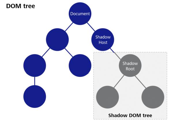
“Shadow DOM” means a method that allows for a separate DOM tree, which is largely isolated from the rest of the document, to be created for a component. This means, for example, that CSS properties set globally in the document do not take effect in the Shadow DOM, and on the other hand, CSS definitions within a component do not affect other elements in the document. The goal is to better encapsulate the components and avoid unwanted side effects when integrating foreign web components.
The following code block shows a simple Hello World component that comprises a property for the name of the person to be greeted.
class HelloWorld extends HTMLElement {

    person = ""

    constructor() {
        super();

        this.attachShadow({mode: "open"})

        this.shadowRoot.innerHTML = `
            <div>
                <p>Hello <span id="personGreeting"></span></p>
            </div>
        `
    }

    static get observedAttributes() {
        return ['person']
    }

    attributeChangedCallback(name, oldValue, newValue) {
        if(name === "person") {
            if(this.person !== newValue) {
                this.person = newValue
                this.update()
            }
        }
    }

    update() {
        this.shadowRoot.querySelector("#personGreeting").textContent = this.person
    }

}
window.customElements.define("app-hello-world", HelloWorld)
Firstly, a separate Shadow DOM tree is created for the component in the constructor of the component. “Mode: open” ensures that it is possible to access the DOM tree of the component from the outside with JavaScript despite the Shadow DOM barrier.
Then, the “shadowRoot”, i.e. the root node of the Shadow DOM, is created according to our requirements—in this case, with “innerHTML”.
With “observedAttributes”, we describe which attributes the component is supposed to have and/or which attributes we want to be notified of (we can also specify standard attributes such as “class” at this point).
The notification is done by means of the “attributeChangedCallback” method, with the name of the changed attribute and both the old and the new value as parameters. Since we only specified one attribute in “observedAttributes” in this case, checking the name of the attribute is not really necessary. In the case of several attributes, however, it is important to always check which attribute has been changed in each case.
In our case, we first check whether the new value is actually different from the previous one (we will see how this can happen later on). Then, we set the “person” property that we created as class variable to the value of the submitted attribute.
To update the presentation of the component, the “update” method was created in this example. This method is not part of the Custom Elements standard, but only serves to gather the update logic in one place in this case. We retrieve the previously created span element with the ID “person” from the Shadow DOM and set its text to the value of the “person” property.
The code example shows how, in a final step, our component class is registered with the tag name “app-hello-world”. It is important that the name comprises at least one minus sign. This rule was defined in order to avoid possible name collisions with future standard HTML tags. Choosing a meaningful prefix for one’s own components has also proven to be useful to prevent collisions with other component libraries as far as possible (the prefix “app” used in the example is, in fact, not a very good example in this respect). However, there is no sure way to prevent conflicts.
We are now able to submit simple data to the component by means of attributes. “Attributes” have a few more particularities and pitfalls, but we are going to deal with those in the next part of this series of blog posts. For this general introduction, we will leave it at that.
Slots
The so-called “slots” are another important feature of web components that will be dealt with again in a later part of this series. Slots allow for HTML snippets to be submitted to a component. The component then decides how to present the submitted elements. For example, if we want to build a message box that presents both a text and an icon inside a frame, it is advisable to submit the message text to the component by means of a slot instead of an attribute. This way, we are not limited to plain text, but we can use any HTML content we want.
Here is an example of how this can look in the application:
<app-notification-box>
	<p>Some Text with additional <strong>tags</strong></p>
</app-notification-box>
We only have to write the HTML tags we want as child elements. Within the component, there has to be a <slot> element in the Shadow root for this purpose. When the component is rendered, the submitted content is then displayed instead of the slot element.
<div>
    <div>Icon</div>
    <div id="content">
        <slot></slot>
    </div>
</div>
A component can also contain several slots. In order for the browser to be able to decide which HTML elements to assign to which slot, so-called “named slots” have to be used in this case, i.e. the slots are given a specific name attribute. A component must not contain more than one slot without a name attribute. This one is called the “default slot”. Here is an example of how this can look in the component:
<div>
    <div id="header">
        <h1>
            <slot name="header"></slot>
        </h1>
    </div>
    <div id="icon">
        <slot name="icon"></slot>
    </div>
    <div id="content">
        <slot><slot>
    </div>
</div>
This is an example of how this could look when used:
<app-notification-box>
    <p>Some Content</p>
    <span slot="header">A meaningful Header</span>
    <img slot="icon" src="..." alt="notification icon"/>
</app-notification-box>
You can see how the “slot” attribute is used here. The values have to match the “name” attributes of the slots within the component. Consequently, this is part of a component’s public API and has to be documented accordingly.
Events
So far, we have only considered how data can be submitted to the components, but we have not yet looked at the opposite direction. In order to be truly interactive, developers must also be able to respond to certain events and accept data from the component.
This is the purpose of HTML events. We are only going to take a brief look at this aspect in this post and address it in more detail later.
Web components can generate both standard events and custom events.
Standard events are useful if the type of event also appears with standard HTML elements and does not need to be invented, e.g. a KeyboardEvent. Custom events are useful if additional data are to be sent with the event as payload. For example, if we build our own interactive table component where the users can select individual lines, it may be advisable to trigger an event upon selection that contains the data from the selected line as payload.
The mechanism for triggering an event is the same for all kinds of events. It can be seen in the following code block:
class InteractiveComponent extends HTMLElement {

    triggerStandardEvent() {
        const event = new Event("close")
        this.dispatchEvent(event)
    }

    triggerCustomEvent() {
        const event = new CustomEvent("some-reason",
            { detail: { someData: "..." }}
        )
        this.dispatchEvent(event)
    }
}
To generate an event, you either generate an instance of “event” or one of the other event classes (one of which is “CustomEvent”). Every event constructor expects the first parameter to be the type of event. This type is later used to register listeners for these events as well.
The second parameter is optional and constitutes a JavaScript object that configures the event. For CustomEvent, for example, the “detail” field is provided to submit any desired payload data.
Conclusion
This post gives a brief introduction to the topic of “web components”, and with the methods shown, you can already build your own components. There are, of course, numerous other aspects that need to be considered in the development of web components. After all, this topic fills a number of reference books. In this series of blog posts, we want to focus on some of the pitfalls that can occur with individual issues, and examine how to avoid them. This series will also include a critical analysis of the web component API. The next blog posts are going to focus on the interaction with SPA frameworks in particular.
This post was written by: