Setting a full-size background image with CSS3 is no problem, right? There are numerous solutions available on the internet. They work quite well at first glance, but once you take a closer look, more often than not you will be disappointed. Should a 2 MB image be delivered to mobile devices with 3G? Probably not. Are mobile browsers supported as well? You often won’t find that information, and the standard solution fails your own test. The first question: What characterizes a good full-size background image?
- It is always focused.
- It does not take up too much network traffic.
- It is centered.
- It is not distorted.
- It adjusts to the size of the device or browser window without any whitespace.
- And it looks the same in all common browsers, from Android browsers to Chrome, Safari, Firefox, and Internet Explorer.
Is there a simple, clean solution to meet all of these requirements?
If you are researching how to choose the right motive, or you want to use an svg file as a background, you are unfortunately looking in the wrong place. But if you are looking for a substantiated answer to the issue described above, you should read this post. And if all you need is a quick solution to conjuring up a background image for your website, just scroll right down to the end.
The perfect image
As the variety of screen sizes increases and responsive designs have been developed, images on the web have become a science in themselves. Therefore, the “perfect background image” is in fact a combination of image sizes that are optimized for various requirements. But what are the requirements that have to be fulfilled? And how can they be fulfilled?
What has to be observed?
As a rule, the user experience, i.e. the way the web platform is perceived by the user, should be the first priority. Google thinks so, too, basing many of its ranking factors for search results on this principle.
The four most important points with respect to background images are listed below.
1. Short load times are essential for the user experience
A survey shows that 65% of online shoppers cancel their purchase after a waiting period of three seconds, and many of them never return to the shop. This result can also be translated to web presences in general. Therefore, images should not take much time to download, i.e. they should be small.
2. Google ranks websites with long load times lower
This means that the slower your website is, the lower it is among the search results.
3. The whole thing has to look good, too
The brain recognizes images more quickly than other content, and images speak to the users’ emotions. Furthermore, it is difficult for an emotion to be balanced by content. A pixelated or distorted image has a negative effect on your website’s credibility, and it can cause the user to leave the website quickly even if its performance is okay.
4. The bounce rate is a ranking factor
Even though search engines currently do not check whether an image is visually appealing, an image of poor quality can affect the ranking of your platform in the search results because of the bounce rate.
In summary:
Your background image should be as small as possible, but as large as necessary.
Which file format should I use?
In the web environment, two file formats are important for photographs: png and jpg. Generally speaking, the png format provides a greater subjective richness of detail because only the number of colors is reduced upon compression. Furthermore, it supports the alpha channel, meaning that it enables transparent areas. The advantage of jpg is in the compression and the resulting lower file size.
As background images rarely require great detail or transparency, but the file size is important, the jpg format is preferable in this case.
Which image sizes do I need?
A definitive answer to this question is given in the “Media queries” section below. But first, there are some aspects that play a role in choosing suitable image sizes and help to better understand how images on the web work.
In order to deliver the background image that matches the respective screen size, we use media queries to classify the sizes into ranges. Then, each of them is allocated an image that has been optimized for the respective range. For example, a range covers screen widths of 320 to 640 pixels. Any background image for this range should have a width of at least 640 pixels. The dots per inch (dpi) are not important in this context.
The ratio of logical and physical pixels (device pixel ratio) should also be taken into account in the selection of the suitable image sizes. The device pixel ratio describes how many physical pixels (device pixels) a logical pixel (CSS pixel) consists of. If the value is two, each logical pixel of your background image consists of four physical pixels (two vertical and horizontal each). In this case, an image with a width of 640 pixels looks pixelated on a 640 pixel screen. Therefore, your background image should be delivered double the size in this case.
Currently, device pixel ratios on the market range from one to five. In theory, this means that images need to be provided in up to quintuple size. With connections in the 3G range in particular, this would cause long load times. However, with a pixel ratio of one, the human eye can no longer distinguish individual pixels at a distance of a little over the screen diagonal. With a pixel ratio of two, this is true already at half this distance. This means that with a pixel ratio of two, you would have to press your nose to your smartphone to be able to see individual pixels. Consequently, providing images double the size is sufficient for normal use.
The question remains what the maximum image size should be. These days, 4K screens (usually 3840×2160 pixels) are all the rage, and more and more manufacturers are jumping on the bandwagon. Other sizes such as 5K (MacBook Pro 2016) and 8K (Dell UltraSharp 32 Ultra HD 8K) are, of course, also available on the market. You alone decide which maximum size you choose. Obviously, the original image should have a corresponding size.
How do I optimize my image?
Once the sizes of your image have been determined, there are several tools or web apps that can be used for the actual optimization. Photoshop, for example, provides a feature for exporting images for the web. As every image reacts differently to the optimization according to its properties, you should fiddle around some with the quality and other options and compare the result with the original image, always keeping an eye on the file size and the corresponding download time. The latter should be less than one second in common networks (e.g. 3G). To determine appropriate download times for files, you can use online tools such as the download calculator.
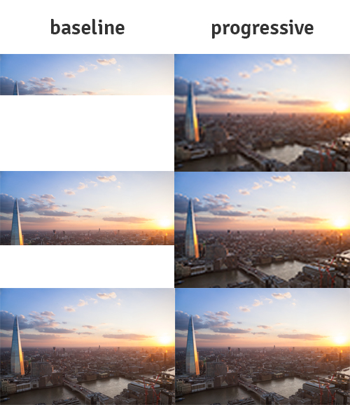
To reduce the perceived waiting time, the jpg format offers the progressive mode, which has been supported by IE since version 9 and by all true browsers since the beginning of time. Contrary to the common baseline version, the image is not loaded line by line from top to bottom, but the quality gradually improves.
Media queries
Unfortunately, there is currently no way to determine the current network speed by CSS, JavaScript and the like, and to deliver images accordingly. Consequently, you have to look at the screen size and aspect ratios, and try to design the image to be as visually appealing as possible for them and as small as possible at the same time. As mentioned above, CSS media queries are used to realize the background image in various sizes. Are there other methods? Yes, there are.
Then why use media queries?
You could, for example, use different img elements and show or hide them with JavaScript, or use the srcset attribute. However, this method violates the principle of separating design and content. An image integrated with img is part of the content, but a background image is definitely part of the design. Furthermore, Internet Explorer does not support the srcset attribute
Ok… And how does it work?
With media queries, you can link styles to certain attributes. The styles take effect only when the attribute has the required value. For background images, the attributes min-width, max-width and orientation are of particular interest. They refer to the size and aspect ratio of the browser window, and therefore they work both in the full-screen and in the windowed mode. The values used in this context are called breakpoints. With background images, breakpoints ensure that only the image corresponding to the current browser window is downloaded. In the example below, the background is red on devices with a width of less than 640 pixels, and blue on larger devices.
    .class {
      background: red;
    }
    @media (min-width: 640px) {
      .class {
        background: blue;
      }
    }
What does orientation mean?
The orientation attribute can take on two values: landscape and portrait. They indicate whether the device is currently wider than it is high, or higher than wide, i.e. whether a smartphone, for example, is being held upright or horizontally. As our background image scales itself according to the longest edge of the browser window and is usually wider than high, larger images have to be delivered for devices with portrait mode. If, for example, a tablet (16:9) is 640 pixels wide and 1130 pixels high in portrait mode, the image (4:3) is delivered with a width of 640 pixels and a height of 480 pixels. Consequently, the image is scaled to more than twice its height, becoming distorted. Therefore, the image should be delivered at a correspondingly larger size in this case.
Which breakpoints do I use for my background image?
As always with CSS, it is important to use the mobile-first principle. This means that you specify styles for small screen sizes without a media query, and then add or override styles for larger screens by means of media queries. For background images, you should also pay attention to whether you deliver the image as landscape or portrait in the general style.
In the years after media queries were first developed, breakpoints used to still be assigned for certain standard screen sizes. But because of the wide variety of devices, the breakpoints of the media queries are now chosen based on the content. There are two approaches for our full-size background image at this point. Either you reuse the breakpoints you chose before, or you choose new ones for the background image. When choosing your own breakpoints, you can base the decision on various things, e.g. on the DevTools of your favorite browser, the HD standards, or make them up yourself.
I like to start my designs with a minimum size of 320 pixels. This corresponds to older iPhones and the slimmest smartphone I know. I use this value as a basis and double it again and again so that I do not have to generate as many images. This way, I can reuse images several times.
My breakpoints:
- 640 pixels
- 1280 pixels
- 2560 pixels
- 5120 pixels
Using this version, if you have a width of less than 1280 pixels in landscape mode, you can use the image optimized for a width of 1280 pixels. If the screen has a device pixel ratio of two and/or it is held upright, you deliver the image with a width of 2560 pixels. The image will still be scaled to match the aspect ratio for the portrait mode, but only to a small degree. In my experience, slight scaling is not a problem. Since unfortunately it is not possible to determine the aspect ratio of the device by means of a media query, this is difficult to optimize. If you want to optimize the image further at this point, you can determine the aspect ratio using JavaScript and assign corresponding classes with the background URL.
And the device pixel ratio?
There is “a” media query attribute for the above-mentioned device pixel ratio (cross-browser retina/high-resolution media queries). Unfortunately, browser support is poor at present. Safari requires the “-webkit-” prefix, and Google Chrome always delivers the image for the higher pixel ratio despite the media query. Hopefully, a comprehensive solution to this problem will present itself in the future. To achieve almost full coverage, you have to assign the following two attributes:
    @media (-webkit-min-device-pixel-ratio: 2),
           (min-resolution: 192dpi) {
      /* style goes here */
    }
The , between the attributes is equivalent to “or”. Each browser uses the query it requires. It is up to you to what degree of granularity you want the pixel ratio to be queried and specially optimized images to be delivered. To convert the pixel-ratio into dpi, you have to multiply the value by 96.
Depending on the required load time, you can also always have the images be delivered double the size. This way you avoid the problem of new images needing to be loaded when the device is turned sideways.
Styling of the background image
There are two possibilities of where to place your background image: Directly in the “body” or in another block element. The second option, however, should not be used unless absolutely necessary.
You will often find the following solution on the web:
    body {
      width: 100%;
      height: 100%;
      background-image: url('background.jpg');
      background-repeat: no-repeat;
      background-position: center center;
      background-size: cover;
      background-attachment: fixed;
    }
What is this supposed to achieve?
- Firstly, you set
widthandheightat 100% in order to fill the entire viewport. - You set a background image with
background-image, which is simple. - Using
background-repeat: no-repeat;prevents the background from being repeated and thereby tiled. background-position: center center;centers the image both horizontally and vertically.background-sizeadjusts the image to the viewport.covermeans that the image fills the viewport without whitespaces.background-attachment: fixed;fixes the image in place. This way it does not scroll away if thebodyis higher than the viewport.
Sounds good, but…
Mobile devices adjust the image to the content with this method, i.e. to the overall height of the website. As soon as you have to scroll, the image is scaled and it pixelates quickly. To solve this problem, you can use relatively unknown units in CSS: vw and vh. vw stand for viewport width, and vh for viewport height. This unit is supported by all common browsers and by IE Version 9 or higher. With width: 100vw; and height: 100vh; you set the width and height at precisely 100% of the width and height of the viewport. This also means that when the scrollbar appears in Windows browsers, it does not affect the background image. In addition, the overflow attribute should be set in html and body.
Any other problems?
New problems arise when you try to translate all of this, e.g. to a div element:
- On mobile devices, the image is again distorted to the height of the content.
- Certain scalings cause a scrollbar to be displayed at the bottom of the screen.
- In Internet Explorer, scrolling causes an unpleasant flickering effect.
Points 1 and 3 can be solved by replacing background-attachment: fixed; with position: fixed;.
For point 2, overflow: auto; has to be set in html and body.
    html, body {
      overflow: auto;
    }
    .background-container {
      width: 100vw;
      height: 100vh;
      background-image: url('background.jpg');
      background-repeat: no-repeat;
      background-position: center center;
      background-size: cover;
      position: fixed;
    }
Is there a common solution?
Unfortunately not. If you use this method for block elements on the body, the image shifts upwards. If you try to combine the solutions and set both background-attachment: fixed; and position: fixed; for the body element, it flickers in IE. If you use both attributes on a block element, that does not change the original problem.
In summary
- Image files should be small, but appealing.
- Background images should take less than one second to load in a 3G network, i.e. be smaller than ~900 KB.
- The progressive attribute should be set in all jpg files.
- Media queries should be used to deliver images that match various screen sizes.
- Choose your breakpoints wisely.
- For screens with a high device pixel ratio, images should be delivered double the size.
- The same is true for landscape images on portrait-format devices.
- Set the background image with CSS.
- Use the units
vwandvhinstead of %. - Browsers are troublemakers, so test as much as you can!!!
### One more example?
I chose a resolution of up to 5K in this case and decided to serve high device pixel ratios only up to full HD. I deliver the larger image with a device pixel ratio of 1.5.
    html, body {
      overflow: auto;
    }
    body {
      width: 100vw;
      height: 100vh;
      /* picture for a device-width between 0 and 640px in landscape-mode */
      background-image: url(background_640.jpg);
      background-repeat:  no-repeat;
      background-position: center center;
      background-size: cover;
      /* change  */
      background-attachment: fixed;
      /* to  */
      /* position: fixed; */
      /* if your style is not added to body */
    }
    @media (orientation: portrait),
           (-webkit-min-device-pixel-ratio: 1.5),
           (min-resolution: 144dpi) {

      body {
        background-image: url(background_1280.jpg);
      }
    }
    @media (min-width: 640px) and (orientation: landscape) {
      body {
        background-image: url(background_1280.jpg);
      }
    }
    @media (min-width: 640px) and (orientation: portrait) {
      body {
        background-image: url(background_2560.jpg);
      }
    }
    @media (min-width: 640px) and (-webkit-min-device-pixel-ratio: 1.5),
           (min-width: 640px) and (min-resolution: 144dpi) {

      body {
        background-image: url(background_2560.jpg);
      }
    }
    @media (min-width: 1280px)  and (orientation: landscape) {
      body {
        background-image: url(background_2560.jpg);
      }
    }
    @media (min-width: 1280px)  and (orientation: portrait) {
      body {
        background-image: url(background_5120.jpg);
      }
    }
    @media (min-width: 1280px) and (-webkit-min-device-pixel-ratio: 1.5),
           (min-width: 1280px) and (min-resolution: 144dpi) {

      body {
        background-image: url(background_5120.jpg);
      }
    }
    @media (min-width: 2560px)  and (orientation: landscape) {
      body {
        background-image: url(background_5120.jpg);
      }
    }
This post was written by: