ISO 25000, which was originally developed from ISO 9000, describes quality within software development. For software developers, ISO 25010, which depicts the typical quality characteristics of software products, is of particular interest. This standard is of particular interest within ZEISS Digital Innovation too, as it not only affects the products of our customers, but also our internal processes. Especially in conjunction with the regular health checks, the standard is an important guideline as it defines which properties of software require particular attention. After more than ten years, this important standard is now being revised. This article deals with the changes we expect.
ISO 25010
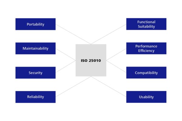
The ISO 25010 standard was approved in 2011, thereby replacing standard 9126, which was applicable at that time. It defines eight main characteristics of software, which are then divided into additional sub-characteristics.
Figure 1: Quality characteristics for software – defined in ISO 25010
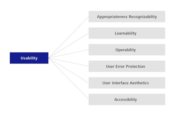
Usability, for example, is a well-known characteristic. It describes the degree to which the software supports its users in implementing their work processes. Important sub-categories include, for example, how easy it is to learn to use the software (learnability), and the degree to which it protects users from input errors (user error protection). The degree to which the software can be used by those with potential operating restrictions in terms of visual and hearing impairments is also relevant.
Figure 2: Sub-characteristics for the quality criterion usability
The detailed description within the standard makes it possible to provide various project participants, such as software architects, software testers or product owners with relevant descriptions of requirements and for these participants to prioritize appropriate quality characteristics.
Changes to the standard
ISO standards are subject to a review process every five years to check whether they are up-to-date. This was done for ISO 25010 in 2016 and 2021. During the last audit, various potential changes became apparent. For example, the feature of scalability is not currently included in the standard, although it is crucial for determining whether an application should be implemented in the cloud or on-premises. The question of whether the software should be implemented as a monolith or in the form of micro-services is also largely dependent on the required scalability.
The standardization entities had the chance to propose requested changes such as these until November 15, 2022. Thus a proposal is now available, which will be agreed on in the next three months. If the second edition follows the usual path, it can be expected that the new edition will be binding around mid-2023 and will be published broadly. But what specific changes can be expected?
Possible ISO 25010 – 2nd Edition
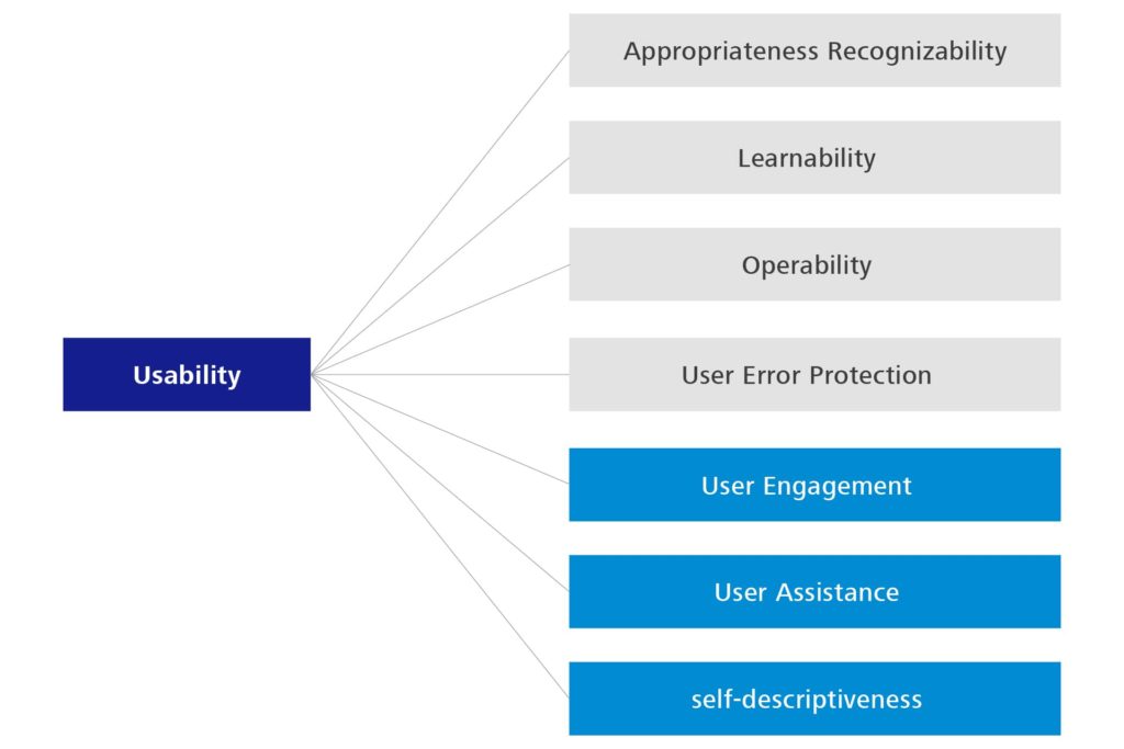
There are some changes relating to the usability characteristic, such as ‘Aesthetics’ and ‘Accessibility’ changing to ‘User Engagement’, ‘User Assistance’ and ‘Self-Descriptiveness’. The previously available descriptions have basically been explained in more detail or more clearly distinguished.
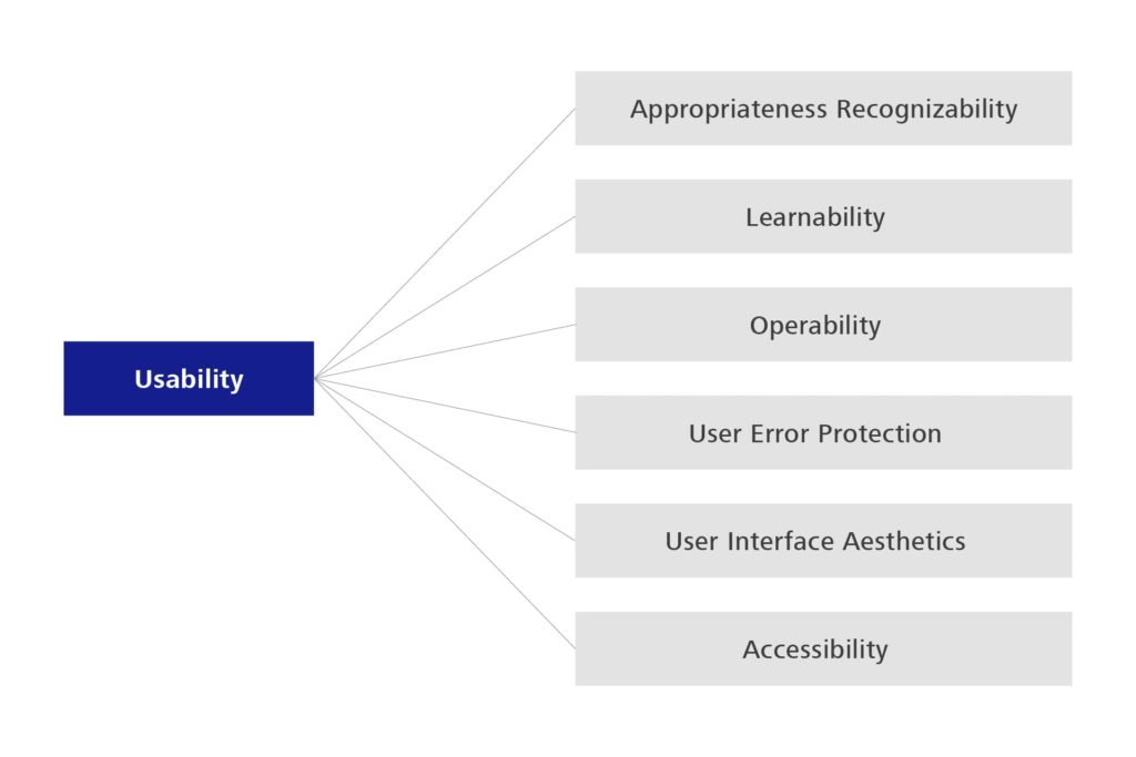
Figure 3: Sub-characteristics of Usability – 1st edition
Figure 4: Sub-characteristics of Usability – 2nd edition
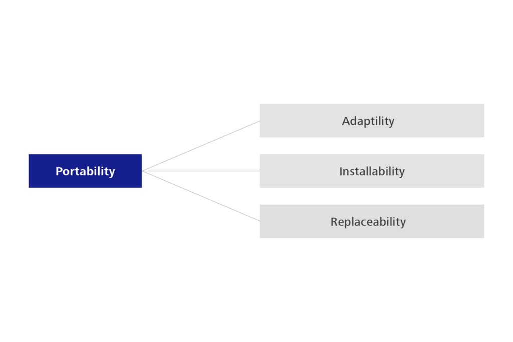
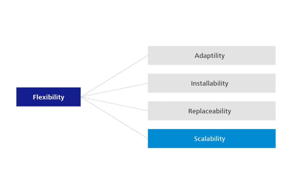
There is a further change in that ‘Portability’ is changing to ‘Flexibility’, which comes much closer to its actual character and distinguishes it more clearly from compatibility. Flexibility also includes the Scalability that has long been missing from the standard.
Figure 5: Sub-characteristics of Portability – 1st edition
Figure 6: Sub-characteristics of Portability – 2nd edition
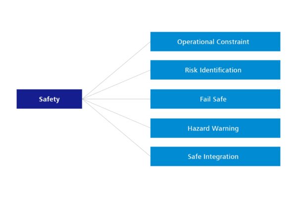
The biggest change relates to a new characteristic that has not yet been considered at all — Safety, in the sense of operational safety. Its introduction as an important quality characteristic therefore also reflects the significant prevalence of software in the context of hardware. After all, software controls hardware in many cases, and can therefore lead to damage to people and materials in the real world.
Figure 7: New quality characteristic – Safety
Conclusion
Changes to standards must always be viewed somewhat critically, as the standard becomes somewhat less well understood, especially during the transition period. For example, it can be expected that the similarity of the names in the different editions will cause some confusion about the different terms. On the other hand, the changes are comprehensible and useful. However, it is not yet certain to what extent the changes will take place, as the votes on these adjustments have not yet been finalized.
“Tester Teatime” is a blog post format, which addresses topics that testers deal with on a daily basis. As certain issues or topics tend to recur again and again, the aim here is to create a basis for explaining such phenomena and finding solutions for them. To that end, the blog focusses on stimulating discussions and new ways of thinking. In testing, we can learn a lot from each other by observing our behaviour in our daily lives!
Moderator: Welcome to Tester Teatime! In this interview with testers from ZEISS Digital Innovation (ZDI), we will once again discuss exciting topics.
Today, we are talking to Sandra Wolf (SW), a tester at ZDI, about “spelling”. Sandra, why are we discussing this topic and what’s the connection with software development?
SW: A tester’s normal workday is full of challenges. During the testing process in particular, full concentration is required as every detail has to be checked for quality. One of these details is spelling and grammar. The importance of correct spelling is often underestimated. In our daily work, it is not unusual to find spelling mistakes in the software. But the tester is often ridiculed when they report these to Development for correction. According to the prevailing view, these are only minor and insignificant errors. Today’s talk aims to dispel this opinion. Spelling and punctuation are not exactly the most popular topics and are often perceived as being very dry. Yet these very rules, which we have been learning since our school days, act as a guide for us and our brains. Spelled correctly, a word is easier to read, easier to combine in a sentence to form a statement and thus easier to process for the brain. Attentive readers – or in the case of software development – users will inevitably stumble across incorrect spelling in the software. It has even been demonstrated that certain personality types react differently to incorrect spelling in terms of their emotional response (cf. Weiß, 2016). Thus, contrary to their reputation as being dry, errors in this area can trigger emotions, which in turn affect use of the software.
Image: Stanislaw Traktovenko and Sandra Wolf during the interview at the Tester Teatime.
Moderator: What kind of influence are we talking about here?
SW: For instance, correct spelling radiates respectability. In job applications and official requests, error-free spelling is an absolute must. For example, studies have even shown that a loan application is less likely to be approved if there are linguistic errors in it (cf. Weiß, 2016). If we now apply this to the software we develop, only one possible conclusion can be drawn: Spelling is essential for the user experience and external appearance of the software. And so this topic should clearly be taken more seriously in the development process and receive more attention than it has previously. If we look at the common workday of testers and developers, we know that their focus is on the functionality of the software. Of course, it is understandable that a seemingly cosmetic issue like spelling takes a back seat to elaborately programmed application parts. However, this should not fool all those involved in the process as to its importance. For it is quite clear that the success of a product, and thus also of an application, can be affected by the linguistic quality. First impressions count: When reading a text or using a software, we automatically judge the level of education of the creators based on these (cf. Frost, 2020). Incorrect spelling can therefore cast a bad light on good software.
Moderator: Can you give me a detailed example of this?
SW: Poor spelling can lead to less confidence in the quality of the software and a resulting decline in acceptance of the application. The user might presume that little value is placed on quality in general if even the spelling is handled carelessly. After all, correct spelling expresses not only professionalism but also a certain respect for the reader/user. It has even been found that the quality of a text can affect whether a prospective buyer chooses to make the purchase. Placing this in the context of software development, it can definitely save money if attention is paid to spelling from the onset and reports of such errors are taken seriously (cf. Frost, 2020). Ultimately, we also present our company in our projects, which is why the issue of spelling can have more far-reaching effects than we may initially think. In the best case, good spelling can improve or maintain the reputation of our software development. This in turn can lead to more customers and higher sales because the consistent quality of our software products can be an argument in favour of working with ZDI.
Moderator: I would like to build on this and let Stanislaw Traktovenko (ST) from our usability team have his say. What is the importance of spelling from your point of view? Do you also see the impact to the extent described by Sandra?
ST: The way I see it, spelling has an impact on the readability and therefore on the perception of the information in the application. We assign this to the usability principles of consistency and language. Spelling errors therefore potentially have a direct impact on the usability of an application. For instance, incorrect spelling disturbs the flow of reading and thus the way the user perceives the software. It creates a negative sentiment and the user no longer engages in the task they were actually pursuing with the software. The user is distracted by the incorrect spelling and this affects the user’s effectiveness and efficiency. Even though spelling is only a small part of usability, it can have a bigger impact than we think, as Sandra explained earlier.
Moderator: Thank you Sandra and Stanislaw for these interesting insights. The impact is indeed more far-reaching than expected, which is quite amazing. We can thus summarise that the seemingly dry topic of spelling must be taken seriously in all software projects in order to deliver the highest possible quality and to adequately present both the products and our company. Though the topic of spelling may seem trivial at first, ultimately it has a major effect and is therefore important for all of us. The topic should therefore definitely receive the attention it deserves.
In the following articles, we will address other issues from the daily lives of testers and discuss possible solutions for these.
In May 2020, Microsoft released a new, unified UI platform for all systems under the resounding name MAUI or in full “. NET Multi-Platform App UI”, which is expected to be launched in November 2021. But what exactly is behind this name? This question is to be answered in this article. The platform will be presented, the technical background explained and, above all, the potential of the technology will be highlighted.
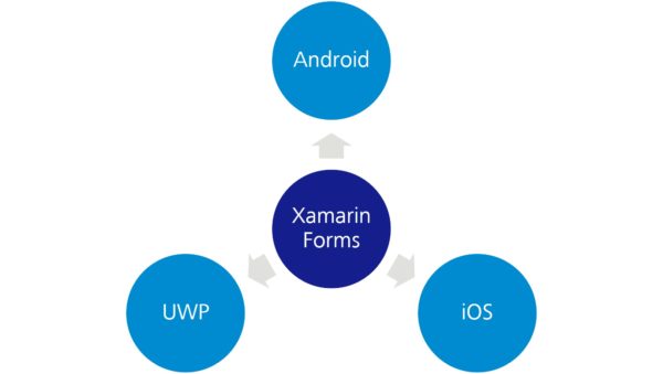
To understand MAUI as a platform, you need to know Xamarin. Xamarine (and in particular Xamarine.Forms is a platform for developing native apps for iOS, Android, and UWP with C#, XAML, and .NET. You can create an app from a code base for all supported operating systems. Thus, the development effort for different operating systems is significantly lower compared to the native coding of the applications. Currently, the various SPA frameworks for the browser are actually the only technology that offers comparable portability at a similar overall effort.
Figure 1: Xamarin.Forms allows you to create native apps for all supported operating systems from a single code base. MAUI is the direct successor of Xamarin.Forms.
But what is this mysterious MAUI and what does it have to do with Xamarin? The answer to this question is quite simple: MAUI is the new Xamarin or, more precisely, its direct successor, which is shipped with .NET 6 for the first time.
Just like Xamarin.Forms, MAUI can create apps for all supported operating systems from a single project and with the same code base. Installation packages are generated from the code, which can then be installed on the different platforms. Officially, Microsoft supports Android from version 10, iOS, macOS and of course Windows, both natively and as UWP app. In addition, there will be a community implementation for Linux operating systems and an implementation for their Tizen platform provided by Samsung. The project and build system will be standardized for all platforms and the creation of the apps will be possible via both Visual Studio and the .NET CLI
Another feature will be the sharing of resources such as images or translations. These should be automatically converted by MAUI into the corresponding native formats and integrated into the created packages. You will also be able to access the APIs of the respective operating system at any time. For this purpose, there should be a special folder in the project, under which the native code hooks are stored and which are then automatically integrated into the package when compiling.
All functionalities available in the .NET standard, such as Dependency Injection, should also be able to be used for a MAUI app. By using C# and XAML it will also be possible to use corresponding design patterns such as the widely used MVVM pattern. Also new is the support for the Model View Update Pattern, a pattern borrowed from Elm, which is intended to be able to display a unidirectional data flow analogous to Redux. Also, Microsoft’s web-based client technology Blazor is to be supported.
Unfortunately, MAUI will not be officially available until the launch of .NET 6 in November 2021. In addition, parts of the framework have been moved to .NET 7 and thus to 2022. The official support for Blazor and the MVU pattern should be mentioned here. Since MAUI is the official successor of Xamarin, it will be supported with the release of .NET 6 for another year and then discontinued.
Microsoft’s strategy for the future of UI development with the .Net Framework seems clear: MAUI is the new “First Class Citizen” when it comes to creating native user interfaces.
At first it all sounds like Microsoft wants to integrate native cross-platform support into the .NET framework. However, this plan will only work if MAUI is accepted by the developers. Due to the very late release and a lot of excellent open-source alternatives such as Uno might not be able to establish MAUI in the end. At the moment, therefore, one can only wait and see what the future holds.
However, MAUI would actually have the potential to become the only UI technology in the .NET framework and eventually even replace WPF. It offers a variety of functionalities to increase productivity in development – “Write once, run everywhere” is the motto of the hour. This could significantly reduce costs and development time for apps on all supported platforms. Just imagine the joy of the customer if you could create not only a Windows application, but also the corresponding mobile apps for only a small amount of development effort. Of course, this is an idealized idea, the devil is in the detail as you know. Migration of existing WPF applications is difficult, for example, because the long-awaited XAML standard, which was supposed to define a standardization of elements and tags for all XAML dialects, has apparently been dropped and MAUI and WPF will not be able to be exchanged seamlessly due to different elements.
But if the technology actually delivers on its promises, developers deploy it widely, and MAUI becomes as high-class as Microsoft promises, a cross-platform revolution under .NET could be in the offing.
The focus of this blog article is the integration of User Cantered Design (UCD) into our software development process at Saxonia Systems AG (since 03/2020 ZEISS Digital Innovation). A highlight is put on the tools and methods used to tailor the software to the actual user’s needs.
The root of bad usability
Why doesn’t anyone use the new software? If this question arises, it is usually too late. The development is already completed, and the users stay away or continue to use the previous solution. If this happens it maybe has happened again, that the requirements collected do not align with the actual user’s requirements. This is a common real-world phenomenon, which shows itself in bad usability and low acceptance of the finished solution. One of the possible approaches is offered by User Centred Design (UCD). This puts the tasks, properties and goals of the future groups of users in the centre of the software development process to achieve a high usability of the final product.
User Centered Design at Saxonia Systems AG
Due to our agile software development process, reaction to changes and new requirements is fast. Early feedback from the future users is essential for high levels of usability. Our Scrum inspired agile process is extended with tools and methods of usability engineering so that the user is involved regularly from the beginning.
Figure 1 UCD deliverables of our agile process
At the start of the project the UCD elements are incorporated into the product vision. Beside classic parts like project goal or system scope, the description of prospective user groups and the usage context are sensible UCD additions.
The product backlog does not only contain user stories and technical spikes, but also contains room for design spikes, that enable the team to focus on usability issues. This can include prototypes as a basis for decisions or the planning and the carrying out of user studies.
Additional quality gates are added to the scrum artifacts Definition of Ready and Definition of Done, in order to guarantee, that the software fulfils future user requirements.
Before user stories are ready for implementation, they are supplemented with sketches, mock-ups or designs. These visualise the functions, that are to be implemented, to the team. If they can be applied, process models are also included to show more complex sequence of events.
User stories are considered done in the UCD perspective if the usability principles are met. This can be checked via an expert evaluation. Hereby the usability engineer checks the functions heuristically for the adherence to the rules. Additionally, the consistency of the application and the style-guide conformity are checked.
It is advisable to have a central storage for usability background knowledge, e.g. a team wiki.
That way a team can always get information on user feedback and current status regarding UCD. Recommended content is:
Information architecture
Domain model
System documentation
Studies and test results e.g. user studies and CUI tracking
As you can see in the preceding sections, we incorporate the prospective user into the development of custom software development. In our experience this is essential for a high usability and acceptance of the final product. By getting early feedback by the user and using agile and lightweight methods you can eliminate the starting question “Why doesn’t anyone use the software?”, from your vocabulary.
Personas in a nutshell – What are personas, and why do we need them?
In the field of agile, distributed software development, and in a B2B context in particular, the client often is the only contact for the software developer. This is usually due to the end users not being available because they are either located elsewhere, separate from the development team, or do not have time. When a user is not close at hand, personas can help and compensate for the lack of contact.
Personas are prototypical users representing a user group and their essential characteristics and needs in regard to the planned product. They consolidate the results of the context analysis, but they cannot replace the user research. They are designed as posters, as “life-like” and realistic as possible because otherwise, the persona is useless. In general, personas are developed in early project stages (analysis and planning), and they are used for performance/target comparison throughout the entire development cycle. This enables the design and development team to focus on the users’ requirements. Personas serve as a reference for decisions in discussions, and by asking questions like “Would person x understand this?”, they give priority to the user. Personas help the product owner in particular to evaluate ideas for new features.
More often than not, it takes more than one persona to cover the prospective users of the software. If there are too many, possibly even contradictory, personas, it is advisable to classify them into primary and secondary personas. This helps to keep the focus on the target user group and prioritize the decision alternatives.
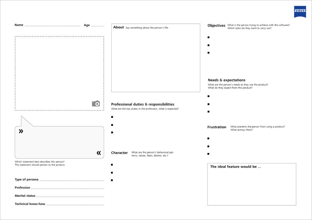
Which elements are needed to create a good persona?
Name: A realistic name that identifies the persona
Age: Allows for conclusions regarding the persona’s attitude
Image: An image, either a photograph or a drawing, to make the persona more realistic
Personal information: Age, gender, professional education, knowledge and skills, marital status, children, …
Type of persona: Associated user group / archetype (e.g. teenager, housewife, pensioner)
Profession: Function, responsibilities and duties
Technical know-how: General computer skills; technical affinity; knowledge of related products, previous systems or competitors’ products
Character: Individual preferences and values of the persona, e.g. are they open to new ideas?
Behavioral patterns and approaches: Values, fears, desires and preferences
Objectives: Key tasks to be handled with the new application
Needs & expectations: Requirements regarding the handling of the product
Frustration: Typical nuisances with products in general, i.e. issues that have to be avoided at all costs
Persona Template
The Usability Team at Saxonia Systems AG (since 03/2020: ZEISS Digital Innovation) has developed a template for creating a persona based on the best practices and their own experience. The template is available as a PDF free of charge: DOWNLOAD
Template for creating a persona
The Persona Template allows you to customize your software even more precisely to the requirements of its prospective users, and never to lose sight of the most important aspect—because we all know: “The user is always right.”
Like virtually all artifacts in software development, the style guide is also subject to continuous change. Nevertheless, traditional versions are frequently used today, even though technological progress has long since opened up new ways to bring traditional documents to life. This blog post addresses this issue, using the example of the style guide to show how its continuous development can improve the collaboration of designer and developer: Are living style guides the future of UI design?
Once upon a time… there was the document-based style guide
For a long time, the collaboration of the UX designer and the front-end developer was governed by an artifact: the document-based style guide. This style guide is typically created as follows:
First, a requirements analysis is done.
The designer then creates mockups based on the requirements.
The mockups are discussed with the client (x iterations) and finally approved.
Then, the designer creates the agreed graphics with the design tool.
The “style guide” document is compiled from the graphics and corresponding descriptions.
In case of amendments, all these steps have to be repeated.
Figure 1: The document-based style guide
As a basis for communications, a good style guide should include the following points:
Concept (application from the project’s perspective, product vision, UX objectives)
Structure (structure of the application)
Interaction design (design of the dialog between the user and the system)
Color scheme (rules of use for colors)
Typography (fonts and font sizes)
Icons and graphics (overview of all icons and graphics of the application)
Standard interaction elements (repeatedly used user interface elements)
Special views (non-standard UI views and control elements)
Language (communication style and wording)
Multimedia (use of images, audio and video)
However, listing the standard interaction elements in particular in a rigid, document-based style guide is not ideal. Considering the number of different UI states such as hover, active, selected, etc. for each element, this list can easily grow to several pages. Few developers like to dig through pages and pages of documents; therefore, the risk of non-compliance with the style guide increases.
Furthermore, the traditional version of the style guide poses two problems: The rigid reference to a document which is often very long requires great imagination, and there is no possibility of interaction with the various elements.
Status quo & future of UI design… coming to life
There are several approaches for addressing the points of criticism described above. For example, the content of the style guide can be brought to life by means of a UI prototype kept and updated in parallel. This makes it possible to test the various states of the standard interaction elements in the context of the application, or also to represent special views in detail. With this “hands-on” mentality, the design requirements become clear more quickly, and the tedious rifling through style guide documents becomes unnecessary.
However, this solution does not eliminate the following issues: In everyday project work, the designer often creates templates that are too unusual and cannot be implemented with the applicable UI framework without significant additional effort. The limited range of functions of the prototyping tool is another problem. It is not always possible to simulate the final behavior down to the last detail, which can lead to false assumptions.
Therefore, the current trend is towards implementing the entire style guide as a separate “live” web application. This means that the elements are implemented in the actual application before use, and the developers only need to copy the source code.
Figure 2: Example from the IBM Style Guide (www.ibm.com)
The benefits of this implementation are obvious: In addition to a clear structure of the necessary information and elements, maintainability in particular improves significantly. If a color has to be changed, this usually only means a change of the color code in the style sheet in the “living style guide”; whereas in the traditional, document-based style guide, countless paragraphs and designs have to be updated. Furthermore, the QA department can test the required behavior before the actual development starts. It is even possible for changes in the style guide to be adopted into the application immediately if both applications reference the same style sheet. This way, redundancies and inconsistencies can be excluded from the start. The level of integration of the style guide into the development process certainly depends on the project at hand, but the possibilities of optimization are limitless in this respect.
The “living style guide” has become all the rage, and it is used by numerous top IT companies such as Google or IBM. It continuously reduces the gap between design and development, and in the end, the one who profits the most is the user :-)!
Some time ago I presented the design principles we use at Saxonia Systems (since 03/2020 ZEISS Digital Innovation) to design and develop user-friendly Software in a blog article. As part of the development of our Custom Usability Index, which can be used to measure the degree of usability of a software project, we as Usability Team took a closer look at those principles and extended them to 13 top categories, which contain multiple usability aspects each. In this article those categories and aspects are explained in more detail and illustrated with examples.
Effectivity: Reach the goal. (Principle 1)
The first and therefore most important rule is the observance of effectivity. An application should enable the user to work effectively by providing a suitable functionality for the completion of his task. The user is not overloaded with information and functions that are not necessary for his use case. Accordingly, dialogs should only contain relevant or frequently used information. Every additional information distracts the user from the important content and brings the risk of reducing relative visibility.
It is therefore necessary to answer the central question: What is the task to be supported? An in-depth analysis of workflows and their comprehension is the key to understand the tasks and goals of the users to be able to evaluate the efficiency of the implementation.
Figure 1: How much information is necessary to display the time?
Efficiency: Reach the goal quickly. (Principle 2)
Particular attention also needs to be paid to the optimisation of efficiency. The user should be able to accomplish a task in minimal time. At the same time, the application requires only minimal time to react and execute an action. So, this principal refers to the speed of operation of both users and the system. Indications of users not being able to work efficiently are for example unsuitably used interface widgets, missing default values, misleading search results and high-resolution pictures requiring a fast internet connection.
Signs of low system efficiency, on the other hand, are delayed reactions to input in the form of a “shaking” cursor, slow interface widgets and missing feedback.
Controllability: The user has the power! (Principle 3)
The user has, regarding his authority within the system, control over all actions. He may cancel, pause, and resume actions at a later point in time. It is possible for him to revert an action and, as the case may be, start a new attempt if the result was not satisfactory. To control the application, the user still has the option of using alternative input devices to the mouse, such as keyboard, screen reader and Braille display, according to his personal requirements.
Not satisfying these points will lead to increased frustration for the user.
Customisability: Everything suits the user. (Principle 4)
The application should be flexible enough to support different approaches for the completion of a task. Additionally, the user can customize the system according to his previous experiences, culture and needs e.g. by changing font size, changing the default settings, and setting his own shortcuts. A good example for the consideration of customisability is the online platform http://www.elster.de/, which is used for web based registration and submission of tax returns. After logging in, the user is asked to which user group he belongs to, to better adapt to his needs afterwards.
The control of the application should comply with the expectations of the user in every aspect and needs to follow general conventions (platform, style guides, etc.). One part of it is the consistent usage of terms, icons, and layouts within the application and in product families. Process structures also follow a uniform principle. By maintaining consistency, the user can reuse a behaviour pattern once learned. When using an application for example, every user knows (or expects) to find the button to close a dialog window in the upper right corner. When switching to the operating system Mac OS X he has to completely readjust.
Evidence that an application does not behave as expected and consistently includes surprised to confused users and e.g. the use of different terms for one and the same function.
Design and layout: Comprehensible at first sight. (Principle 6)
This principle comprises every aspect of visual design of an application. According to that, the kind of aggregation, layout of the GUI elements and purposely used colours should support the user with recognising links. Information and components are generally presented to the user in such a way, that they can be noticed and that texts can be read easily. Indications of not satisfying this principle are e.g. no obvious correlation between labels and data fields, tiny fonts and low-contrast colours used for front- and background.
Language: Speak the user’s language. (Principle 7)
The application should basically be in line with the user’s language and way of thinking. Text elements should therefore be verbalized clearly and a for the audience understandable vocabulary should be used. Nevertheless, a lot of things are worded technical instead of using the user’s words. The “best” example for it are error reports with a high degree of detail, therefore valuable for the system developer, but not helpful for the user at all. To avoid this, an in-depth analysis of the user’s technical vocabulary is necessary.
Visibility: The user recognizes his possibilities. (Principle 8)
To guaranty the user’s ability to complete his task instead of becoming lost, he needs to know at any time, in which part of the application he is, which actions can be executed and how they are triggered. He also needs to know his system’s status at any time. That is why the main menu should display the user’s current position and e.g. comprehensibly show how to get there using a breadcrumb navigation. Relevant objects, functions and options should be visible to the user’s eye and enable him to find the desired klicks directly. He needs to be able to estimate the effects an action is going to have.
Feedback: The user is told what is going on. (Principle 9)
The system should react to the user’s input at any time and inform him about events actively. In case of an occurring error, a corresponding notification illustrates its reason and suggests a solution to the user if possible. Shortcomings of an application regarding feedback can for example be a missing spinner icon during complex operations. User inputs seem to be ignored by the system and the user experiences the application as “frozen”.
The system should support the user getting to know the interface and should encourage him to try previously undiscovered features without having negative effects on the user. Especially during first usage the user should be supported when performing complicated actions and limit possible missteps this way. At this point, short tutorials and explaining texts are helpful. A possibility for experimental learning would be a test mode, meaning a separated test section within the application, where all the functionalities can be tested without consequences. Using a test mode, the user is training using the system und learns dealing with it without having to completely execute the processes.
Help and documentation: Help, that helps. (Principle 11)
Help systems should be easily findable or embedded into the interaction. Embedded help is for example implemented by using tool tips, place holder, short help texts and assistants. Are those not sufficient, contextual help like a help panel, getting-started pages and a search function should be the choice. Note that a help system is only supporting the user when relating to the user’s task and listing specific steps to solve the problem.
Error tolerance: Forgive and avoid user errors. (Principle 12)
The system should be designed to save the user from mistakes from the beginning, for example by disabling invalid functions and describing the reason for the restriction. In case of happening anyway, the system should detect invalid inputs or actions. If they are unmistakable, the system can correct the mistakes on its own if possible. Are there multiple possibilities, alternative suggestions are shown. Under no circumstances errors may lead to data loss or even a system crash.
User experience (UX): The software feels good. (Principle 13)
One aspect not yet considered is the user experience (short UX). It results out of the complete experience of the user with the application and is made up of the actual usage, the user’s expectations, and the previous experiences with other systems. The application mediates a feeling of security and reliability, is fun to use and serves the purpose. The system excites the user by not only satisfying specific expectations, but also overshoot them. Principle 13 is mostly fulfilled by sticking to the principles listed above. A slow, inconsistent application with a lot of error messages and crashed will not contribute to the user’s satisfaction. That is why the software should be up to date with the current technology and should support the current control paradigms.
Conclusion
13 important principles for reaching user-friendly, satisfying software were presented in this blog article. Take note, that there is no such thing as the one and only user-friendly solution. How comfortable it is to use an application always depends on the specific use-case and the user group. This is why it is recommended to analyse the users‘ needs and involve them through user tests.
That there is something going on not only in Saxony, but especially around our headquarter in Munich was shown at the end of last year by the “International JavaScript Conference“ and the “W-JAX“. Both conferences took place shortly after each other and attracted numerous visitors to the Bavarian capital.
Just like the S&S Media Group as event organizer of the iJS (international JavaScript Conference) noticed, JavaScript is everywhere by this time: hardly any digital business can do without JavaScript and high level frameworks like Angular, React or NodeJS these days. It is hardly surprising that there was a whole conference with numerous keynotes, sessions and power workshops dedicated to this topic on iJS during 23. – 27.10.2017 in the Holiday Inn Munich City Centre. The W-JAX, too, partly deals with these topics but offers many additional impulses in the areas of enterprise technology, software architecture, agility and Java.
Figure 1: iJS and W-JAX conferences
We took the opportunity on both of the conferences to exchange intensively with the community. That is why we brought some questions to put them to the participants of the conferences. We were able to conduct close to 100 surveys total, that split to share equally among the two events. We would like to take this opportunity to once again thank all those who took the time to participate in our survey. Only through an intensive exchange with partners, customers and community can we succeed in constantly improving. This approach of continuous improvement, which is also anchored in the agile manifesto, is not only taken within our projects, but is also lived across the company.
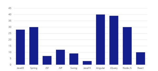
While our experts Manuel Mauky and Alexander Casall spoke about topics like “Angular applications with Redux“ and “Offline-capable desktop application with Angular and Electron“, we first of all wanted to know the frameworks and languages that were used by our interview partners in their main projects at that time. Angular and JQuery were used most often, followed closely by JavaEE and Spring. React for example was still used quite rarely. Additionally, 72 of 88 interviewees used JavaScript, 69 HTML and 51 used Java as programming language. Ruby, Groovy and CoffeeScript on the other hand were used quite little and got a maximum of 5 votes each.
Figure 2: Which frameworks do you use in your main project?
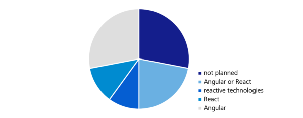
Of course, we were not only interested in the technologies currently used, but even more important is the direction in which the trends of software development are moving. More and more users of business computer programmes expect modern web applications instead of existing desktop software. The usability of those often does not meet the expectations of the users in times of modern B2C-applications and so more and more web-based solutions, that are actively supporting the user with their work, are established. It is therefore not surprising that 70% of the respondents were planning to work with Angular, React or another interactive technology (e.g. ReactiveX, RxJS). Vue.JS (14 votes) and JavaFX (3 votes) on the other hand only play a tangential role.
Figure 3: Do you plan to work with one of the following technologies in the nearest future?
Half of the polled participants could position themselves quite precisely and settled either for Angular, React, or at least a reactive technology. But about 20% were still indifferent and not able to decide between Angular and a reactive technology. The decision matrix that we evaluated could be of assistance here, which provides a personal technology recommendation with the help of a list of questions. It is based on the experiences of our web experts.
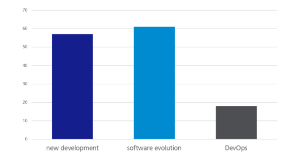
Furthermore, the content of a project is important when choosing a suitable programming language or a framework, of course. This is why we asked the survey participants what they were doing in their main project. The majority was dealing with software evolution projects (61 votes), closely followed by new developments (56 votes). About one fifth was dealing with DevOps in everyday working live. Depending on whether maintaining an existing software or having a green-field project on the table, the tolerances when choosing programming languages and tools can be very different.
Figure 4: What are you doing in your main project?
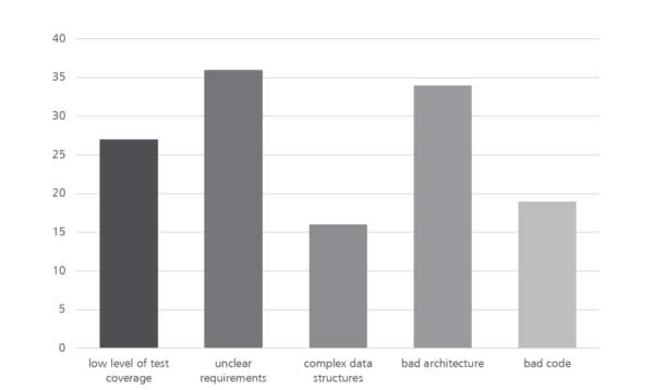
Now that we had found out a little more about what the respondents were doing, most of whom were software developers of different nationalities and from a wide range of industries and company sizes, we wanted to know what was holding them back most in the current project. At this point, we gave quite open answer possibilities like “bad code” or “bad architecture” on purpose to leave the interviewees some room for interpretation and challenge them to address problems and where possible initiate a first dialogue to solve the problems.
The most frequently mentioned problems are shown in the following graphic. Additional to the answers shown here, where “unclear requirements” is still one of the major problems, there were a few free answers. “Legacy code”, “waiting for the client / customer” or “rapidly growing and confusing software architecture” were mentioned quite often.
Figure 5: What frustrates you most in your main project?
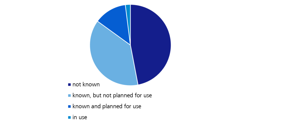
Finally we turned to some questions of the area of “modern web development” to verify, which trends are actually confirmed by the community and which ones are “hyped” in the web but are not yet arrived in everyday developer life. One of these trends in information technology is for example GraphQL. We first asked the basic question on how the conference visitor’s position on this technology is. Only one forth of the respondents were planning to use this REST alternative for the future or were already using GraphQL, while almost half of them have never heard of this technology before.
Figure 6: What do you think about “GraphQL”?
Additionally we wanted to know, whether the interviewees were utilising cloud technologies in their projects. Here, the ratio of the responses was nearly balanced. 45% affirmed the statement, while the other 55% are not, or at least not in their main project, working with cloud technology. The second question of this thematic block was about the technology currently used by the surveyed for state management. The options were React/Angular (without extra framework for the state management), Redux or MobX. While the latter only got one vote, the majority (around 50%) did not use an extra framework and approximately 25% work with Redux, while about again 20% did not give an answer, which unfortunately distorts the survey results somewhat.
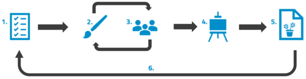
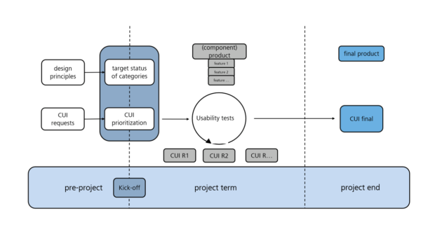
In an earlier blog post, I introduced the Custom Usability Index. The index allows you to monitor the usability in software development projects. In this blog post, I would like to further elaborate on this, and to explain the steps necessary to use the CUI.
The above diagram illustrates how the CUI is used in the course of the project, and constitutes the basis for the following observations.
Target state of the categories – Make a wish!
At the start of the project at the latest, the required target states should be defined for each of the CUI categories, i.e. the responsible stakeholders have to specify what they deem to be the optimal state. This state can be different for each project, as shown by the following example. Let us take the category of customizability. It means that the system is sufficiently flexible so as to facilitate different approaches to the way a task is executed. The user must be able to adapt the system according to their previous experience, culture, and requirements. The optimal state could then be described as follows:
Project 1: The optimal state in the category of customizability would be for the user to be able to configure different experience levels from the first time they start the application, with the system then automatically adapting.
Project 2: The optimal state in the category of customizability would be for the user to be able to activate an expert mode which in turn activates additional settings in the system.
Because of the different optimal states in the above example, reaching the highest possible rating is easier in project 2 than in project 1. When describing the target states, it is advisable to involve the actual users, such as the company’s department for which the new application is to be developed. This ensures that the usability requirements are not pulled out of a hat, and that the actual application is perfectly tailored for the end user’s needs. A general rule of thumb in this context: The more specific the description of the desired state, the better the evaluation results will be!
CUI prioritization – Everything is important, is it not?!
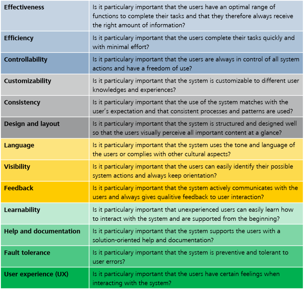
When the target state has been defined for each of the CUI categories, the following problem often arises in practice: the resulting catalog of wishes is extensive, and the client in charge is worried about high costs, or they may pursue different economic goals in developing the system. To take this aspect into account, the CUI categories must subsequently be prioritized. The following questions help with the prioritization:
The questions listed in the table above constitute a guideline for the usability expert in the interview with the client’s representative. The client’s responses need to be translated into numbers. The Fibonacci sequence (1, 2, 3, 5, 8, 13, …, as required) is used for the CUI priority. The higher the number, the more important the category is for the project.
If the client has trouble making a concrete statement as to the significance of the categories, the Magic Estimation method, which comes from the agile approach, can be useful. Here, the individual categories are briefly introduced and then arranged by significance. The comparison often makes prioritizing easier.
<Preparation> CUI </preparation> –Can I finally get started?
Yes! Now that the prerequisites in terms of content (target states of the categories) and business (CUI prioritization) have been fulfilled, the first usability tests can be carried out. All the stakeholders involved have automatically been made aware of the issue of usability, and (hopefully) they are enthusiastic.
The problem: Making usability comprehensible and transparent
How is the usability of my software? At the latest, this question will arise by the time the actual users first see the application. Often, this is when you notice that the planned software is not really optimally tailored for the end users. However, it is usually too late to make major changes at this point. Subsequent problems such as poor acceptance or even the failure of the software project have been confirmed by numerous studies. Approaches like “user-centered design” that put the user at the center of attention of the development process show just how beneficial such involvement and the consideration of usability at an early stage can be. The core problem that persists, however, is the difficulty of making usability comprehensible. This blog post presents a possible solution.
The idea: The Custom Usability Index
The Custom Usability Index (CUI) is an index that measures the degree of achievement of the usability of computer software at the current project stage.
The basis: 13 design principles
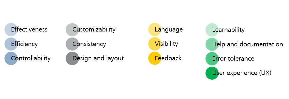
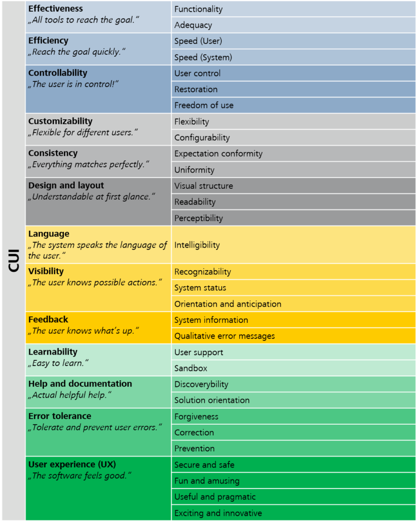
The index represents the aggregated rating of 31 criteria allocated to 13 categories. The categories are based on design principles developed in-house that are in turn based on ISO standards and the state-of-the-art literature on usability.
At the start of each project, stakeholders can weight the categories listed above according to their individual requirements, and thereby specify priorities.
The evaluation: Where the magic happens
As each project is unique, it is important to specify at the start of a project when a criterion has reached the best possible usability. To gain a uniform understanding of the required target state that the application is to achieve with respect to the respective criteria, it is advisable to involve the entire team, including the stakeholders involved, in the definition. The fact that both sides are made aware of the issue of usability is a positive side effect.
The actual evaluation of the criteria is done by means of specific usability test methods. The tests have to be done on the sub-product on a regular basis throughout the course of the project. A criterion is given the highest rating in the assessment only if the previously defined target state has been achieved 100%. The final CUI value then reflects the weighted average rating of the 13 categories.
The result: Usability brings happiness
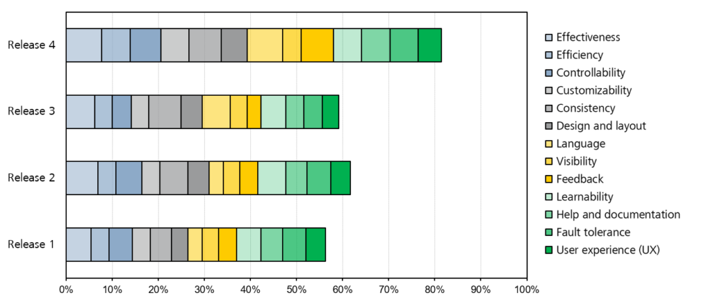
Measuring the CUI at regular intervals makes usability transparent both for the team and all the stakeholders. The current status of the software in each of the categories is apparent at all times, as are any issues that may still require improvement.
The example above shows continuous improvement in usability up until release 2. Release 3, however, brought a deterioration. By identifying the categories affected, it was possible to remedy the issue immediately during development. The result becomes apparent in the significant increase in usability in release 4.
The CUI presented in this blog post provides a possibility to measure the usability of software throughout the development process, and to make it transparent for all the parties involved in the project. The high level of transparency and the stakeholders’ awareness of usability in general constitute a distinctive quality feature of the software.