Improving Healthcare Through User Experience Design in Medical Software Development 

In any given healthcare setting, such as doctor’s offices or hospitals, one encounters a wide array of medical systems and software solutions, each with its own workflows, functions, and user interfaces (UIs). In this landscape of healthcare technology, where medical software is becoming increasingly sophisticated, the incorporation of User Experience (UX) Design is crucial to provide real value to both patients and healthcare professionals. 

The user-centric approach according to ISO 9241 creates solutions that are not only technically proficient but also support users in the unpredictable nature of real-world medical practice. It ensures both pragmatic qualities like safety and usability for efficient and effective goal achievement, as well as hedonic aspects like user satisfaction. Particularly in the field of medical technology, the safety aspect is of paramount importance and is precisely defined in regulatory standards such as IEC 62366-1 and the EU’s Medical Device Regulations (MDR). 

This article delves into the multifaceted discipline of UX design in the medical field. We explore the significance of UX design in the development of medical software and how the process-oriented approach of user-centered design can be successfully implemented. We demonstrate how its application can sustainably enhance treatment outcomes and standards of care. 

Importance of UX design in the medical software development 

The role of UX design in developing medical software is crucial for creating thoughtful and user-friendly solutions. These solutions offer numerous advantages, from streamlined workflows for healthcare professionals and enhanced patient safety and comfort to cost savings and increased sales. UX design goes far beyond the mere pixel-perfect design of graphical UIs and focuses on the development of systems specifically tailored to the unique demands and contexts within the healthcare industry. It enables companies to position themselves in a competitive market and differentiate themselves from competitors. 

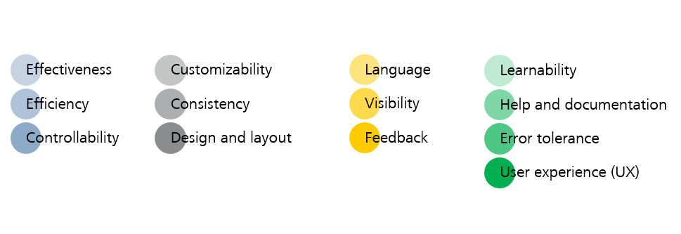
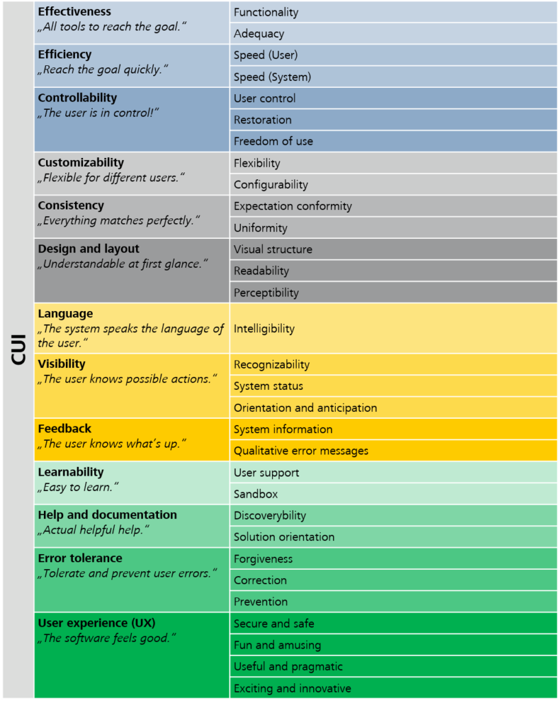
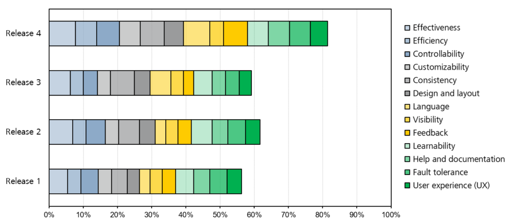
Here are five key reasons why UX design is particularly important in the development of medical software solutions: 

  1. Increase in efficiency 
    A good interaction design promotes a natural dialog between software and user. Interaction elements are designed to be quickly accessible and comprehensible, enabling efficient operation, which means that medical professionals can use more time for value-adding tasks. In other words: when users aren’t wrestling with complex UIs or incomprehensible processes, they can better focus on direct patient care, thus enhancing the quality of care delivery. 
  1. Prevention and reduction of errors 
    In the medical field, errors can have serious, sometimes fatal, consequences. Medical software manufacturers are legally obliged to eliminate or at least minimize risks to ensure their systems can be used safely. By understanding the users’ needs and mental models, UX designers can integrate features into the software that enhance error tolerance, minimizing the likelihood of mistakes during operation. Concepts that intuitively guide users, offering error-proofing features and fail-safe mechanisms are crucial in this domain where there is no margin for error. The IEC 62366-1 standard outlines a detailed usability engineering process to ensure that risks associated with the use of medical software are minimized. 
  1. Reduction of cognitive load 
    Reducing cognitive load allows users to work more naturally, making important information easily accessible and presenting it in a way that aligns with clinical workflows. In the fast-paced, high-stress medical environment, a user-centered approach serves as a crucial strategy to mitigate the risk of cognitive overload. This not only contributes to the overall safety during interaction but also fosters user trust and confidence in the systems. 
Reduced cognitive load helps to avoid errors in the hectic and distracting medical environment.
  1. Reduction of training effort 
    User-centered medical software reduces the training effort required for users to become proficient with the system. Intuitive design aligns with the users’ expectations and prior experiences, accelerating the learning process and integration into practice. This aspect is especially crucial in healthcare, where time is a particularly scarce and valuable resource. 
  1. Improvement of consistency 
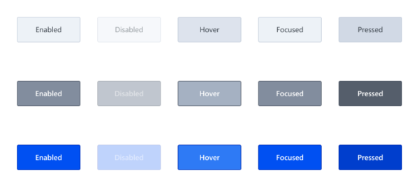
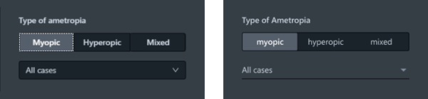
    Effective UX design considers not only individual systems and workflows but the entire existing clinical infrastructure. The goal is to gather and present information in a consistent manner across all systems and workflows. A design system like “Beyond” by ZEISS, combined with tools such as the ZUi Web Component Library that provides ready-to-use software components, ensures consistent interaction patterns and a cohesive appearance. This approach reduces the effort required for design, implementation, and maintenance for medical system manufacturers, and leads to lower training costs and enhanced efficiency for users. 

Integration of UX design in the medical software development 

In the development of medical software, the discipline of UX design is inextricably linked with the process-oriented approach of user-centered design (UCD). This approach aims to create seamless interactions between users and medical software by involving end users in the development process. The needs and limitations of humans, as well as the context of use, are at the core of the design process. This is particularly challenging in the complex medical field, where the spectrum of users ranges from caregivers and doctors to service staff and patients. Ultimately, medical software should adapt to the user, not the other way around – the user adapting to the software.  

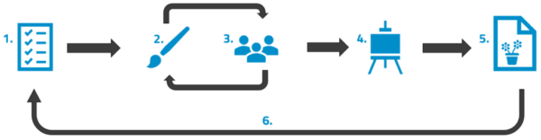
The iterative nature of UCD, aligned with an agile software development approach, underscores the need for multiple cycles to refine software solutions. In alignment with ISO 9241-210, the UCD process comprises four key phases: 

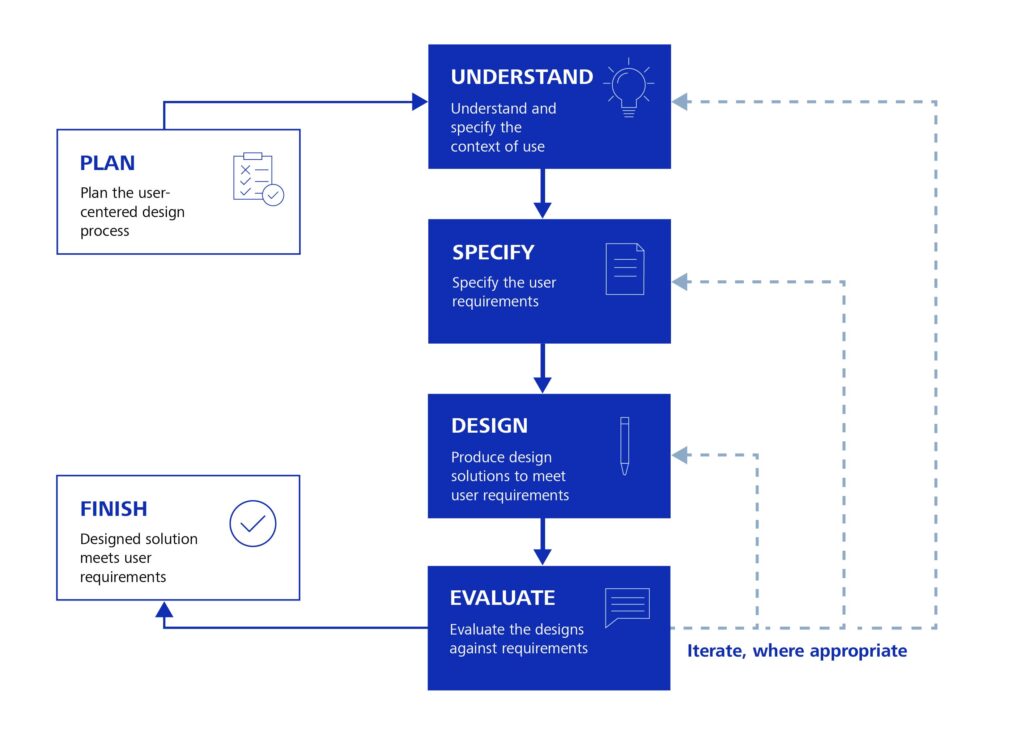
The user-centered design (UCD) process adapted according to ISO 9241-210. 

  • Understand and specify context of use 
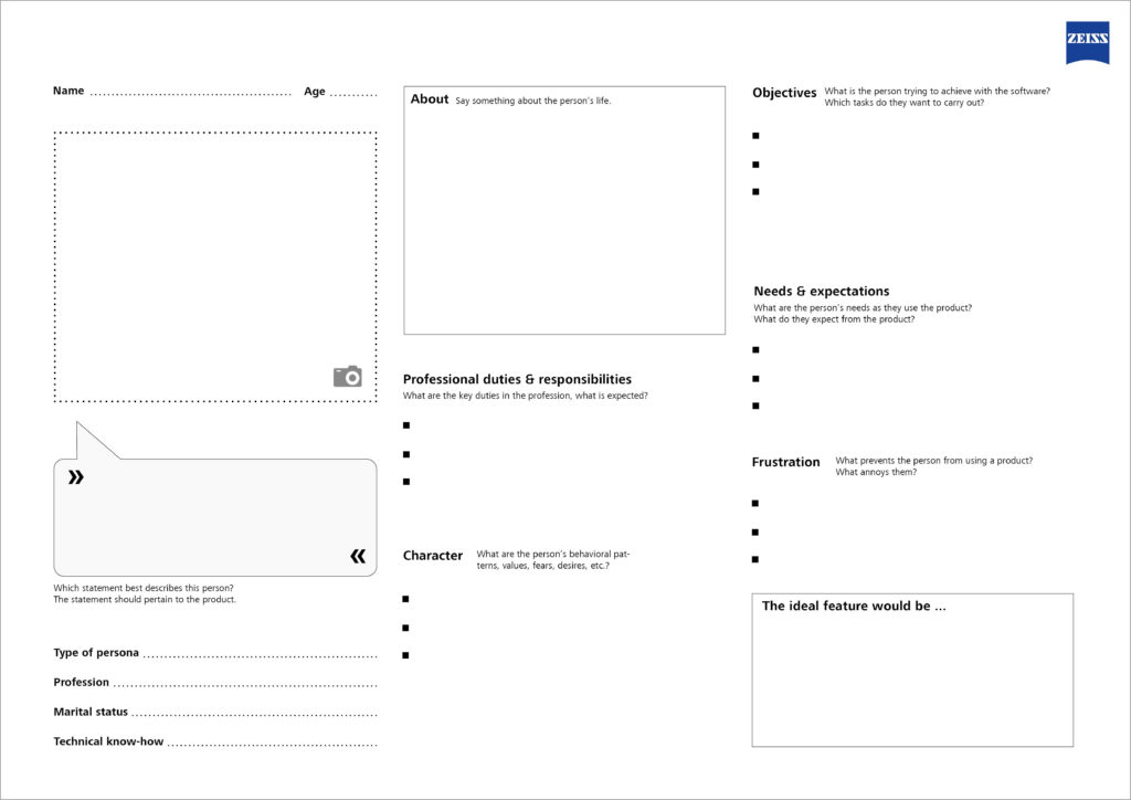
    In this phase, future users and their tasks, activities, and goals are analyzed. The objective is to ensure that the final medical software meets the users’ expectations and needs and supports them in achieving their objectives. Additionally, a context analysis should be conducted to understand the specific work environment and conditions in healthcare settings. Results may include user personas (user profiles), task descriptions, or scenarios. Information is gathered through direct engagement with prospective users such as patients, doctors, and other healthcare providers. Typically, methods such as surveys, interviews, and observations are employed. 
  • Specify the user requirements 
    During this stage of the process, concrete requirements and design recommendations are derived from insights gathered in the previous phase. Both functional and non-functional requirements are captured, tailored to the specific needs of medical institutions. The goal is to bridge the gap between abstract findings from the data collection and the practical implementation, ensuring that user needs and expectations are effectively translated into specific and actionable requirements for the medical software solution. 
  • Produce design solutions to meet user requirements 
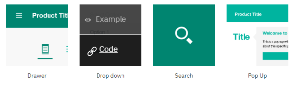
    In this step of the process, the identified requirements are translated into concrete interaction and UI concepts that will ultimately be implemented in the software. This includes creating user flows, wireframes, prototypes, and detailed UI designs, as well as collaborating with the development team. Working with prototypes, ranging from simple low-fidelity representations to sophisticated high-fidelity versions, allows UX designers to iterate efficiently through various solution approaches and design variations. 
  • Evaluate designs against requirements 
    In this phase, the functionality and performance of created wireframes, prototypes, or software solutions is assessed to ensure they meet the defined usage requirements. Continuous feedback enables comprehensive evaluation and ensures that user needs and expectations are met. Formative evaluation involves assessments by experts using various qualitative and quantitative methods, such as heuristic evaluations, cognitive walkthroughs, and usability testing in real medical environments. Summative acceptance tests conclude the evaluation process. 

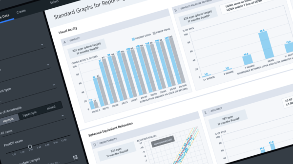
Wireframes and prototypes enable UX designers to continuously evaluate different solution variants and design concepts. 

Closing thoughts 

UX design plays a crucial role in the development of medical software, harmonizing technological advancements with the core values of healthcare. Its focus is on creating software for real people in real situations, aiming not only to meet pragmatic requirements but ultimately to foster positive user experiences. This can significantly enhance treatment outcomes and elevate standards of care. 

The integration of UX design in medical software development is an investment in healthcare quality. As medical software becomes increasingly embedded across all sectors of healthcare in the future, the commitment to UX design will determine the success or failure of medical systems.


Contact us to learn more about our end-to-end cloud solution development and quality assurance services and discover more about ZEISS Digital Innovation Health & Life Science Solutions

You may be also interested in: 

➡️ Further blog articles on Health Solutions

➡️ Our reference on UX design in medical environments “ZUi Design System”

➡️ Our whitepaper “From Hype to Value” on the role of digital health apps and DTx in the hospital of the future

➡️ Our whitepaper on Threat Modeling

This post was written by:

Dominik Tim Schlackl

Dominik Tim Schlackl holds a master’s degree in User Experience Design and works as a Consultant User Experience Design for ZEISS Digital Innovation in the field of medical technology with a focus on ophthalmology. His expertise lies in usability engineering, interaction design, and the application of the user-centered design (UCD) process to design human-machine interfaces that meet both pragmatic and hedonic requirements of specific user groups. His core competencies include wireframing and prototyping processes, user interface design, qualitative user and context analysis, as well as quantitative UX evaluations. 

UI-Dev Session (Part 2) – Experience report from everyday project life

The first post of this blog article series describes a lightweight method to eliminate discrepancy between the default user interface design and the implemented application. Developers as well as specialists for User Interface (UI) / User Experience (UX) work in this area by means of Pair Programming, in order to optimize the usability and appearance of an application in an uncomplicated way. 

In our project we regularly conduct such “UI-Dev Sessions.” In this blog post I want to report on our experiences – away from theory to practice. 

Why are the UI-Dev Sessions important to us?  

Within the scope of the project a standalone software is being developed, which serves ophthalmic specialists as a support tool for collecting patient data and analyzing the results of surgical laser vision corrections. Also in the medical environment, user experience is becoming an important purchasing criterion. In addition to safety, which is probably the most important criterion for medical devices, soft criteria such as “Joy of Use” and appearance are gaining in importance. The UI-Dev Sessions are a way for us to give the finishing touch to our application. 

„The details are not the details. They make the design.” 

Charles Eames, Designer
screenshot of the software, which serves ophthalmic specialists as a support tool for collecting patient data and analyzing the results of surgical laser vision corrections
Figure 1: Screenshot of Software

How do the UI-Dev Sessions work with us?  

Our project team works agilely and uses Scrum as a framework for its approach. Like most of the teams at ZEISS Digital Innovation (ZDI), the team members work in a distributed way, i. e. they are not in the same location and therefore not in the same office. Our project team is spread over four locations in two countries. The roles of Scrum Master, Developer, Tester, Business Analyst and UI/UX Specialist are represented.

Usually, people from the fields of UI/UX and development take part in a UI-Dev Session. The UI/UX specialists focus on two different aspects, which makes them ideally complementary: on the one hand, on the visual design of the UI and on the other hand, on the behavior of the UI components. The participating developers have a high affinity for front-end development. One of these people participates in each UI-Dev Session and has an overview of the items to be completed. A few days before, the UI/UX specialists in the Daily remind us that there will be a UI-Dev Session and that one more person from the development team is needed to assist. Depending on availability, we then decide who can support. The four-eyes principle applies on both sides (design and development), thus avoiding errors and extensive review rounds.

The list of UI errors to be solved is maintained, structured and prioritized by the UI/UX experts in project Wiki and is accessible to all team members. Confluence from Atlassian is used as a tool for this purpose. A selection of the themes is shown in Figure 2.

Example for list of UI errors
Figure 2: Excerpt from the list of UI errors 

Since our list of possible topics is currently quite extensive, regular sessions are necessary. A UI-Dev Session takes place once per sprint – i. e. once every three weeks – for two hours. If other topics are priorities in the sprint, the date can also be postponed at short notice, but ideally within the same sprint. The event will be held remotely with the help of Microsoft Teams, as the participants are distributed over the locations Dresden, Leipzig and Miskolc.

One or two days before the UI-Dev Session, the developers pick out a few points from the list in project Wiki and start preparing them. This includes, for example, marking the appropriate places in the code with to-dos in order to efficiently use the time in the UI-Dev Session for the actual adjustments.

At the beginning of the UI-Dev Session, all participants briefly go through the selected UI errors, which are to be corrected in the session. The topics are then dealt with from top to bottom. A person from the development department transmits the screen, opens the development environment, and the style guide in Figma. The other participants also open the style guide. One of the advantages of Figma is that the attendees can see where the other participants currently are in the style guide. In this way, the relevant positions can be quickly found by everyone. The specialists for UI/UX help the developers to find their way through the style guide faster and to find the relevant information. It is important that the people in the development team are able to look at the relevant places themselves and, for example, color values are not just “predicted”. This also trains the handling of the style guide.

The selected points will be dealt with gradually. If the selected UI errors are fixed faster than expected, new topics are added within the event. If selected topics remain open, they will be dealt with at the beginning of the next appointment.

During the preparation, or during the UI-Dev Session, it turns out that topics are more complex than initially thought, the developers communicate this to the specialists for UI/UX. These then move the theme from project Wiki to a separate backlog item in Jira, for example as an improvement or new-user story.

The results are presented to the testers in a follow-up appointment, which usually takes place one to two days after the UI-Dev Session and lasts a maximum of 30 minutes. This is important to determine if test cases are affected by the changes. Afterwards, the list of topics in project Wiki is updated by the specialists for UI/UX. The completed items are documented in tabular form in order to make it possible to track the changes made.

Excerpt from the list of fixed UI errors
Figure 3: Excerpt from the list of fixed UI errors

There doesn’t have to be a catch everywhere 

In our project, the use of UI-Dev Sessions has proven itself to optimize the appearance of the application quickly and easily. For us, the sessions primarily bring the following advantages: 

  • It fixes UI errors which have been known for a long time, but have been given only a low priority compared to the development of new features.
  • The lightweight method with little documentation effort can be easily integrated into our sprints.
  • We achieve a high level of compliance with the ZEISS style guide for user interfaces

In addition, the sessions strengthen collaboration and knowledge sharing within the team:

  • The collaboration between the development and UI/UX departments enables UI errors to be efficiently corrected, as developers can focus on the implementation and the UI/UX specialists can directly pass on design-specific specifications (e. g. font color, spacing) orally.
  • The experts for UI/UX get to know the implementation problems of the developers, which, for example, result from the technologies used.
  • With the experience gained from the UI-Dev Sessions, the UI/UX specialists will be able to make future design decisions even better based on the development effort.
  • The development team gets to know the Figma design tool, including the style guide, better.
  • The team of UI/UX specialists have the opportunity to explain design decisions and give developers an insight into what is important in the design.
  • The development team is working out a better awareness of subtleties in design and will thus be able to avoid UI defects in the future.

The list of benefits that the method brings to us is therefore long. But what’s the catch? For us there is currently none, and we are convinced of the method. We therefore recommend it to any team that has accumulated a large number of smaller UI errors in the project over time. The procedure is flexible and can be adapted according to the needs of the team. For example, the number of participants can be minimised or the timeframe expanded. 

The outlook 

Our goal is to continuously reduce the list of existing UI errors with the help of the UI-Dev Sessions. In order to keep the number of new UI errors as low as possible, we plan to integrate the UI-Dev Sessions into the Sprint during the implementation of a user story. In this way, new deviations from the design can be avoided from the outset.

UI-Dev-Session (Part 1) – Efficiently Solve UI Errors in the Team

The central objective of each style guide is to ensure a consistent appearance and a consistent user experience (UX) across multiple applications. For this reason, there are detailed specifications for applications of the ZEISS Group as to how a user interface (UI) should look and behave. Any application that is to be published and used commercially must comply with these requirements. 

Figure 1 illustrates the complexity and the manifold states that hide behind even very simple UI elements. The efforts for the correct implementation of such states are usually hidden and are often overlooked during application development or given lower priority compared to the implementation of functions.

Graphic showing the different states of a button in the ZEISS style guide
Figure 1: Different states of a button in the ZEISS style guide

With an advanced project duration, small deviations from the style guide accumulate, which quickly deceive the overall picture. Other classic examples of such UI errors are: 

  • Missing states of UI elements (Hover, Focused, …) 
  • Incorrect use of font sizes, fonts and font colors 
  • Incorrect use of greyscales for surfaces, borders or dividing lines 
  • Incorrect spacing and positioning of UI elements 

Although such deviations can usually be corrected quickly, extensive creation and acceptance processes often result in disproportionate effort for such comparatively small adjustments. If there are also misunderstandings or misinterpretations of the design specifications and several feedback loops are required, this is a negative experience for all involved. 

In order to correct such small UI errors more effectively and efficiently and thus improve the product piece by piece and adapt it to the style guide, we have created and established an uncomplicated form of collaboration.

Pair Programming with Specialists for UI/UX   

Pair programming has been successfully used within the development team of our project for a long time. It promotes collaboration and the quality of the code through the four-eyes principle. Two people from the development team work simultaneously and directly on the program code. Through discussion, criticism and the introduction of new ideas, high-quality code should be generated and development time saved.  

We made use of this principle in the project and expanded the circle of participants to include specialists for UI/UX in order to be able to give developers direct feedback on their adaptations to the user interface. The requirements and requests for changes to the user interface are communicated by the experts for UI/UX directly in the appointment and the changes are checked instead of documenting them in the backlog and waiting for them to be implemented correctly at some point. The people who specialize in UI/UX include those responsible for the user interface specifications, who are significantly involved in the development of the Figma UI design.  

The regular exchange in this circle is called UI Dev session or simply Dev session. The whole thing works very well in a decentralized way in mobile work, because thanks to Microsoft Teams and its screen-sharing function, all participants can see the changes to the code and the user interface at the same time.  

To create a framework for pair programming, we have created the following “rules of the game”: 

  1. People from the field of development as well as from the field of UI/UX participate. The group consists of two to a maximum of four people. Together, we search for the solution for specific UI errors and program live on the code. 
  1. A UI Dev session does not have a predefined scope. On the contrary, the objectives achieved are limited by the time available. 
  1. Depending on the requirements of the project, a UI Dev session should take place at regular intervals and should have a clear time frame. For example, 2-3 hours per sprint, week or month can be reserved for a UI Dev session. This means that the time required to solve UI errors should be proportionate and consistent. 
  1. Possible topics are maintained in a list by the specialists for UI/UX and processed iteratively in several UI Dev sessions. The basis for this is, for example, deviations between implementation and style guide or feedback from usability tests. 
  1. The development team is free to select topics from the list and prepare them in advance if need be. This should help to solve as many issues as possible in a short time. However, where necessary, priority may be given to issues for maximum benefit, in order to solve the most important issues first, especially in tight time frames. 
  1. The activities on unexpectedly complex topics whose live implementation is beyond the time frame of a UI Dev session will be stopped after the participants agree and outsourced to other backlog items (e. g. user stories or spikes) and edited later. 

The edited and solved UI errors should be documented after the UI Dev session and made available to the project team. This allows each project member to see what changes have been made in which UI Dev session. In addition, it is a good idea to present the topics covered in the Sprint Review briefly to the entire project team.  

Example of deviations from implementation (left) and style guide-compliant Figma design (right)
Abbildung 2: Beispiel für Abweichungen von der Implementierung (links)
und für Styleguide-konformes Figma-Design (rechts)

Conclusion

Whether clear deviations from the style guide, optimizations after usability tests or other minor adjustments to the user interface: The procedure described in this article for conducting a joint UI Dev session with developers and UI/UX specialists promotes team collaboration and can solve UI errors quickly and efficiently. The documentation effort should be reduced to a minimum and the time required for implementation should be clearly defined. Through iterative implementation of the UI dev sessions, the list of UI errors is processed piecemeal, whereby the project team raises a mutual awareness of such issues. 

The UI-Dev Session is now a proven tool in our project and an integral part of every sprint. My colleague Franziska Kubitz will describe a detailed experience of our project in the second part of this blog article series

Personas – When the User Is Not at Hand…

Personas in a nutshell – What are personas, and why do we need them?

In the field of agile, distributed software development, and in a B2B context in particular, the client often is the only contact for the software developer. This is usually due to the end users not being available because they are either located elsewhere, separate from the development team, or do not have time. When a user is not close at hand, personas can help and compensate for the lack of contact.

Personas are prototypical users representing a user group and their essential characteristics and needs in regard to the planned product. They consolidate the results of the context analysis, but they cannot replace the user research. They are designed as posters, as “life-like” and realistic as possible because otherwise, the persona is useless. In general, personas are developed in early project stages (analysis and planning), and they are used for performance/target comparison throughout the entire development cycle. This enables the design and development team to focus on the users’ requirements. Personas serve as a reference for decisions in discussions, and by asking questions like “Would person x understand this?”, they give priority to the user. Personas help the product owner in particular to evaluate ideas for new features.

More often than not, it takes more than one persona to cover the prospective users of the software. If there are too many, possibly even contradictory, personas, it is advisable to classify them into primary and secondary personas. This helps to keep the focus on the target user group and prioritize the decision alternatives.

Which elements are needed to create a good persona?

  • Name: A realistic name that identifies the persona
  • Age: Allows for conclusions regarding the persona’s attitude
  • Image: An image, either a photograph or a drawing, to make the persona more realistic
  • Personal information: Age, gender, professional education, knowledge and skills, marital status, children, …
  • Type of persona: Associated user group / archetype (e.g. teenager, housewife, pensioner)
  • Profession: Function, responsibilities and duties
  • Technical know-how: General computer skills; technical affinity; knowledge of related products, previous systems or competitors’ products
  • Character: Individual preferences and values of the persona, e.g. are they open to new ideas?
  • Behavioral patterns and approaches: Values, fears, desires and preferences
  • Objectives: Key tasks to be handled with the new application
  • Needs & expectations: Requirements regarding the handling of the product
  • Frustration: Typical nuisances with products in general, i.e. issues that have to be avoided at all costs

Persona Template

The Usability Team at Saxonia Systems AG (since 03/2020: ZEISS Digital Innovation) has developed a template for creating a persona based on the best practices and their own experience. The template is available as a PDF free of charge: DOWNLOAD

Template Personas
Template for creating a persona

The Persona Template allows you to customize your software even more precisely to the requirements of its prospective users, and never to lose sight of the most important aspect—because we all know: “The user is always right.”

Living Style Guides – The Future of UI Design?

Like virtually all artifacts in software development, the style guide is also subject to continuous change. Nevertheless, traditional versions are frequently used today, even though technological progress has long since opened up new ways to bring traditional documents to life. This blog post addresses this issue, using the example of the style guide to show how its continuous development can improve the collaboration of designer and developer: Are living style guides the future of UI design?

Once upon a time… there was the document-based style guide

For a long time, the collaboration of the UX designer and the front-end developer was governed by an artifact: the document-based style guide. This style guide is typically created as follows:

  1. First, a requirements analysis is done.
  2. The designer then creates mockups based on the requirements.
  3. The mockups are discussed with the client (x iterations) and finally approved.
  4. Then, the designer creates the agreed graphics with the design tool.
  5. The “style guide” document is compiled from the graphics and corresponding descriptions.
  6. In case of amendments, all these steps have to be repeated.
figure for a document-based style guide
Figure 1: The document-based style guide

As a basis for communications, a good style guide should include the following points:

  • Concept (application from the project’s perspective, product vision, UX objectives)
  • Structure (structure of the application)
  • Interaction design (design of the dialog between the user and the system)
  • Color scheme (rules of use for colors)
  • Typography (fonts and font sizes)
  • Icons and graphics (overview of all icons and graphics of the application)
  • Standard interaction elements (repeatedly used user interface elements)
  • Special views (non-standard UI views and control elements)
  • Language (communication style and wording)
  • Multimedia (use of images, audio and video)

However, listing the standard interaction elements in particular in a rigid, document-based style guide is not ideal. Considering the number of different UI states such as hover, active, selected, etc. for each element, this list can easily grow to several pages. Few developers like to dig through pages and pages of documents; therefore, the risk of non-compliance with the style guide increases.

Furthermore, the traditional version of the style guide poses two problems: The rigid reference to a document which is often very long requires great imagination, and there is no possibility of interaction with the various elements.

Status quo & future of UI design… coming to life

There are several approaches for addressing the points of criticism described above. For example, the content of the style guide can be brought to life by means of a UI prototype kept and updated in parallel. This makes it possible to test the various states of the standard interaction elements in the context of the application, or also to represent special views in detail. With this “hands-on” mentality, the design requirements become clear more quickly, and the tedious rifling through style guide documents becomes unnecessary.

However, this solution does not eliminate the following issues: In everyday project work, the designer often creates templates that are too unusual and cannot be implemented with the applicable UI framework without significant additional effort. The limited range of functions of the prototyping tool is another problem. It is not always possible to simulate the final behavior down to the last detail, which can lead to false assumptions.

Therefore, the current trend is towards implementing the entire style guide as a separate “live” web application. This means that the elements are implemented in the actual application before use, and the developers only need to copy the source code.

Some useful references:

example from the IBM Style Guide
Figure 2: Example from the IBM Style Guide (www.ibm.com)

The benefits of this implementation are obvious: In addition to a clear structure of the necessary information and elements, maintainability in particular improves significantly. If a color has to be changed, this usually only means a change of the color code in the style sheet in the “living style guide”; whereas in the traditional, document-based style guide, countless paragraphs and designs have to be updated. Furthermore, the QA department can test the required behavior before the actual development starts. It is even possible for changes in the style guide to be adopted into the application immediately if both applications reference the same style sheet. This way, redundancies and inconsistencies can be excluded from the start. The level of integration of the style guide into the development process certainly depends on the project at hand, but the possibilities of optimization are limitless in this respect.

The “living style guide” has become all the rage, and it is used by numerous top IT companies such as Google or IBM. It continuously reduces the gap between design and development, and in the end, the one who profits the most is the user :-)!

Design Principles Reloaded: 13 Important Usability Principles

Some time ago I presented the design principles we use at Saxonia Systems (since 03/2020 ZEISS Digital Innovation) to design and develop user-friendly Software in a blog article. As part of the development of our Custom Usability Index, which can be used to measure the degree of usability of a software project, we as Usability Team took a closer look at those principles and extended them to 13 top categories, which contain multiple usability aspects each. In this article those categories and aspects are explained in more detail and illustrated with examples.

Effectivity: Reach the goal. (Principle 1)

The first and therefore most important rule is the observance of effectivity. An application should enable the user to work effectively by providing a suitable functionality for the completion of his task. The user is not overloaded with information and functions that are not necessary for his use case. Accordingly, dialogs should only contain relevant or frequently used information. Every additional information distracts the user from the important content and brings the risk of reducing relative visibility.

It is therefore necessary to answer the central question: What is the task to be supported? An in-depth analysis of workflows and their comprehension is the key to understand the tasks and goals of the users to be able to evaluate the efficiency of the implementation.

several clocks with different characteristics
Figure 1: How much information is necessary to display the time?

Efficiency: Reach the goal quickly. (Principle 2)

Particular attention also needs to be paid to the optimisation of efficiency. The user should be able to accomplish a task in minimal time. At the same time, the application requires only minimal time to react and execute an action. So, this principal refers to the speed of operation of both users and the system. Indications of users not being able to work efficiently are for example unsuitably used interface widgets, missing default values, misleading search results and high-resolution pictures requiring a fast internet connection.

Signs of low system efficiency, on the other hand, are delayed reactions to input in the form of a “shaking” cursor, slow interface widgets and missing feedback.

Controllability: The user has the power! (Principle 3)

The user has, regarding his authority within the system, control over all actions. He may cancel, pause, and resume actions at a later point in time. It is possible for him to revert an action and, as the case may be, start a new attempt if the result was not satisfactory. To control the application, the user still has the option of using alternative input devices to the mouse, such as keyboard, screen reader and Braille display, according to his personal requirements.

Not satisfying these points will lead to increased frustration for the user.

Customisability: Everything suits the user. (Principle 4)

The application should be flexible enough to support different approaches for the completion of a task. Additionally, the user can customize the system according to his previous experiences, culture and needs e.g. by changing font size, changing the default settings, and setting his own shortcuts. A good example for the consideration of customisability is the online platform http://www.elster.de/, which is used for web based registration and submission of tax returns. After logging in, the user is asked to which user group he belongs to, to better adapt to his needs afterwards.

Consistency: Everything fits together. (Principle 5)

The control of the application should comply with the expectations of the user in every aspect and needs to follow general conventions (platform, style guides, etc.). One part of it is the consistent usage of terms, icons, and layouts within the application and in product families. Process structures also follow a uniform principle. By maintaining consistency, the user can reuse a behaviour pattern once learned. When using an application for example, every user knows (or expects) to find the button to close a dialog window in the upper right corner. When switching to the operating system Mac OS X he has to completely readjust.

Evidence that an application does not behave as expected and consistently includes surprised to confused users and e.g. the use of different terms for one and the same function.

Design and layout: Comprehensible at first sight. (Principle 6)

This principle comprises every aspect of visual design of an application. According to that, the kind of aggregation, layout of the GUI elements and purposely used colours should support the user with recognising links. Information and components are generally presented to the user in such a way, that they can be noticed and that texts can be read easily. Indications of not satisfying this principle are e.g. no obvious correlation between labels and data fields, tiny fonts and low-contrast colours used for front- and background.

Language: Speak the user’s language. (Principle 7)

The application should basically be in line with the user’s language and way of thinking. Text elements should therefore be verbalized clearly and a for the audience understandable vocabulary should be used. Nevertheless, a lot of things are worded technical instead of using the user’s words. The “best” example for it are error reports with a high degree of detail, therefore valuable for the system developer, but not helpful for the user at all. To avoid this, an in-depth analysis of the user’s technical vocabulary is necessary.

Visibility: The user recognizes his possibilities. (Principle 8)

To guaranty the user’s ability to complete his task instead of becoming lost, he needs to know at any time, in which part of the application he is, which actions can be executed and how they are triggered. He also needs to know his system’s status at any time. That is why the main menu should display the user’s current position and e.g. comprehensibly show how to get there using a breadcrumb navigation. Relevant objects, functions and options should be visible to the user’s eye and enable him to find the desired klicks directly. He needs to be able to estimate the effects an action is going to have.

Feedback: The user is told what is going on. (Principle 9)

The system should react to the user’s input at any time and inform him about events actively. In case of an occurring error, a corresponding notification illustrates its reason and suggests a solution to the user if possible. Shortcomings of an application regarding feedback can for example be a missing spinner icon during complex operations. User inputs seem to be ignored by the system and the user experiences the application as “frozen”.

Learn supportive: Easily learnable. (Principle 10)

The system should support the user getting to know the interface and should encourage him to try previously undiscovered features without having negative effects on the user. Especially during first usage the user should be supported when performing complicated actions and limit possible missteps this way. At this point, short tutorials and explaining texts are helpful. A possibility for experimental learning would be a test mode, meaning a separated test section within the application, where all the functionalities can be tested without consequences. Using a test mode, the user is training using the system und learns dealing with it without having to completely execute the processes.

Help and documentation: Help, that helps. (Principle 11)

Help systems should be easily findable or embedded into the interaction. Embedded help is for example implemented by using tool tips, place holder, short help texts and assistants. Are those not sufficient, contextual help like a help panel, getting-started pages and a search function should be the choice. Note that a help system is only supporting the user when relating to the user’s task and listing specific steps to solve the problem.

Error tolerance: Forgive and avoid user errors. (Principle 12)

The system should be designed to save the user from mistakes from the beginning, for example by disabling invalid functions and describing the reason for the restriction. In case of happening anyway, the system should detect invalid inputs or actions. If they are unmistakable, the system can correct the mistakes on its own if possible. Are there multiple possibilities, alternative suggestions are shown. Under no circumstances errors may lead to data loss or even a system crash.

User experience (UX): The software feels good. (Principle 13)

One aspect not yet considered is the user experience (short UX). It results out of the complete experience of the user with the application and is made up of the actual usage, the user’s expectations, and the previous experiences with other systems. The application mediates a feeling of security and reliability, is fun to use and serves the purpose. The system excites the user by not only satisfying specific expectations, but also overshoot them. Principle 13 is mostly fulfilled by sticking to the principles listed above. A slow, inconsistent application with a lot of error messages and crashed will not contribute to the user’s satisfaction. That is why the software should be up to date with the current technology and should support the current control paradigms.

Conclusion

13 important principles for reaching user-friendly, satisfying software were presented in this blog article. Take note, that there is no such thing as the one and only user-friendly solution. How comfortable it is to use an application always depends on the specific use-case and the user group. This is why it is recommended to analyse the users‘ needs and involve them through user tests.

Additional literature

  • J. Nielsen‘s 10 Usability Heuristiken (Web)
  • B. Shneiderman: 8 Golden Rules of Interface Design, In: „Designing the User Interface: Strategies for Effective Human-Computer Interaction“ (Web)
  • DIN-Norm EN ISO 9241-110: Grundsätze der Dialoggestaltung (Web)
  • B. Tognazzini, Principles of Interaction Design (Web)
  • J. Johnson, GUI Bloopers 2.0: Common User Interface Design Don‘ts and DOs, 2007
  • D. Norman, The Design of Everyday Things: Revised and Expanded Edition, 2013
  • Web Content Accessibility Guidelines 2.0 (Web)

Usability in Software Development Projects

The problem: Making usability comprehensible and transparent

How is the usability of my software? At the latest, this question will arise by the time the actual users first see the application. Often, this is when you notice that the planned software is not really optimally tailored for the end users. However, it is usually too late to make major changes at this point. Subsequent problems such as poor acceptance or even the failure of the software project have been confirmed by numerous studies. Approaches like “user-centered design” that put the user at the center of attention of the development process show just how beneficial such involvement and the consideration of usability at an early stage can be. The core problem that persists, however, is the difficulty of making usability comprehensible. This blog post presents a possible solution.

The idea: The Custom Usability Index

The Custom Usability Index (CUI) is an index that measures the degree of achievement of the usability of computer software at the current project stage.

The basis: 13 design principles

The index represents the aggregated rating of 31 criteria allocated to 13 categories. The categories are based on design principles developed in-house that are in turn based on ISO standards and the state-of-the-art literature on usability.

At the start of each project, stakeholders can weight the categories listed above according to their individual requirements, and thereby specify priorities.

The evaluation: Where the magic happens

As each project is unique, it is important to specify at the start of a project when a criterion has reached the best possible usability. To gain a uniform understanding of the required target state that the application is to achieve with respect to the respective criteria, it is advisable to involve the entire team, including the stakeholders involved, in the definition. The fact that both sides are made aware of the issue of usability is a positive side effect.

The actual evaluation of the criteria is done by means of specific usability test methods. The tests have to be done on the sub-product on a regular basis throughout the course of the project. A criterion is given the highest rating in the assessment only if the previously defined target state has been achieved 100%. The final CUI value then reflects the weighted average rating of the 13 categories.

The result: Usability brings happiness

Measuring the CUI at regular intervals makes usability transparent both for the team and all the stakeholders. The current status of the software in each of the categories is apparent at all times, as are any issues that may still require improvement.

The example above shows continuous improvement in usability up until release 2. Release 3, however, brought a deterioration. By identifying the categories affected, it was possible to remedy the issue immediately during development. The result becomes apparent in the significant increase in usability in release 4.

The CUI presented in this blog post provides a possibility to measure the usability of software throughout the development process, and to make it transparent for all the parties involved in the project. The high level of transparency and the stakeholders’ awareness of usability in general constitute a distinctive quality feature of the software.