What can you expect from this read?
Nowadays, Microfrontends as architectural style are not unknown – and Microfrontends is quite a popular buzzword in the world of modern frontend software development, but for us it is more than a buzzword!
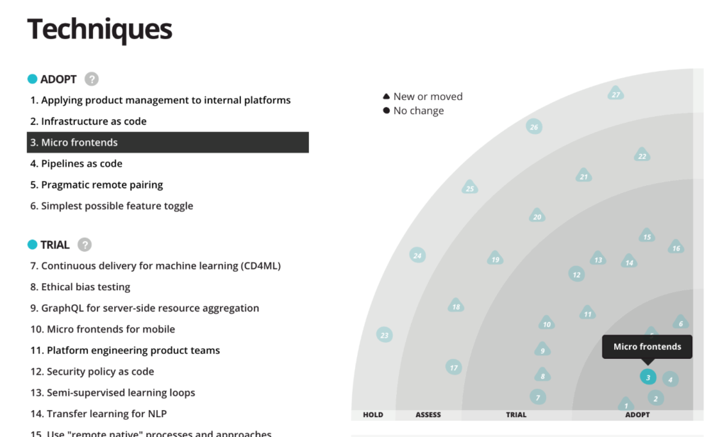
And if we look at ThoughtWorks Technology Radar you can see how this tech had its fast expansion since it first came up, at the end of 2016. If you search for Microfrontends you can find many resources, and nowadays also many frameworks for building your Microfrontends applications, and that’s why in this blog post I would like to focus more on why we chose this technology, and how we developed our Microfrontends, instead of explaining this coding style in general.
I will not be talking about simple to-do-list application, but a real-world, fully flagged, international application, used by all our clients. So, if you are someone thinking about using Microfrontends in your application or business, and looking for an idea, or maybe some positive example of a famous, large, international company, which managed to successfully implement this technology, then you are in right place.
A little bit of history…
Now, before I start going more into details about our Microfrontend solution, I want to tell you about how it all started. At the end of 2017, when we were about to start working on our new project – one-stop-shop for our customers, to access and consume all our digital solutions.
Since this project was pretty much greenfield, we had a great opportunity to choose our tech stack and architecture. Although microservices where quite a known term and architecture style, but Microfrontends was still new and not many resources were available. We were pioneers in this area. The community started talking about Microfrontends, but most of the engineers and architects were hesitant to use it in a large-scale application.
About our application …
Our team’s task was to build an application called “Digital Customer Companion”, meant to serve as customer facing portal for many different digital solutions for very different customers and customer groups. Since the application was primarily a B2B app and meant to work as a sort of a tool for our customers (that is: ZEISS’ businesses), we definitely wanted to build a Single Page Application (SPA). As the ZEISS Group has various business units, with a lot of different digital solutions, our intended solution was supposed to be exposed to our clients via this application.
Above all, these business units also had different teams that are often geographically distant and use different technologies – hence, they had independence in choosing the frontend framework to be used. For instance, some teams wanted to use Angular, but others React as their frontend framework, with the potential of using some other technologies as well – and our goal was to provide the means of accommodating all those choices – we needed to stay flexible.
To accommodate these requirements, Microfrontends seemed to be a great choice, and it turned out, it was, indeed. In just a few weeks, we had the first version of React and Angular applications running next to each other inside their isolated Microfrontend “sandboxes”.
Architecture
Challenges
Most of our Microfrontends where isolated and independent from each other. That, on the one hand, was quite positive because the architecture we have chosen was perfect for it, but on the other hand, it was quite challenging as we wanted to avoid the scenario of reinventing the wheel over and over again. Most of our Microfontend applications had to deal with a similar set of challenges like common layout, authentication, common UI, error handling, localization, tracking, etc.
Solution
Basically, there are two important parts to our solution. The first one is our Microfrontends common layer, aka the Portal. It was designed as a layer to expose useful common APIs but as well to enforce some common shared dependencies – like React, Redux, our UI library, etc. This UI library was an important piece of the puzzle, and I would like to use this opportunity to point you to our open source component library, Precise-UI (see also one of my colleague’s blog post), which we have developed and used for the mentioned application.
The second part were the actual Microfrontends, aka Zeisslets. The Zeisslet is an AMD library which exports one specific function, used by the portal as an entry point. From the perspective of the portal, a Zeisslet is just a single JavaScript file that is transmitted via HTTP.
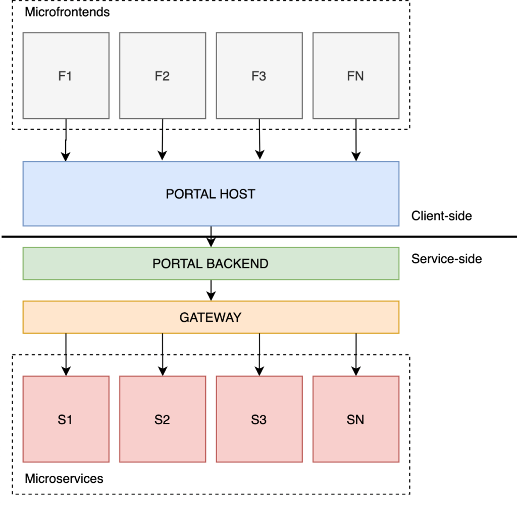
The portal provides many common functionalities, exposed via different APIs to each Microfrontend application.
Just to give you an idea what I’m talking about – APIs can be used by Microfrontends as mounting points such as, dashboard tiles, pages, navigation, etc. The Portal also exposes APIs for accessing our GraphQL gateway, but there are others like translation, localization, tracking, and some other handy APIs. With all this infrastructure provided by the Portal, the Zeisslet developer can clearly focus on business logic implementation.
One might argue that this layer is quite thick, and sure, depending on use cases, this might be the truth, but in our case, this worked well.
For a Zeisslet to be served by the portal it needs to be built following an AMD module specification, exposing one specific function as entry point – but it must also be available on our CDN, so that it can be “picked up” by our microservice.
Developer experience (DX)
Nowadays, an important part in software development is developer experience – and that’s why we invested heavily in providing the best possible DX. For this purpose, we managed to develop different generators for getting you up and running with your Zeisslet in a matter of seconds, no matter which frontend framework you want to use. Also, together with the mentioned generator, the Zeisslets get shipped with the development version of the Portal, which enables developers to see their Zeisslet running in the actual portal when locally debugging.
When it comes to CI/CD, this is also being handled out-of-the-box, and the Zeisslets are tested and available on the CDN as soon as they get merged into corresponding branch (see also other blog post on our CI/CD).
Take-aways
What I’ve shown you here is really high-level and just scratching the surface of the overall challenge. The intention was not going too much into details and distract the focus from important things. What I would like you to take out of this read, is, first of all, the high-level architecture, but also a positive example of one great company which is successfully using Microfrontends as architectural style.
I hope I managed to spark your attention about this pretty cool technology, but also about ZEISS as a cool company growing also into a digital technology company. If you would like to know more about ZEISS and Microfrontends, I would like to use this opportunity to point you to a meetup group, which is proudly supported by ZEISS and ZEISS Digital Innovation Partners. Although the group is still quite young, we already managed to gather more than 100 Microfrontends enthusiasts, and we plan to use this group to socialize and share knowledge and ideas.
Precise UI
Introduction to Precise UI
Why we developed Precise UI
Few years ago we started working on Digital Customer Companion, which is an online portal for customers of Zeiss. It was a greenfield project, where we were laying foundation for one of the core digital products at Zeiss.
From initial design prototypes it was clear, that existing component libraries or frameworks like Bootstrap or Material Design either were too generic or had very strong design language, that redesigning it didn’t make sense. In addition, those frameworks and component libraries offered simple components, which meant they were only basic building blocks. Hence, Precise UI was created.
What is Precise UI
Precise UI is an extensive React component library based on design language of Zeiss brand. It is created with styled components and Typescript. Currently, Precise UI offers more than 75 components, and more components are planned.
How to use Precise UI
To start using Precise UI, you just need to install the package with npm or yarn
npm install precise-uior
yarn add precise-uiAs Precise UI is built with React and styled-components, they need to be installed as well
npm i react@16 styled-components@4Once project is set up and dependencies are installed, simplest app can be as below
import * as React from 'react';
import { render } from 'react-dom';
import { Button, PageHead, Container } from 'precise-ui';

import './styles.css';

function App() {
  return (
    <Container>
      <PageHead title="Hello, Precise" />
      <Button onClick={() => alert('hello')}>Text</Button>
    </Container>
  );
}

const rootElement = document.getElementById('root');
render(<App />, rootElement);

//render codesandbox app
![alt][/img/initial.png]
Styling
As already mentioned, Precise UI uses styled components underneath. On top of that, styled components exposes it’s own version of styled from styled-components, that has additional functionality to make it easier to use theme variables of Precise UI.
Example below changes color of the link to primary and secondary colors of the theme.
import { styled, themed, ActionLink, getFontSize } from 'precise-ui';

const StyledActionLink = styled(ActionLink)`
  ${themed(
    ({ theme }) => `
    color: ${theme.primary};
    ${getFontSize('xSmall')}
    &:hover{
      ${getFontSize('xLarge')}
      color: ${theme.secondary};
    }
  `
  )}
`;

//render codesandbox here ()
Alongside styled, Precise UI exports helper functions for styling like themed, which allows to use default values of supplied theme, getFontSize, which sets font size, line height and font weight, based on passed parameters
Theme Customization
As shown above, components can be styled on individual level. However, PreciseUI can also receive a customized theme object, where global parameters for the whole component library can be updated.
Advanced component usage
Form
Handling forms can be cumbersome, especially in heavy form driven applications. This is where PreciseUI shines. When used with input components provided by PreciseUI, Form component will handle change and submit events. On top of that, it accepts validation rules, to check, if values of the fields are valid.
Simple example of the form is given below.
import * as React from 'react';
import { render } from 'react-dom';
import { Container, Form, Button, TextField } from 'precise-ui';

import './styles.css';

function App() {
  return (
    <Container>
      <h1>Form</h1>

      <Form onSubmit={e => alert(JSON.stringify(e.data))}>
        <div>First:</div>
        <div>
          <TextField name="first" />
        </div>
        <div>Last:</div>
        <div>
          <TextField name="last" />
        </div>
        <div>
          <Button>Submit</Button>
        </div>
      </Form>
    </Container>
  );
}
Here, Form component fires onSubmit event, with values from input components enclosed in it. For more complex cases, Form also accepts onChange handler, so every time any of the fields change, change event is received.
Responsive
Another useful component worth extra mentioning is Responsive. It allows to show and hide certain content based on the screen size. To use it, you just need to provide breakpoint name (small, medium, large, smallAndMedium, mediumAndLarge ), and component will handle displaying proper components. Below is a short example.
import * as React from 'react';
import { render } from 'react-dom';
import { Container, Responsive } from 'precise-ui';

import './styles.css';

function App() {
  return (
    <Container>
      <Responsive screenSize="small">
        <p>This will render on small screens.</p>
      </Responsive>
      <Responsive screenSize="smallAndMedium">
        <p>This will render on small and medium screens.</p>
      </Responsive>
      <Responsive screenSize="medium">
        <p>This will render on medium screens.</p>
      </Responsive>
      <Responsive screenSize="mediumAndLarge">
        <p>This will render on medium and large screens.</p>
      </Responsive>
      <Responsive screenSize="large">
        <p>This will render on large screens.</p>
      </Responsive>
    </Container>
  );
}
Responsive component also accepts a callback, that receives a screen size label, mentioned above, for the user to dynamically decide, how it should behave.
<Responsive
  render={screenSize => (
    <p>
      This is the screen size: <b>{screenSize}</b>
    </p>
  )}
/>
Apart from the main component, there is also utility function for styled-components that allows to apply certain styles for different screen sizes.
const StyledDiv1 = styled.div`
  ${displayTo('large')`font-weight: bold;`};
`;

const StyledDiv2 = styled.div`
  ${displayTo('mediumAndLarge')`font-weight: bold;`};
`;

const StyledDiv3 = styled.div`
  ${displayTo('medium')`font-weight: bold;`};
`;

const StyledDiv4 = styled.div`
  ${displayTo('smallAndMedium')`font-weight: bold;`};
`;

const StyledDiv5 = styled.div`
  ${displayTo('small')`font-weight: bold;`};
`;

const StyledDiv6 = styled.div`
  ${displayTo('(min-width: 200px) and (max-width: 500px)')`font-weight: bold;`};
`;

return (
  <div>
    <StyledDiv1>It's bold on large screens.</StyledDiv1>
    <StyledDiv2>It's bold on medium and large screens.</StyledDiv2>
    <StyledDiv3>It's bold on medium screens.</StyledDiv3>
    <StyledDiv4>It's bold on small and medium screens.</StyledDiv4>
    <StyledDiv5>It's bold on small screens.</StyledDiv5>
    <StyledDiv6>It's bold on screens between 200px and 500px.</StyledDiv6>
  </div>
);
This is the general overview of PreciseUI component library. There are many more interesting and complex components, documentation for which can be found at https://precise-ui.io/#/Components