The central objective of each style guide is to ensure a consistent appearance and a consistent user experience (UX) across multiple applications. For this reason, there are detailed specifications for applications of the ZEISS Group as to how a user interface (UI) should look and behave. Any application that is to be published and used commercially must comply with these requirements.
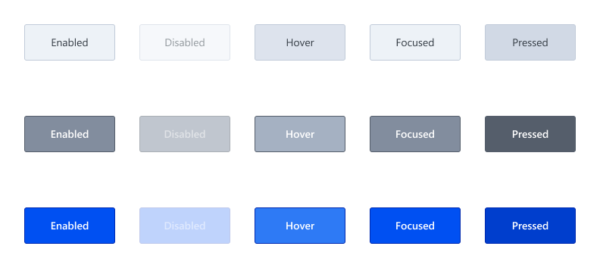
Figure 1 illustrates the complexity and the manifold states that hide behind even very simple UI elements. The efforts for the correct implementation of such states are usually hidden and are often overlooked during application development or given lower priority compared to the implementation of functions.
With an advanced project duration, small deviations from the style guide accumulate, which quickly deceive the overall picture. Other classic examples of such UI errors are:
- Missing states of UI elements (Hover, Focused, …)
- Incorrect use of font sizes, fonts and font colors
- Incorrect use of greyscales for surfaces, borders or dividing lines
- Incorrect spacing and positioning of UI elements
Although such deviations can usually be corrected quickly, extensive creation and acceptance processes often result in disproportionate effort for such comparatively small adjustments. If there are also misunderstandings or misinterpretations of the design specifications and several feedback loops are required, this is a negative experience for all involved.
In order to correct such small UI errors more effectively and efficiently and thus improve the product piece by piece and adapt it to the style guide, we have created and established an uncomplicated form of collaboration.
Pair Programming with Specialists for UI/UX
Pair programming has been successfully used within the development team of our project for a long time. It promotes collaboration and the quality of the code through the four-eyes principle. Two people from the development team work simultaneously and directly on the program code. Through discussion, criticism and the introduction of new ideas, high-quality code should be generated and development time saved.
We made use of this principle in the project and expanded the circle of participants to include specialists for UI/UX in order to be able to give developers direct feedback on their adaptations to the user interface. The requirements and requests for changes to the user interface are communicated by the experts for UI/UX directly in the appointment and the changes are checked instead of documenting them in the backlog and waiting for them to be implemented correctly at some point. The people who specialize in UI/UX include those responsible for the user interface specifications, who are significantly involved in the development of the Figma UI design.
The regular exchange in this circle is called UI Dev session or simply Dev session. The whole thing works very well in a decentralized way in mobile work, because thanks to Microsoft Teams and its screen-sharing function, all participants can see the changes to the code and the user interface at the same time.
To create a framework for pair programming, we have created the following “rules of the game”:
- People from the field of development as well as from the field of UI/UX participate. The group consists of two to a maximum of four people. Together, we search for the solution for specific UI errors and program live on the code.
- A UI Dev session does not have a predefined scope. On the contrary, the objectives achieved are limited by the time available.
- Depending on the requirements of the project, a UI Dev session should take place at regular intervals and should have a clear time frame. For example, 2-3 hours per sprint, week or month can be reserved for a UI Dev session. This means that the time required to solve UI errors should be proportionate and consistent.
- Possible topics are maintained in a list by the specialists for UI/UX and processed iteratively in several UI Dev sessions. The basis for this is, for example, deviations between implementation and style guide or feedback from usability tests.
- The development team is free to select topics from the list and prepare them in advance if need be. This should help to solve as many issues as possible in a short time. However, where necessary, priority may be given to issues for maximum benefit, in order to solve the most important issues first, especially in tight time frames.
- The activities on unexpectedly complex topics whose live implementation is beyond the time frame of a UI Dev session will be stopped after the participants agree and outsourced to other backlog items (e. g. user stories or spikes) and edited later.
The edited and solved UI errors should be documented after the UI Dev session and made available to the project team. This allows each project member to see what changes have been made in which UI Dev session. In addition, it is a good idea to present the topics covered in the Sprint Review briefly to the entire project team.
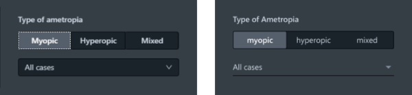
und für Styleguide-konformes Figma-Design (rechts)
Conclusion
Whether clear deviations from the style guide, optimizations after usability tests or other minor adjustments to the user interface: The procedure described in this article for conducting a joint UI Dev session with developers and UI/UX specialists promotes team collaboration and can solve UI errors quickly and efficiently. The documentation effort should be reduced to a minimum and the time required for implementation should be clearly defined. Through iterative implementation of the UI dev sessions, the list of UI errors is processed piecemeal, whereby the project team raises a mutual awareness of such issues.
The UI-Dev Session is now a proven tool in our project and an integral part of every sprint. My colleague Franziska Kubitz will describe a detailed experience of our project in the second part of this blog article series.