WPF Tricks: Context Menu via Behavior

In WPF, behaviors allow for an element of functionality to be packaged into a reusable component. Behaviors enable application designers to trigger changes in the program behavior with little effort and without interfering with the program code. For example, the developers provide behaviors for drag & drop or touch interactions that are then simply used on the corresponding element in the “blend”. This tutorial shows you how to create a context menu by means of a behavior.

The goal

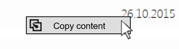
Enable the user to copy the content of a list. As we do not want to convert the individual list elements into editable text boxes, a context menu is required to enable copying:

Figure 1: Context menu for copying the content

Here is how:

We create a new behavior derived from behavior<T>. The blend behavior is located in System.Windows.Interactivity. The type is specified as FrameworkElement—this allows our behavior to work on virtually all controls:

    public class CopyContentBahavior : Behavior<FrameworkElement>

First, we override OnAttached() and OnDetaching(). This is where we can react if a behavior is added or removed.

    protected override void OnAttached()
    {
     base.OnAttached();
    }
    protected override void OnDetaching()
    {
     base.OnDetaching();
    }

The behavior gives us access to the element to which it has been attached. This is what the AssociatedObject property is for. The AssociatedObject is always of the type specified in the class definition (here: FrameworkElement). Now, we attach our context menu with the desired options to the AssociatedObject. In the current example, the command “Copy content” is enough. This command is supposed to copy the clicked-on text to the clipboard. In the example, an icon is provided for the menu entry as well:

    protected override void OnAttached()
    {
     base.OnAttached();
                
     var uri = new Uri("copy-icon-256.png");
     var logo = new BitmapImage();
     logo.BeginInit();
     logo.DecodePixelWidth = 16;
     logo.UriSource = uri;
     logo.EndInit();
     var menuEntry = new MenuItem
     {
      Header = "Copy content",
      Icon = new Image { Source = logo }
     };
     menuEntry.Click += MenuEntryOnClick;
     AssociatedObject.ContextMenu = new ContextMenu();
     AssociatedObject.ContextMenu.Items.Add(menuEntry);
     AssociatedObject.PreviewMouseRightButtonDown += MouseDown;
    }

The element to which we add our context menu is not necessarily the element the content of which we want to copy. We want to copy the content of a ListViewItems, not the entire ListView. Applying the behavior to every single list item, however, would be unreasonably arduous. Therefore, we add an event handler to the AssociatedObject. A right-hand click is not only supposed to open the menu, but identify the “clicked-on” element at the same time. We store the “hit” element in the ‘_element’ field.

    private void MouseDown(object sender, MouseButtonEventArgs args)
    {
     _element = args.MouseDevice.DirectlyOver;
     args.Handled = true;
    }

Now, we implement the actual copying function: For this purpose, the menu entry is given a corresponding event handler. We assume that the hit element is a text block. If it is not, we cannot really copy anything to the clipboard anyway.

    private void MenuEntryOnClick(object sender, RoutedEventArgs args)
    {
     var textBlock = _hitElement as TextBlock;
     if (textBlock != null)
     {
      Clipboard.SetDataObject(textBlock.Text);
     }
    }

Lastly, we use the behavior in our application. It is important that the namespace “blend” is integrated as well: xmlns:i=”http://schemas.microsoft.com/expression/2010/interactivity”

    <ListView>
     <i:Interaction.Behaviors>
      <behaviors:CopyContentBahavior/>
     </i:Interaction.Behaviors>
    </ListView>

WPF Tricks: Coloring Icons at Runtime

Icons help users get their bearings in an application interface. Icons that are done well are easily recognizable, contributing significantly to the intuitive operability. Therefore, they belong in every application—but they can also cause unexpected problems for the developer.

The Problem

An icon is supposed to appear on a button. Both the foreground and background color of the control, and thus the color of the icon, are supposed to change according to the state (normal, hover, disabled). In my example, the color of the icon has to change from black to white for the hover because of the relatively dark background color. Since the background color is prescribed by the client’s CI, it cannot readily be changed.

Figure 1: The color of the icon is supposed to change according to the state (normal, hover, disabled)

Usually, different icon sets are required at this point, and the graphics have to be exchanged at runtime. Wouldn’t it be great if you could simply arbitrarily color the icons at runtime?

Here is how

We replace the control template of the button by way of style. The content itself is hidden behind a border and a rectangle for this purpose. It is important that both are the same size as the original content. The background color of the border is bound to the background color of the button by means of template binding. The fill color of the rectangle is bound to the foreground color. The content of the button is then displayed in this color.

We use the content presenter of the button, which is currently covered, as an opacity mask for the rectangle using a visual brush. Now, the rectangle is “punched out”: The rectangle remains visible wherever the content is visible. Everywhere else, it becomes transparent. Thus, the content of the button becomes visible in the defined foreground color!

An abbreviated version of the control template (without some of the properties):

    <Border
     Background="{TemplateBinding Background}" 
     BorderBrush="{TemplateBinding BorderBrush}" 
     BorderThickness="{TemplateBinding BorderThickness}">
     <Grid>
      <ContentPresenter x:Name="MyContentPresenter" 
                Content="{TemplateBinding Content}"/>
      <Border Background="{TemplateBinding Background}">
       <Rectangle 
        Fill="{TemplateBinding Foreground}" 
        Width="{Binding ElementName=MyContentPresenter, Path=ActualWidth}" 
        Height="{Binding ElementName=MyContentPresenter, Path=ActualHeight}">
        <Rectangle.OpacityMask>
         <VisualBrush Stretch="None" Visual="{Binding ElementName=MyContentPresenter}"/>
        </Rectangle.OpacityMask>
       </Rectangle>
      </Border>
     </Grid>
    </Border>

The button can furthermore be filled with any desired content:

    <Button>
     <StackPanel Orientation="Horizontal">
      <Image  Source="{StaticResource Icon}" Margin="2" />
      <TextBlock VerticalAlignment="Center">let’s go!</TextBlock>
     </StackPanel>
    </Button>

(The complete style is provided at the end of this post.)

Conclusion

This little trick enables you to color icons at runtime virtually any way you like, making different-colored icon sets unnecessary. The principle is very lightweight, but it has its limitations: Gray-scale or multi-colored icons, for example, cannot be used.

Obviously, the principle is not only useful for buttons; it can also be used for any other kind of control. Due to the binding of the color, even color gradients and animation are ultimately possible.


The complete style:

    <Style TargetType="Button">
     <Setter Property="Background" Value="WhiteSmoke" />
     <Setter Property="Foreground" Value="Black" />
     <Setter Property="SnapsToDevicePixels" Value="True" />
     <Setter Property="FontWeight" Value="Normal"/>
     <Setter Property="MinWidth" Value="50"/>
     <Setter Property="Padding" Value="1"/>
     <Setter Property="BorderBrush" Value="LightGray"/>
     <Setter Property="BorderThickness" Value="1"/>
     <Setter Property="VerticalContentAlignment" Value="Center"/>
     <Setter Property="HorizontalContentAlignment" Value="Center"/>
     <Setter Property="Template">
      <Setter.Value>
       <ControlTemplate TargetType="{x:Type Button}">
        <Border
         Background="{TemplateBinding Background}" 
         BorderBrush="{TemplateBinding BorderBrush}" 
         BorderThickness="{TemplateBinding BorderThickness}" 
         MinWidth="{TemplateBinding MinWidth}">
         <Grid>
          <ContentPresenter x:Name="MyContentPresenter" 
           Content="{TemplateBinding Content}" 
           HorizontalAlignment="{TemplateBinding HorizontalContentAlignment}" 
           VerticalAlignment="{TemplateBinding VerticalContentAlignment}" 
           Margin="{TemplateBinding Padding}"/>
          <Border Background="{TemplateBinding Background}">
           <Rectangle 
            Fill="{TemplateBinding Foreground}" 
            Margin="{TemplateBinding Padding}"
            Width="{Binding ElementName=MyContentPresenter, Path=ActualWidth}" 
            Height="{Binding ElementName=MyContentPresenter, Path=ActualHeight}" 
            HorizontalAlignment="{TemplateBinding HorizontalContentAlignment}" 
            VerticalAlignment="{TemplateBinding VerticalContentAlignment}">
            <Rectangle.OpacityMask>
             <VisualBrush Stretch="None" Visual="{Binding ElementName=MyContentPresenter}"/>
            </Rectangle.OpacityMask>
           </Rectangle>
          </Border>
         </Grid>
        </Border>
        <ControlTemplate.Triggers>
         <Trigger Property="IsMouseOver" Value="True">
          <Setter Property="Background" Value="{DynamicResource Brushes50HzOrange158}" />
          <Setter Property="Foreground" Value="White" />
         </Trigger>
         <Trigger Property="IsPressed" Value="True">
          <Setter Property="Background" Value="{DynamicResource Brushes50HzRotOrange179}" />
          <Setter Property="Foreground" Value="White" />
         </Trigger>
         <Trigger Property="IsEnabled" Value="False">
          <Setter Property="Foreground" Value="{DynamicResource Brushes50HzGrau430}"/>
         </Trigger>
        </ControlTemplate.Triggers>
       </ControlTemplate>
      </Setter.Value>
     </Setter>
    </Style>