The focus of this blog article is the integration of User Cantered Design (UCD) into our software development process at Saxonia Systems AG (since 03/2020 ZEISS Digital Innovation). A highlight is put on the tools and methods used to tailor the software to the actual user’s needs.
The root of bad usability
Why doesn’t anyone use the new software? If this question arises, it is usually too late. The development is already completed, and the users stay away or continue to use the previous solution. If this happens it maybe has happened again, that the requirements collected do not align with the actual user’s requirements. This is a common real-world phenomenon, which shows itself in bad usability and low acceptance of the finished solution. One of the possible approaches is offered by User Centred Design (UCD). This puts the tasks, properties and goals of the future groups of users in the centre of the software development process to achieve a high usability of the final product.
User Centered Design at Saxonia Systems AG
Due to our agile software development process, reaction to changes and new requirements is fast. Early feedback from the future users is essential for high levels of usability. Our Scrum inspired agile process is extended with tools and methods of usability engineering so that the user is involved regularly from the beginning.
Figure 1 UCD deliverables of our agile process
At the start of the project the UCD elements are incorporated into the product vision. Beside classic parts like project goal or system scope, the description of prospective user groups and the usage context are sensible UCD additions.
The product backlog does not only contain user stories and technical spikes, but also contains room for design spikes, that enable the team to focus on usability issues. This can include prototypes as a basis for decisions or the planning and the carrying out of user studies.
Additional quality gates are added to the scrum artifacts Definition of Ready and Definition of Done, in order to guarantee, that the software fulfils future user requirements.
Before user stories are ready for implementation, they are supplemented with sketches, mock-ups or designs. These visualise the functions, that are to be implemented, to the team. If they can be applied, process models are also included to show more complex sequence of events.
User stories are considered done in the UCD perspective if the usability principles are met. This can be checked via an expert evaluation. Hereby the usability engineer checks the functions heuristically for the adherence to the rules. Additionally, the consistency of the application and the style-guide conformity are checked.
It is advisable to have a central storage for usability background knowledge, e.g. a team wiki.
That way a team can always get information on user feedback and current status regarding UCD. Recommended content is:
Information architecture
Domain model
System documentation
Studies and test results e.g. user studies and CUI tracking
As you can see in the preceding sections, we incorporate the prospective user into the development of custom software development. In our experience this is essential for a high usability and acceptance of the final product. By getting early feedback by the user and using agile and lightweight methods you can eliminate the starting question “Why doesn’t anyone use the software?”, from your vocabulary.
Personas in a nutshell – What are personas, and why do we need them?
In the field of agile, distributed software development, and in a B2B context in particular, the client often is the only contact for the software developer. This is usually due to the end users not being available because they are either located elsewhere, separate from the development team, or do not have time. When a user is not close at hand, personas can help and compensate for the lack of contact.
Personas are prototypical users representing a user group and their essential characteristics and needs in regard to the planned product. They consolidate the results of the context analysis, but they cannot replace the user research. They are designed as posters, as “life-like” and realistic as possible because otherwise, the persona is useless. In general, personas are developed in early project stages (analysis and planning), and they are used for performance/target comparison throughout the entire development cycle. This enables the design and development team to focus on the users’ requirements. Personas serve as a reference for decisions in discussions, and by asking questions like “Would person x understand this?”, they give priority to the user. Personas help the product owner in particular to evaluate ideas for new features.
More often than not, it takes more than one persona to cover the prospective users of the software. If there are too many, possibly even contradictory, personas, it is advisable to classify them into primary and secondary personas. This helps to keep the focus on the target user group and prioritize the decision alternatives.
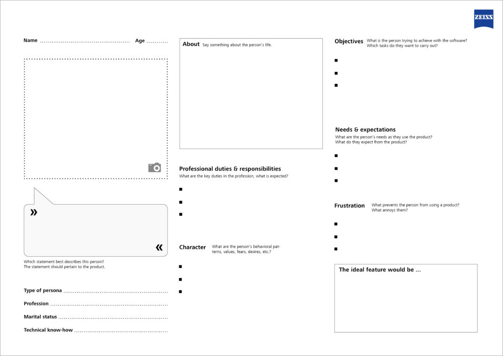
Which elements are needed to create a good persona?
Name: A realistic name that identifies the persona
Age: Allows for conclusions regarding the persona’s attitude
Image: An image, either a photograph or a drawing, to make the persona more realistic
Personal information: Age, gender, professional education, knowledge and skills, marital status, children, …
Type of persona: Associated user group / archetype (e.g. teenager, housewife, pensioner)
Profession: Function, responsibilities and duties
Technical know-how: General computer skills; technical affinity; knowledge of related products, previous systems or competitors’ products
Character: Individual preferences and values of the persona, e.g. are they open to new ideas?
Behavioral patterns and approaches: Values, fears, desires and preferences
Objectives: Key tasks to be handled with the new application
Needs & expectations: Requirements regarding the handling of the product
Frustration: Typical nuisances with products in general, i.e. issues that have to be avoided at all costs
Persona Template
The Usability Team at Saxonia Systems AG (since 03/2020: ZEISS Digital Innovation) has developed a template for creating a persona based on the best practices and their own experience. The template is available as a PDF free of charge: DOWNLOAD
Template for creating a persona
The Persona Template allows you to customize your software even more precisely to the requirements of its prospective users, and never to lose sight of the most important aspect—because we all know: “The user is always right.”
Some time ago I presented the design principles we use at Saxonia Systems (since 03/2020 ZEISS Digital Innovation) to design and develop user-friendly Software in a blog article. As part of the development of our Custom Usability Index, which can be used to measure the degree of usability of a software project, we as Usability Team took a closer look at those principles and extended them to 13 top categories, which contain multiple usability aspects each. In this article those categories and aspects are explained in more detail and illustrated with examples.
Effectivity: Reach the goal. (Principle 1)
The first and therefore most important rule is the observance of effectivity. An application should enable the user to work effectively by providing a suitable functionality for the completion of his task. The user is not overloaded with information and functions that are not necessary for his use case. Accordingly, dialogs should only contain relevant or frequently used information. Every additional information distracts the user from the important content and brings the risk of reducing relative visibility.
It is therefore necessary to answer the central question: What is the task to be supported? An in-depth analysis of workflows and their comprehension is the key to understand the tasks and goals of the users to be able to evaluate the efficiency of the implementation.
Figure 1: How much information is necessary to display the time?
Efficiency: Reach the goal quickly. (Principle 2)
Particular attention also needs to be paid to the optimisation of efficiency. The user should be able to accomplish a task in minimal time. At the same time, the application requires only minimal time to react and execute an action. So, this principal refers to the speed of operation of both users and the system. Indications of users not being able to work efficiently are for example unsuitably used interface widgets, missing default values, misleading search results and high-resolution pictures requiring a fast internet connection.
Signs of low system efficiency, on the other hand, are delayed reactions to input in the form of a “shaking” cursor, slow interface widgets and missing feedback.
Controllability: The user has the power! (Principle 3)
The user has, regarding his authority within the system, control over all actions. He may cancel, pause, and resume actions at a later point in time. It is possible for him to revert an action and, as the case may be, start a new attempt if the result was not satisfactory. To control the application, the user still has the option of using alternative input devices to the mouse, such as keyboard, screen reader and Braille display, according to his personal requirements.
Not satisfying these points will lead to increased frustration for the user.
Customisability: Everything suits the user. (Principle 4)
The application should be flexible enough to support different approaches for the completion of a task. Additionally, the user can customize the system according to his previous experiences, culture and needs e.g. by changing font size, changing the default settings, and setting his own shortcuts. A good example for the consideration of customisability is the online platform http://www.elster.de/, which is used for web based registration and submission of tax returns. After logging in, the user is asked to which user group he belongs to, to better adapt to his needs afterwards.
The control of the application should comply with the expectations of the user in every aspect and needs to follow general conventions (platform, style guides, etc.). One part of it is the consistent usage of terms, icons, and layouts within the application and in product families. Process structures also follow a uniform principle. By maintaining consistency, the user can reuse a behaviour pattern once learned. When using an application for example, every user knows (or expects) to find the button to close a dialog window in the upper right corner. When switching to the operating system Mac OS X he has to completely readjust.
Evidence that an application does not behave as expected and consistently includes surprised to confused users and e.g. the use of different terms for one and the same function.
Design and layout: Comprehensible at first sight. (Principle 6)
This principle comprises every aspect of visual design of an application. According to that, the kind of aggregation, layout of the GUI elements and purposely used colours should support the user with recognising links. Information and components are generally presented to the user in such a way, that they can be noticed and that texts can be read easily. Indications of not satisfying this principle are e.g. no obvious correlation between labels and data fields, tiny fonts and low-contrast colours used for front- and background.
Language: Speak the user’s language. (Principle 7)
The application should basically be in line with the user’s language and way of thinking. Text elements should therefore be verbalized clearly and a for the audience understandable vocabulary should be used. Nevertheless, a lot of things are worded technical instead of using the user’s words. The “best” example for it are error reports with a high degree of detail, therefore valuable for the system developer, but not helpful for the user at all. To avoid this, an in-depth analysis of the user’s technical vocabulary is necessary.
Visibility: The user recognizes his possibilities. (Principle 8)
To guaranty the user’s ability to complete his task instead of becoming lost, he needs to know at any time, in which part of the application he is, which actions can be executed and how they are triggered. He also needs to know his system’s status at any time. That is why the main menu should display the user’s current position and e.g. comprehensibly show how to get there using a breadcrumb navigation. Relevant objects, functions and options should be visible to the user’s eye and enable him to find the desired klicks directly. He needs to be able to estimate the effects an action is going to have.
Feedback: The user is told what is going on. (Principle 9)
The system should react to the user’s input at any time and inform him about events actively. In case of an occurring error, a corresponding notification illustrates its reason and suggests a solution to the user if possible. Shortcomings of an application regarding feedback can for example be a missing spinner icon during complex operations. User inputs seem to be ignored by the system and the user experiences the application as “frozen”.
The system should support the user getting to know the interface and should encourage him to try previously undiscovered features without having negative effects on the user. Especially during first usage the user should be supported when performing complicated actions and limit possible missteps this way. At this point, short tutorials and explaining texts are helpful. A possibility for experimental learning would be a test mode, meaning a separated test section within the application, where all the functionalities can be tested without consequences. Using a test mode, the user is training using the system und learns dealing with it without having to completely execute the processes.
Help and documentation: Help, that helps. (Principle 11)
Help systems should be easily findable or embedded into the interaction. Embedded help is for example implemented by using tool tips, place holder, short help texts and assistants. Are those not sufficient, contextual help like a help panel, getting-started pages and a search function should be the choice. Note that a help system is only supporting the user when relating to the user’s task and listing specific steps to solve the problem.
Error tolerance: Forgive and avoid user errors. (Principle 12)
The system should be designed to save the user from mistakes from the beginning, for example by disabling invalid functions and describing the reason for the restriction. In case of happening anyway, the system should detect invalid inputs or actions. If they are unmistakable, the system can correct the mistakes on its own if possible. Are there multiple possibilities, alternative suggestions are shown. Under no circumstances errors may lead to data loss or even a system crash.
User experience (UX): The software feels good. (Principle 13)
One aspect not yet considered is the user experience (short UX). It results out of the complete experience of the user with the application and is made up of the actual usage, the user’s expectations, and the previous experiences with other systems. The application mediates a feeling of security and reliability, is fun to use and serves the purpose. The system excites the user by not only satisfying specific expectations, but also overshoot them. Principle 13 is mostly fulfilled by sticking to the principles listed above. A slow, inconsistent application with a lot of error messages and crashed will not contribute to the user’s satisfaction. That is why the software should be up to date with the current technology and should support the current control paradigms.
Conclusion
13 important principles for reaching user-friendly, satisfying software were presented in this blog article. Take note, that there is no such thing as the one and only user-friendly solution. How comfortable it is to use an application always depends on the specific use-case and the user group. This is why it is recommended to analyse the users‘ needs and involve them through user tests.