The User in the Center of Software Development

The focus of this blog article is the integration of User Cantered Design (UCD) into our software development process at Saxonia Systems AG (since 03/2020 ZEISS Digital Innovation). A highlight is put on the tools and methods used to tailor the software to the actual user’s needs.

The root of bad usability

Why doesn’t anyone use the new software? If this question arises, it is usually too late. The development is already completed, and the users stay away or continue to use the previous solution. If this happens it maybe has happened again, that the requirements collected do not align with the actual user’s requirements. This is a common real-world phenomenon, which shows itself in bad usability and low acceptance of the finished solution. One of the possible approaches is offered by User Centred Design (UCD). This puts the tasks, properties and goals of the future groups of users in the centre of the software development process to achieve a high usability of the final product.

User Centered Design at Saxonia Systems AG

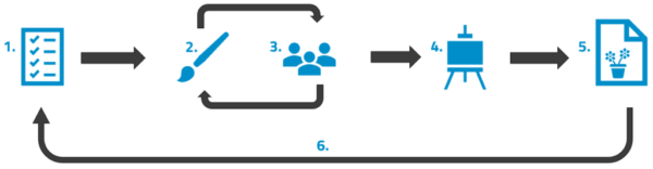
Due to our agile software development process, reaction to changes and new requirements is fast. Early feedback from the future users is essential for high levels of usability. Our Scrum inspired agile process is extended with tools and methods of usability engineering so that the user is involved regularly from the beginning.

UCD deliverables of our agile process
Figure 1 UCD deliverables of our agile process

At the start of the project the UCD elements are incorporated into the product vision. Beside classic parts like project goal or system scope, the description of prospective user groups and the usage context are sensible UCD additions.

The product backlog does not only contain user stories and technical spikes, but also contains room for design spikes, that enable the team to focus on usability issues. This can include prototypes as a basis for decisions or the planning and the carrying out of user studies.

Additional quality gates are added to the scrum artifacts Definition of Ready and Definition of Done, in order to guarantee, that the software fulfils future user requirements.

Before user stories are ready for implementation, they are supplemented with sketches, mock-ups or designs. These visualise the functions, that are to be implemented, to the team. If they can be applied, process models are also included to show more complex sequence of events.

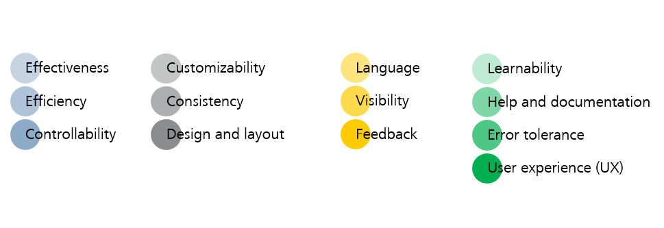
User stories are considered done in the UCD perspective if the usability principles are met. This can be checked via an expert evaluation. Hereby the usability engineer checks the functions heuristically for the adherence to the rules. Additionally, the consistency of the application and the style-guide conformity are checked.

It is advisable to have a central storage for usability background knowledge, e.g. a team wiki.

That way a team can always get information on user feedback and current status regarding UCD. Recommended content is:

  • Information architecture
  • Domain model
  • System documentation
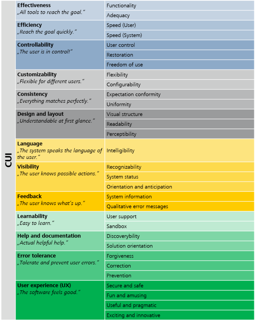
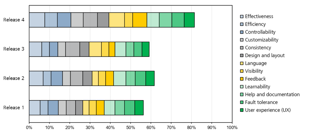
  • Studies and test results e.g. user studies and CUI tracking
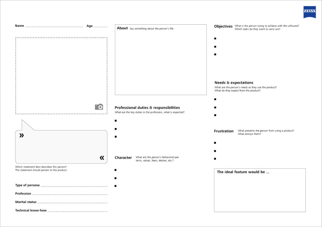
  • Personas

As you can see in the preceding sections, we incorporate the prospective user into the development of custom software development. In our experience this is essential for a high usability and acceptance of the final product. By getting early feedback by the user and using agile and lightweight methods you can eliminate the starting question “Why doesn’t anyone use the software?”, from your vocabulary.

Personas – When the User Is Not at Hand…

Personas in a nutshell – What are personas, and why do we need them?

In the field of agile, distributed software development, and in a B2B context in particular, the client often is the only contact for the software developer. This is usually due to the end users not being available because they are either located elsewhere, separate from the development team, or do not have time. When a user is not close at hand, personas can help and compensate for the lack of contact.

Personas are prototypical users representing a user group and their essential characteristics and needs in regard to the planned product. They consolidate the results of the context analysis, but they cannot replace the user research. They are designed as posters, as “life-like” and realistic as possible because otherwise, the persona is useless. In general, personas are developed in early project stages (analysis and planning), and they are used for performance/target comparison throughout the entire development cycle. This enables the design and development team to focus on the users’ requirements. Personas serve as a reference for decisions in discussions, and by asking questions like “Would person x understand this?”, they give priority to the user. Personas help the product owner in particular to evaluate ideas for new features.

More often than not, it takes more than one persona to cover the prospective users of the software. If there are too many, possibly even contradictory, personas, it is advisable to classify them into primary and secondary personas. This helps to keep the focus on the target user group and prioritize the decision alternatives.

Which elements are needed to create a good persona?

  • Name: A realistic name that identifies the persona
  • Age: Allows for conclusions regarding the persona’s attitude
  • Image: An image, either a photograph or a drawing, to make the persona more realistic
  • Personal information: Age, gender, professional education, knowledge and skills, marital status, children, …
  • Type of persona: Associated user group / archetype (e.g. teenager, housewife, pensioner)
  • Profession: Function, responsibilities and duties
  • Technical know-how: General computer skills; technical affinity; knowledge of related products, previous systems or competitors’ products
  • Character: Individual preferences and values of the persona, e.g. are they open to new ideas?
  • Behavioral patterns and approaches: Values, fears, desires and preferences
  • Objectives: Key tasks to be handled with the new application
  • Needs & expectations: Requirements regarding the handling of the product
  • Frustration: Typical nuisances with products in general, i.e. issues that have to be avoided at all costs

Persona Template

The Usability Team at Saxonia Systems AG (since 03/2020: ZEISS Digital Innovation) has developed a template for creating a persona based on the best practices and their own experience. The template is available as a PDF free of charge: DOWNLOAD

Template Personas
Template for creating a persona

The Persona Template allows you to customize your software even more precisely to the requirements of its prospective users, and never to lose sight of the most important aspect—because we all know: “The user is always right.”

Living Style Guides – The Future of UI Design?

Like virtually all artifacts in software development, the style guide is also subject to continuous change. Nevertheless, traditional versions are frequently used today, even though technological progress has long since opened up new ways to bring traditional documents to life. This blog post addresses this issue, using the example of the style guide to show how its continuous development can improve the collaboration of designer and developer: Are living style guides the future of UI design?

Once upon a time… there was the document-based style guide

For a long time, the collaboration of the UX designer and the front-end developer was governed by an artifact: the document-based style guide. This style guide is typically created as follows:

  1. First, a requirements analysis is done.
  2. The designer then creates mockups based on the requirements.
  3. The mockups are discussed with the client (x iterations) and finally approved.
  4. Then, the designer creates the agreed graphics with the design tool.
  5. The “style guide” document is compiled from the graphics and corresponding descriptions.
  6. In case of amendments, all these steps have to be repeated.
figure for a document-based style guide
Figure 1: The document-based style guide

As a basis for communications, a good style guide should include the following points:

  • Concept (application from the project’s perspective, product vision, UX objectives)
  • Structure (structure of the application)
  • Interaction design (design of the dialog between the user and the system)
  • Color scheme (rules of use for colors)
  • Typography (fonts and font sizes)
  • Icons and graphics (overview of all icons and graphics of the application)
  • Standard interaction elements (repeatedly used user interface elements)
  • Special views (non-standard UI views and control elements)
  • Language (communication style and wording)
  • Multimedia (use of images, audio and video)

However, listing the standard interaction elements in particular in a rigid, document-based style guide is not ideal. Considering the number of different UI states such as hover, active, selected, etc. for each element, this list can easily grow to several pages. Few developers like to dig through pages and pages of documents; therefore, the risk of non-compliance with the style guide increases.

Furthermore, the traditional version of the style guide poses two problems: The rigid reference to a document which is often very long requires great imagination, and there is no possibility of interaction with the various elements.

Status quo & future of UI design… coming to life

There are several approaches for addressing the points of criticism described above. For example, the content of the style guide can be brought to life by means of a UI prototype kept and updated in parallel. This makes it possible to test the various states of the standard interaction elements in the context of the application, or also to represent special views in detail. With this “hands-on” mentality, the design requirements become clear more quickly, and the tedious rifling through style guide documents becomes unnecessary.

However, this solution does not eliminate the following issues: In everyday project work, the designer often creates templates that are too unusual and cannot be implemented with the applicable UI framework without significant additional effort. The limited range of functions of the prototyping tool is another problem. It is not always possible to simulate the final behavior down to the last detail, which can lead to false assumptions.

Therefore, the current trend is towards implementing the entire style guide as a separate “live” web application. This means that the elements are implemented in the actual application before use, and the developers only need to copy the source code.

Some useful references:

example from the IBM Style Guide
Figure 2: Example from the IBM Style Guide (www.ibm.com)

The benefits of this implementation are obvious: In addition to a clear structure of the necessary information and elements, maintainability in particular improves significantly. If a color has to be changed, this usually only means a change of the color code in the style sheet in the “living style guide”; whereas in the traditional, document-based style guide, countless paragraphs and designs have to be updated. Furthermore, the QA department can test the required behavior before the actual development starts. It is even possible for changes in the style guide to be adopted into the application immediately if both applications reference the same style sheet. This way, redundancies and inconsistencies can be excluded from the start. The level of integration of the style guide into the development process certainly depends on the project at hand, but the possibilities of optimization are limitless in this respect.

The “living style guide” has become all the rage, and it is used by numerous top IT companies such as Google or IBM. It continuously reduces the gap between design and development, and in the end, the one who profits the most is the user :-)!

Usability in Software Development Projects

The problem: Making usability comprehensible and transparent

How is the usability of my software? At the latest, this question will arise by the time the actual users first see the application. Often, this is when you notice that the planned software is not really optimally tailored for the end users. However, it is usually too late to make major changes at this point. Subsequent problems such as poor acceptance or even the failure of the software project have been confirmed by numerous studies. Approaches like “user-centered design” that put the user at the center of attention of the development process show just how beneficial such involvement and the consideration of usability at an early stage can be. The core problem that persists, however, is the difficulty of making usability comprehensible. This blog post presents a possible solution.

The idea: The Custom Usability Index

The Custom Usability Index (CUI) is an index that measures the degree of achievement of the usability of computer software at the current project stage.

The basis: 13 design principles

The index represents the aggregated rating of 31 criteria allocated to 13 categories. The categories are based on design principles developed in-house that are in turn based on ISO standards and the state-of-the-art literature on usability.

At the start of each project, stakeholders can weight the categories listed above according to their individual requirements, and thereby specify priorities.

The evaluation: Where the magic happens

As each project is unique, it is important to specify at the start of a project when a criterion has reached the best possible usability. To gain a uniform understanding of the required target state that the application is to achieve with respect to the respective criteria, it is advisable to involve the entire team, including the stakeholders involved, in the definition. The fact that both sides are made aware of the issue of usability is a positive side effect.

The actual evaluation of the criteria is done by means of specific usability test methods. The tests have to be done on the sub-product on a regular basis throughout the course of the project. A criterion is given the highest rating in the assessment only if the previously defined target state has been achieved 100%. The final CUI value then reflects the weighted average rating of the 13 categories.

The result: Usability brings happiness

Measuring the CUI at regular intervals makes usability transparent both for the team and all the stakeholders. The current status of the software in each of the categories is apparent at all times, as are any issues that may still require improvement.

The example above shows continuous improvement in usability up until release 2. Release 3, however, brought a deterioration. By identifying the categories affected, it was possible to remedy the issue immediately during development. The result becomes apparent in the significant increase in usability in release 4.

The CUI presented in this blog post provides a possibility to measure the usability of software throughout the development process, and to make it transparent for all the parties involved in the project. The high level of transparency and the stakeholders’ awareness of usability in general constitute a distinctive quality feature of the software.