Software that offers not only functionality, but good usability as well, stands out among the competition in a positive way. However, achieving this is not all that simple. This post therefore presents 11 key principles describing the basic rules you need to comply with in order to achieve good usability. Whether in prototyping, during development or during exploratory testing: Keeping these simple rules in mind can help you achieve and/or improve usability in your software project with little effort.
Principle #1: Visibility & feedback
Visibility
For the user to be able to carry out their tasks, they have to know where they are at all times, and how to execute which action. In other words: Anything the user does not see, does not exist. Instead of taking the time to familiarize themselves with the product, they are more likely to switch to the competitor. Therefore, you should always show the user where in the application they are and how they got there. The most important information and features have to be accessible at all times—do not make the user search for it.
Feedback
When the user has completed an action, they want to know whether the system has “understood”. And they expect information as to what will happen next. The system should therefore give the user appropriate, i.e. visual, auditory or tactile, feedback about the current status regarding an action within a reasonable period of time. Notify the user if there is going to be a delay.
Principle #2: Speak the users’ language
Unfortunately, we tend to use technical terms when speaking about things instead of using the users’ language. A classic negative example are error messages containing cryptic code that may be of value to the developer, but does not tell the user anything. Therefore, you should ensure that error messages are useful by not only clearly explaining the problem, but also suggesting a solution.
To avoid confusing the user, you should use terms they are familiar with and map out processes that correspond to their way of thinking. Cultivate terms and processes using the technical terminology of the users. Pay close attention: Are the translations correct? Are abbreviations and acronyms understandable? In this context, it can be useful to do some field research, i.e. to find out which terms the users use and how they work.
Principle #3: Control
We have all been there: You start your computer in the morning, already somewhat in a hurry—and as it boots, the system starts installing updates for 10 minutes without prompting. There is no escape.
The principle of control reminds us of the user’s power. The user is supposed to be able to initiate an action and determine the direction in which it goes, enabling them, for example, to test unfamiliar features and undo them if they do not like them. They should also be able to pause actions, e.g. to save their answers in a survey in order to continue at a later time.
Simply put, the principle of control means that the user tells the computer what to do, not the other way around. Always offer the user an exit.
Principle #4: Consistency
Familiarizing oneself with a new system is easier the more its design and operation refer to something that is already known, and thus meets one’s expectations. Create a consistent look and feel within the application and within product families by using consistent terminology, colors, layouts and icons. If you comply with common platform conventions and design style guides, you avoid surprising the user.
In the end, the most important rule is meeting the user’s expectations. Things may be perfectly logical and well thought out for you as a supposed expert: If the users expect a different functionality, their expectations are difficult to change.
Principle #5: Error tolerance and prevention
Everybody loses focus in their work at one time or another because they are tired or pressed for time, and errors occur. This is why it is all the more important for the application to have a high tolerance that recognizes errors and allows the user to effortlessly correct them. Google, for example, immediately suggests similar search terms that produce more results:

Enable the user to undo unintentional actions. However, loss of data must always be avoided. For critical actions, it is therefore advisable to request confirmation by the user, e.g. before formatting the hard drive.
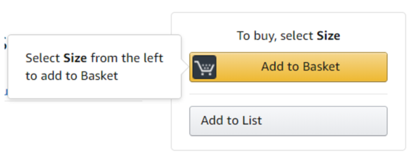
Obviously, appropriate prevention of errors, i.e. avoiding user errors before they occur, is even better than good error handling. Therefore, you should systematically restrict user actions that are inadmissible or futile. Deactivate buttons and use tooltips to explain why they cannot be used at this point, like it is done on Amazon.de, for example (see below). Instead of a free-text field that is prone to typing errors, you can give the user a selection of options to choose from.
Principle #6: Recognition rather than recall
Recognizing something that is already known is easier than recalling it from memory. Such as, for example, calling up a function by clicking on a button vs. calling up the same function by means of the command line.
You can lessen the user’s memory load by making objects, actions and options visible to them: Establish associations between textual and image information; for images, for example, you can provide a preview in addition to the file name. Label search masks and form fields in a meaningful manner, telling the user immediately which information is required. Help the user with their research by listing their most recent queries or making suggestions.
On the other hand, you should avoid forcing the user to memorize information when they switch between dialogues, such as the 10-digit registration code for the installation of software.
Principle #7: Flexibility & efficiency
Users have different requirements regarding an application, either with respect to their technical know-how, origin, or physical needs. If the software does not fulfill these requirements, the user cannot work efficiently because of the necessary transition. The fundamental objective, however, is for the user to be able to execute their tasks with minimum effort. This is true in particular assuming that they wish to work faster as the frequency of use and their know-how increase.
Therefore, you should enable the user to configure standard settings. Provide shortcuts for frequently used features for experienced users, and offer tips to novices on how to reach their goal more quickly. According to Fitts‘ Law, you should use a larger format for important features because they are easier to reach than small objects.
Attention: The user’s expectation is more important than efficiency! You would rather do without a button for saving the current status because it is saved automatically? Not a good idea: The absence of such a button will confuse the user and cause them to search for it.
Principle #8: Simplicity
Dialogues should only contain relevant or frequently needed information. Any additional information distracts the user from the important content and reduces the relative visibility of other elements. Therefore, you should design your solution to be as simple as possible. Which is the task that you want to support? For example, check whether each interface element is truly essential and has a purpose (e.g. “Do we really need this table, and does it need a red frame?”). Reveal advanced features of the application gradually, and only when they are needed. Anything else could prove to be too much for the user.
In this context, it is also advisable to simplify complex processes instead of hiding them. Simplicity is achieved by simplifying things, not by hiding complexity, and not by eliminating necessary functions, either.
In short: Leave out as much as possible. But do not overdo it: Anything the user does not find does not exist for them!
Principle #9: Perceptibility
Information and interface components have to be presented to the user in such a way that they can perceive and/or read them. Visually impaired and blind users in particular have special requirements in this respect. Therefore, you should ensure sufficient color contrast between the foreground and background of the screen to make sure that user input in particular is clearly legible. Design the content and the style to be independent to ensure that the content can, for example, also be displayed in a simpler layout, making it readable for reading aids.
Do not use color as the sole means of transmitting information, e.g. for status indicators. That constitutes an obstacle for colorblind users. You can use one of the many free simulation tools to optimize this aspect of your software, e.g. Contrast-Ratio.
You should also provide alternative text for all graphic elements so that the user can translate them into other forms as required (e.g. Braille or plain language).
Principle #10: Visual structure
Deliberate grouping and arrangement of elements on the interface helps the user to recognize connections. Create a visual hierarchy in your application that emphasizes the most important information. In doing so, place key information on the upper half of the title page to make sure that it is seen immediately.
Once the general structure has been designed, it is advisable to arrange the interface components within a specific view according to the Design Laws. They help you understand the effect of the arrangement in space and time on the viewer, and they provide important tips for a well-functioning design.
Principle #11: Help & documentation
Even though a product that can be used without instructions is desirable, help systems assist with the use of the application and facilitate the introduction to beginners.
Therefore, help should
- be easy to find
- refer to the user’s task
- list specific steps to be taken, and
- not be too extensive.
Help is most appreciated if it is provided the moment it is needed—after all, who likes reading handbooks? This is why it is advisable to use embedded aids such as tooltips, placeholders, watermarks and assistants wherever possible. If this is not enough, contextual aids such as a help panel, introductory pages and the search tool should be the second choice.
Principle #12 – Conclusion: Ask the users!
The principles presented here provide a guideline to ensure a high level of usability in a software project. It is up to you to interpret and prioritize the principles. There is no one true, user-friendly solution to a given problem, and there are few universal answers. Rather, every solution comes with compromises. As computer scientist and UX designer Bill Buxton so aptly put it:
Everything is best for something and worst for something else. The trick is knowing for what, when, for whom, where, and most importantly, why.”
Accordingly, an interface is always suitable for one particular application and a specific user group. This is why it is important to examine the task beforehand, and to research the users’ requirements. For this purpose, the users should be involved in the development process at an early stage and continuously asked to give feedback. The design principles presented above provide good reference points for assessing the usability in this context, but they only allow us to make assumptions. Nobody knows the users better than they know themselves—all you have to do is ask them.
Related literature:
- J. Nielsen‘s 10 Usability Heuristiken (web)
- B. Shneiderman: 8 Golden Rules of Interface Design, In: „Designing the User Interface: Strategies for Effective Human-Computer Interaction“ (web)
- DIN-Norm EN ISO 9241-110: Grundsätze der Dialoggestaltung (web)
- B. Tognazzini, Principles of Interaction Design (web)
- J. Johnson, GUI Bloopers 2.0: Common User Interface Design Don‘ts and DOs, 2007
- D. Norman, The Design of Everyday Things: Revised and Expanded Edition, 2013
- Web Content Accessibility Guidelines 2.0 (web)
This post was written by: